How to create a newspaper with Canva templates: a step-by-step guide
If you’re looking to create a newspaper using Canva, you’re in the right place. At Newspaper Club, we make it simple to design and print...
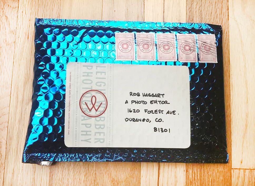
If he had to guess, Rob Haggart would say he's seen tens of thousands of photography portfolios. They first started landing on his desk at Men's Journal and Outside magazines, where he worked as Director of Photography for 7 years.
As founder of Photofolio and curator of A Photo Editor, the photography blog Haggart started in 2007, he still receives around 40 portfolios every week. He shares the best ones on the @aphotoeditor Instagram feed, a source of inspiration for more than 30,000 followers. He's seen portfolios in all shapes and sizes: postcards, books and, yes, newspapers (like these ones).
We figured Haggart would be a great person to ask about packaging a portfolio – what works, and what doesn't? If you're mailing yours, here's his short guide to making a good first impression (and scroll down for examples!).
There are 3 main concerns when deciding how to package your promo: deliverability, protection and ease of opening. After you've covered those you can think about some design choices, but my opinion is that the design of the packaging matters very little. I have seen some well-designed packaging that works with a well-designed promo, but I think it has to also fit in with the personality of the photographer and their work. It's not something you can fake – and really you'd be wasting your time and money on it.
Deliverability has to be the number one concern. I've heard some horror stories about promos all being returned to the sender for problems with the packaging. Make sure it can be mailed, a stamp can be affixed and you can put an address on it.
Protection and ease of opening can go hand in hand. Something that is very well protected can be difficult to get into and is not recommended. Unless you're sending an original print, don't worry too much about it arriving pristine. Some damage from mailing is expected and doesn't matter.
Ease of opening trumps everything in my opinion. I prefer a postcard with no packaging or a cardboard envelope with a pull tab to rip it open. I also like the clear envelopes where you can see what's inside.
Here are a few examples of packaging that I like:
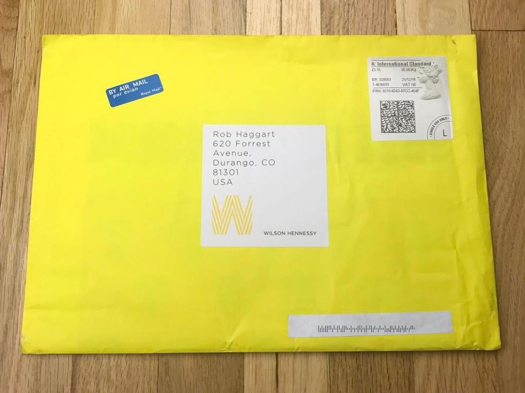
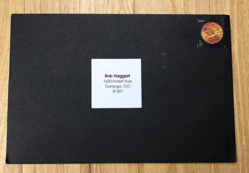
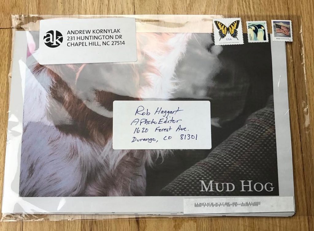
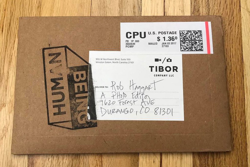
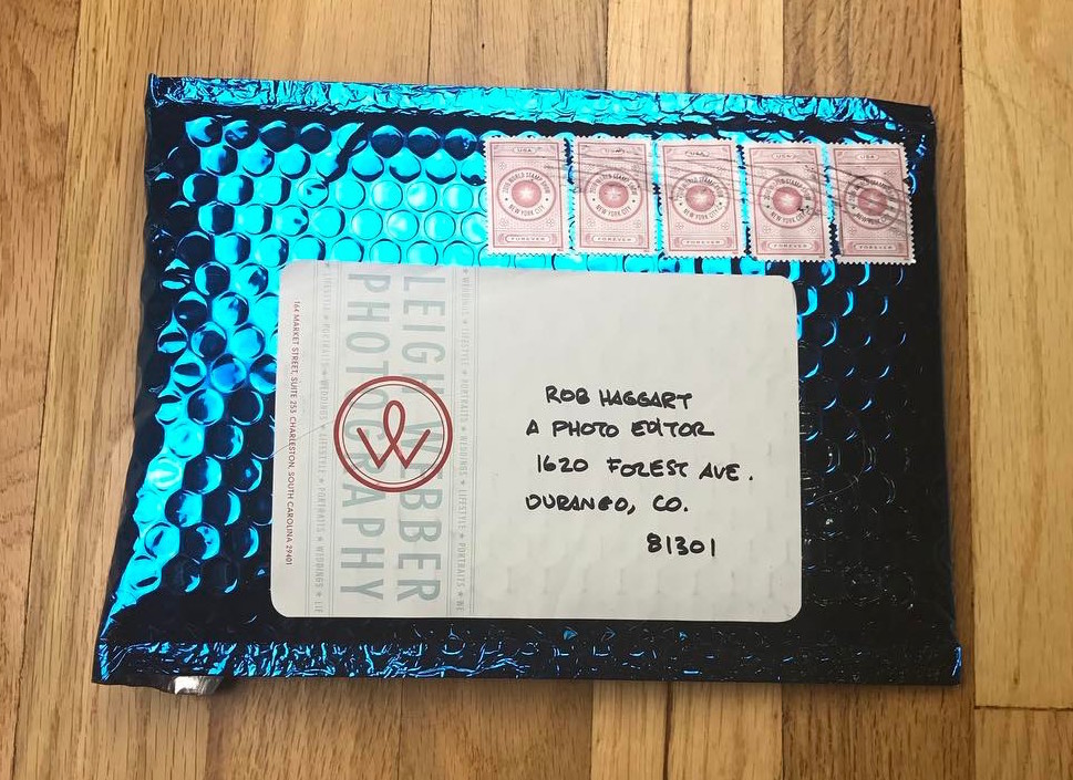
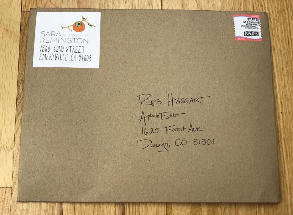
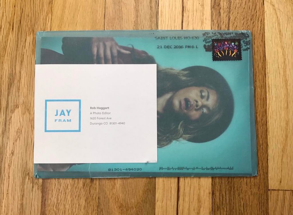
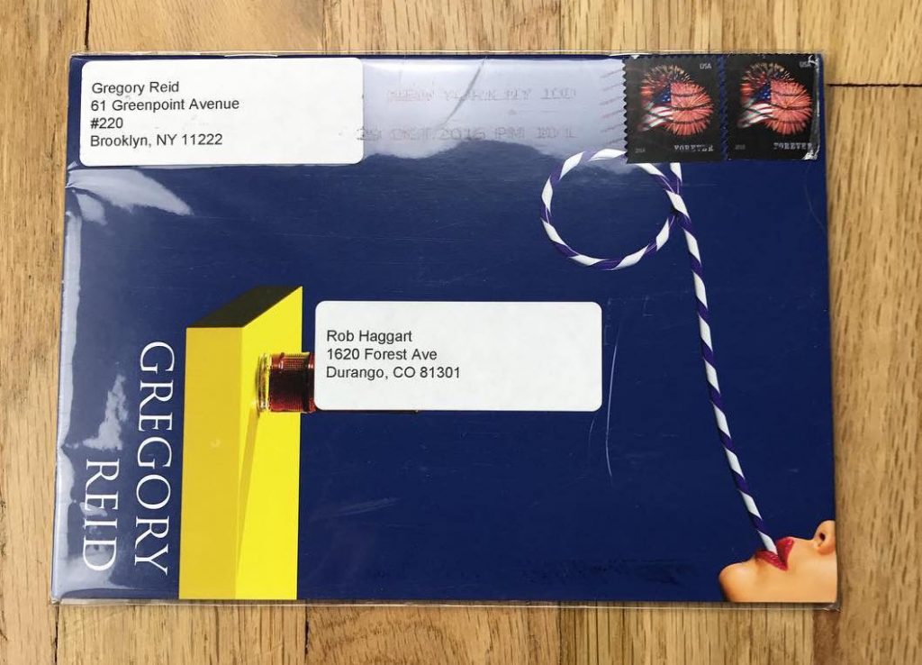
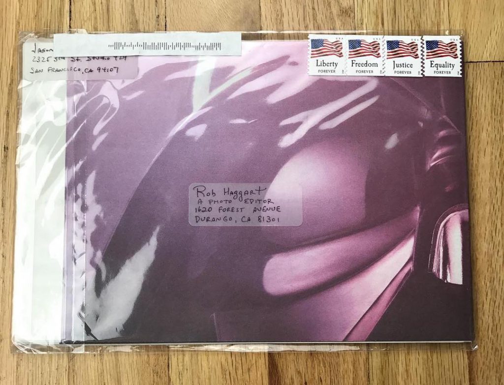
Photo at the top of this post by @leighwebber.
If you’re looking to create a newspaper using Canva, you’re in the right place. At Newspaper Club, we make it simple to design and print...
Are you tired of the same old, one-size-fits-all wedding stationery? Ready to get creative and make something totally unique for your big...
Want to create your own custom newspaper, but not sure where to begin with your design? That's where our free Canva templates come in!...