How new US import tariffs will affect your order
From 5 April 2025, a new 10% US import tariff will apply to goods shipped from the UK, including newspapers. This is outside of our...
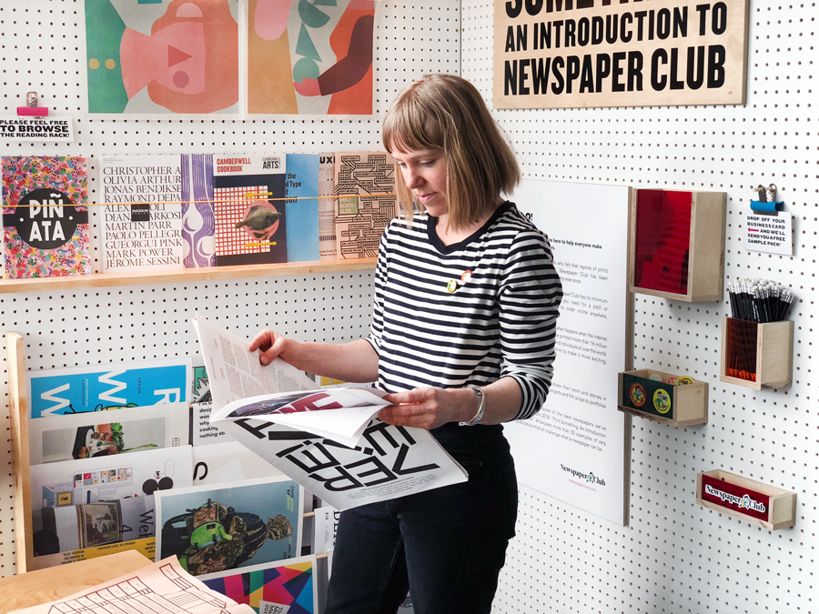
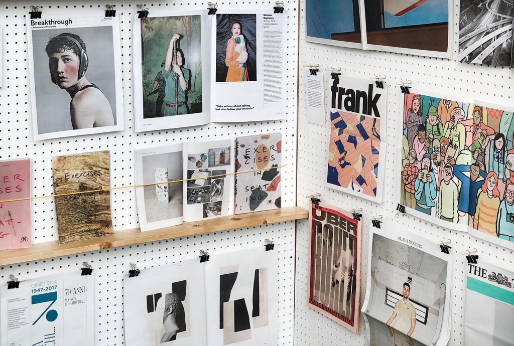
At the end of March, some of the Newspaper Club team headed to Dublin for OFFSET – a 3-day conference celebrating design and creativity. We were excited to showcase over 50 newspapers in the foyer of the Bord Gáis Energy Theatre for our exhibition Print Something: An Introduction to Newspaper Club. Here's a peek at the display:
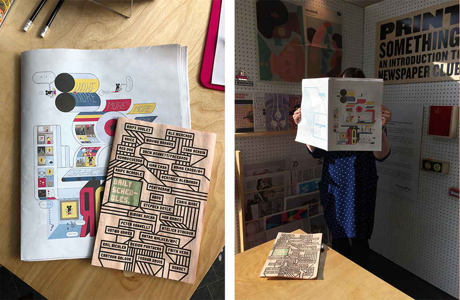
We also printed a mini programme and tabloid magazine for OFFSET. We loved seeing people reading the newspapers throughout the weekend – especially the magazine, which featured a beautiful cover illustration by Chris Ware, one of the most anticipated speakers at this year's event.
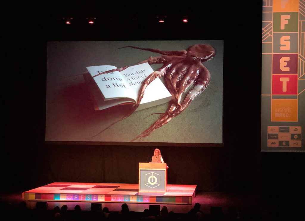
In between chatting to folks at our exhibition (and handing out loads of Newspaper Club stickers) we were able to catch some great talks, covering everything from video game landscapes to fashion photography. Below, a few of our highlights from this year's OFFSET speakers.
Frith Kerr is the founder of Studio Frith, a London-based design studio with a long list of prestigious clients. Kerr talked about "exquisite clashes" in her work – juxtapositions of utility and playfulness – and showed examples from projects for Michael Clark, Alexa Chung and the Guggenheim Museum. When considering packaging designs for Anya Hindmarch, Kerr used the "mantelpiece test": Would you keep the box on the mantelpiece after the object is gone? (If the box looks like this, we certainty would.)
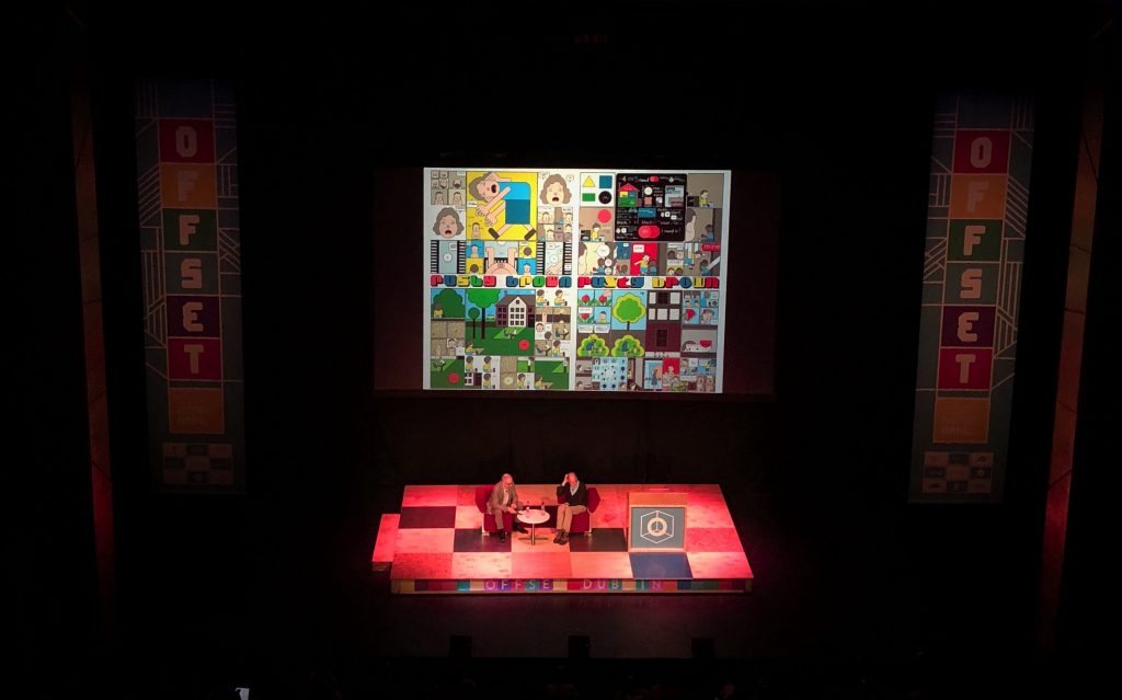
We heard cartoonist Chris Ware in conversation with John L. Walters, the editor of Eye Magazine. Ware said he makes his drawings as clear as possible "to allow for messiness in the story." On the non-linear quality of his comics (it can be unclear which panel to read first) Ware explained that he tries to represent how our minds really work, toggling between disconnected ideas.
Despite his success – Ware has created more than 20 covers for The New Yorker since 1999 and recently published his first monograph – he's prone to self doubt: "I'm never confident with anything until it's completely printed and like 6 months later."
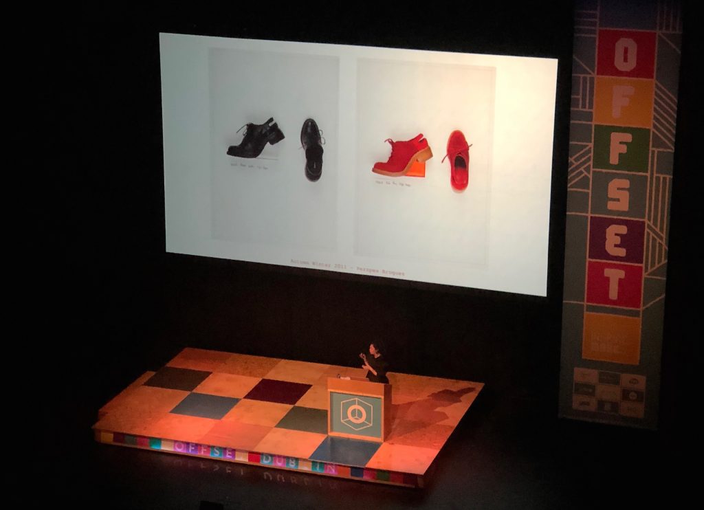
Fashion designer Simone Rocha talked about clothes that balance – and at the same time challenge – ideas of masculinity and femininity. One example: her famous floating perspex brogues (pictured above). She also explained the importance of free printed material to her in-store retail experience: "I want people to leave with something even if they don't want to spend £1,000 on a dress." Plus, making the free photobooks and postcards, she said, is an opportunity to work with collaborators from different industries.
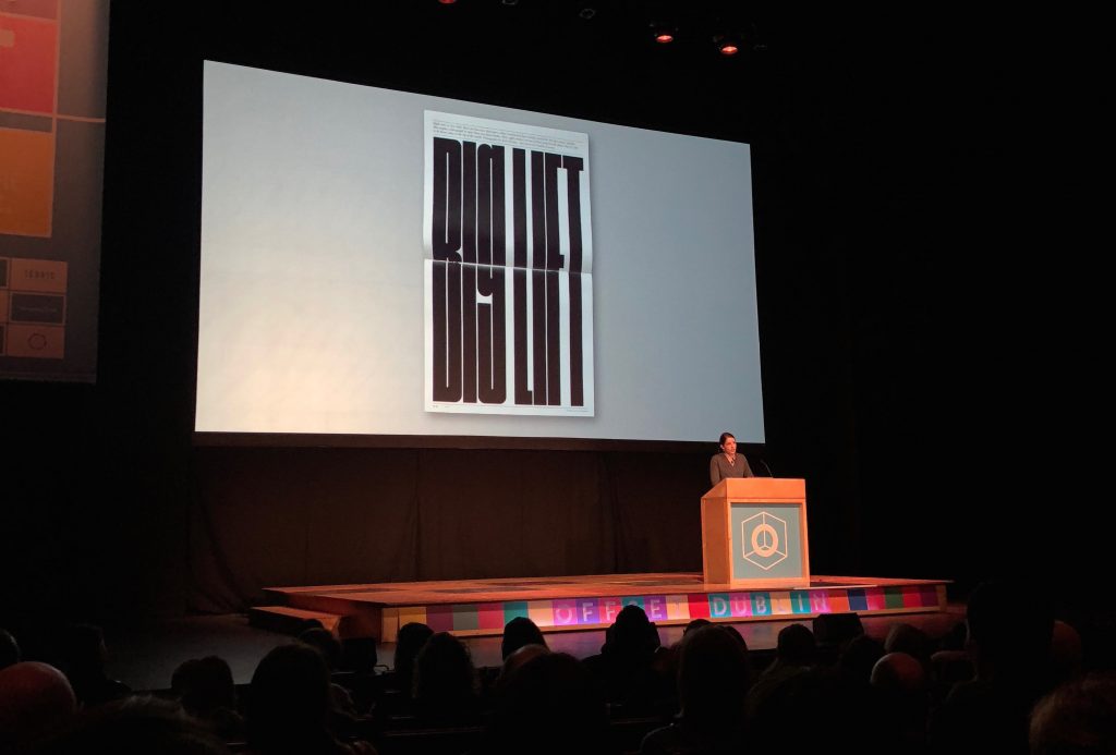
How do you produce a consistently gorgeous, challenging publication? According to Gail Bichler, the design director of The New York Times Magazine, you just have to "treat every magazine like its the last magazine on Earth."
In one of our favourite talks of the weekend, Bichler walked us through the process of designing a cover for the award-winning magazine. It goes something like this: the team mark up a manuscript of the cover story and distill the story into a single sentence that sets the tone; mock up a rough sketch; mock up a polished design; sometimes, throw it all out the window and try again – and do it all in an average turnaround of 5 days.
Bichler also explained why the magazine tries to avoid Photoshopped covers, preferring to actually build things like the square tire they made for the Design Issue in 2016: "Photographing real objects lends an authenticity that readers can feel," she said. "Also it's fun."
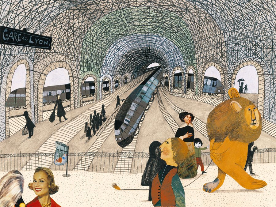
Award-winning children’s book author and illustrator Beatrice Alemagna spoke articulately and thoughtfully about writing for an audience with “no financial and social power”. Alemagna has no formal training as an artist, and was motivated by drawing competitions her dad would stage between her older sister and her (which she hated). After a trip to Paris, Alemagna promised herself that she would make a magnificent drawing of the Eiffel Tower one day. And she did – you can see it in her beautiful story A Lion in Paris (pictured above), one of our favourite contemporary children's books.
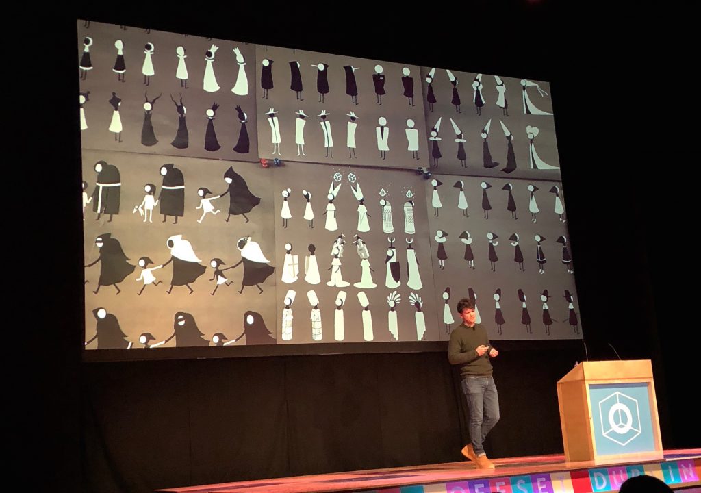
Daniel Gray of games studio ustwo talked about designing Monument Valley 2, a follow up to the gorgeous, BAFTA award-winning Monument Valley. Inspired by midcentury illustration, the team wanted to create a visual landscape "so beautiful you could pause it at any moment, print it out and hang it on your wall."
But beyond being lovely to look at, the game needed to communicate something meaningful about parenthood, and motherhood in particular. In the image above, Gray shared different approaches they tried for depicting the mother figure in the story. (The versions on the bottom left were rejected for feeling too "overbearing" – it was important for the character to appear equal and supportive.)
We didn't expect a design talk to make us teary, but then Gray showed a slideshow of the ustwo team at the game's launch party – all with their mums, who were flown out for the celebration from around the world.
From 5 April 2025, a new 10% US import tariff will apply to goods shipped from the UK, including newspapers. This is outside of our...
2025 is here, and your incredible projects are already rolling off the presses! But before we get stuck into another year of print, we’re...
Planning a wedding can be exhausting, but creating a newspaper for your big day should be nothing but fun and exciting. That's why we're...