How to create a newspaper with free Canva templates: a step-by-step guide
If you’re looking to create a newspaper using Canva, you’re in the right place. At Newspaper Club, we make it simple to design and print...
In a talk organised by Magnum Photos in 2016, photographer Martin Parr called the photobook the “supreme platform to disseminate work." (He should know – he wrote a 3-volume history on the subject.)
As algorithms make it increasingly difficult for photographers to get their work seen online, there's been a renewed interest in physical formats. Luckily, it's never been easier or more affordable to print your own photobook...or photo newspaper.
At Newspaper Club we’ve printed for photographers all over the world – professionals and hobbyists alike – and for esteemed organisations like Magnum Photos and the British Journal of Photography. Newspapers are a popular format for portfolios (we often spot them on A Photo Editor), group projects and exhibition catalogues – they’ve even been exhibited themselves.
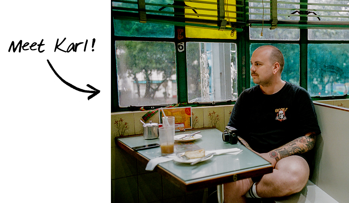
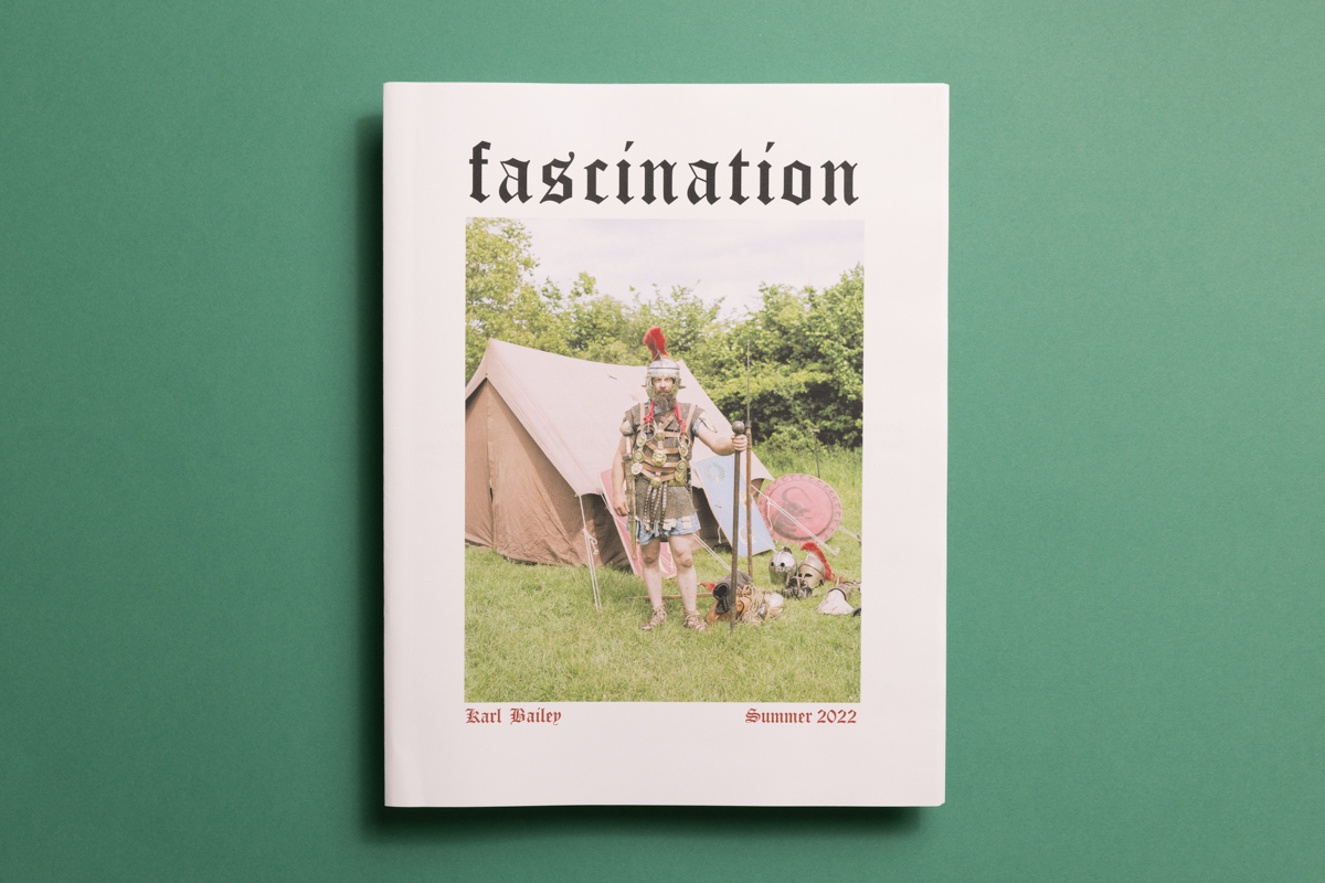
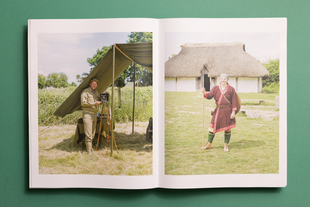
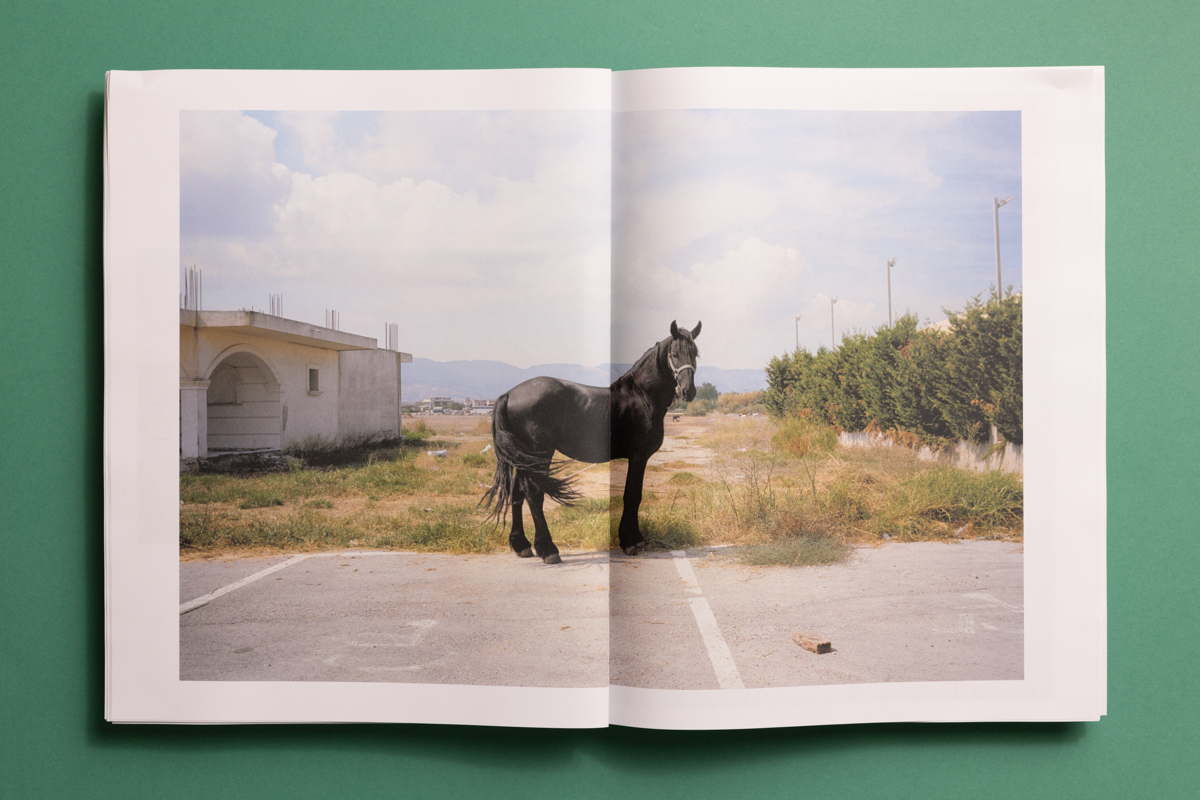
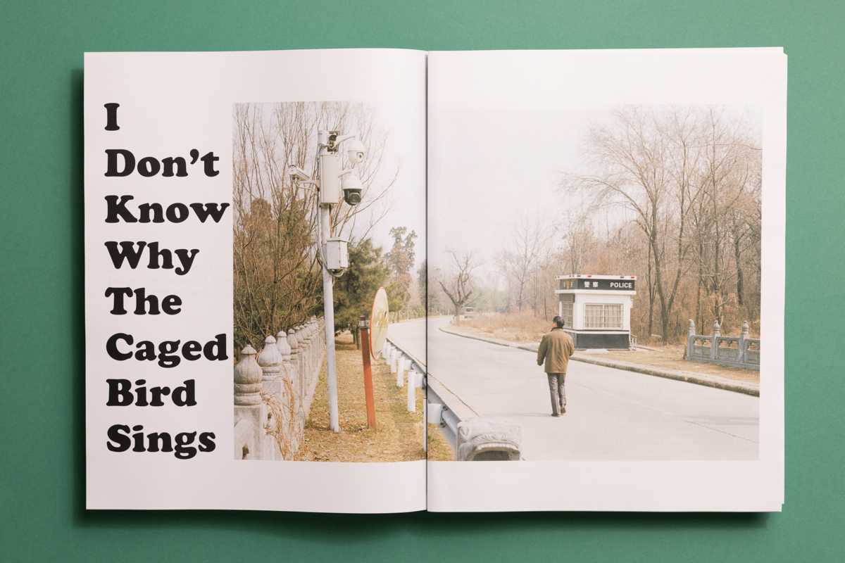
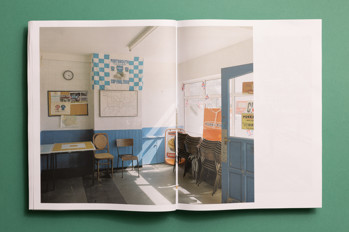
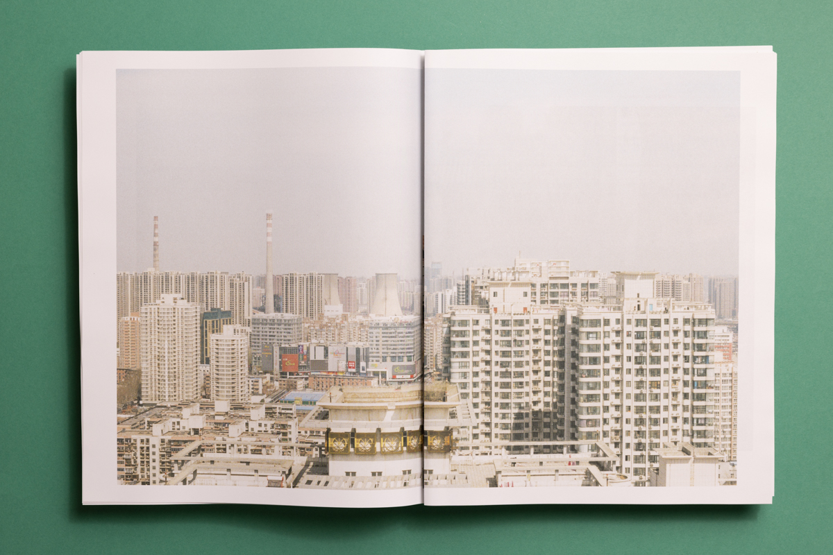
British photographer Karl Bailey recently used our digital tabloids to publish his project Fascination. It’s a collection of 4 visual stories, a mix of old and new work shot between China, Greece and his home country of England.
“I wanted to remove the viewing process from tiny phone screens," says Karl. "A newspaper is more of an experience."
Below, Karl explains why he made a newspaper (rather than a book) and walks us through his design process — from choosing the right paper to creating a visual narrative and balancing images with text.
• Why make a photography newspaper?
• Getting started: Ordering a sample pack and funding your project
• Creating your newspaper: Choosing a format and using Newspaper Club's templates
• Sharing (and selling) your newspaper. Plus advice on packaging and delivery.

Why make a photography newspaper?
I’ve always been interested in how different mediums influence how we consume photography. Over the years, I've experimented with various physical formats: zines, books and, most recently, a newspaper.
I chose to publish Fascination as a newspaper for a number of reasons, including:
• It’s big. Newspaper Club’s tabloid opens up to 578m x 380mm – way bigger than a phone screen and even most photobooks. It’s an ideal size for showing off more detailed imagery.
• It’s accessible. Traditional photography books are expensive to make and expensive to buy. A newspaper is a cost-effective way to share your work with a wide audience.
• It’s a unique tactile experience. Newspapers offer a physicality like no other. There’s a sense of history and authority that sets them apart from any other format.
Order a sample pack
I shopped around several different printing companies before choosing Newspaper Club. Their free sample pack was the key to my decision and is a useful reference throughout the design process. It will help you understand the scale you’re working with and give you an idea of how your design will look in print.
(Top tip: It’s helpful to compare the PDF samples to the printed samples to understand how colours and textures might change between screen and newspaper.)
Funding your newspaper
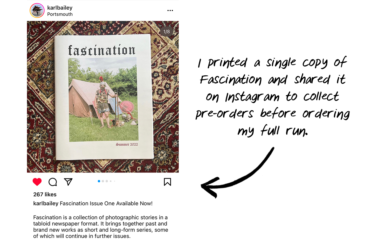
One big benefit of a newspaper is that you can print a single copy for a low upfront cost. I shared a test copy of Fascination on Instagram and used that to drive pre-orders. It gave me a good idea of demand and meant I had money from sales to help cover the costs of my full print run.
Another option is to crowdfund your print run. Look at successful campaigns – like Edward Thompson’s Kickstarter, which raised over £7,000 for his In-A-Gadda-Da-England photobook – for inspiration.
Choosing your format
Newspaper Club prints three different sizes: mini, tabloid and broadsheet. The tabloid was the perfect size for Fascination: compact enough to distribute easily but large enough that a double-page spread makes a big impact.
For paper, I went with 80gsm recycled — a brighter white paper with a more premium feel than standard newsprint. (You can learn more about Newspaper Club's different paper types on their website.)
A few things to consider when choosing a size and paper type for your project:
• Space - How many images do you want to share and how big do you want to show them?
• Experience - How do you want the reader to interact with your newspaper? Do you want them to flip through the pages in order, for example, or be able to pull them apart and rearrange them?
• Cost - What is your budget for printing and how much will you be able to sell each issue for? Can you reduce the cost per issue by ordering more copies?
Designing your layout
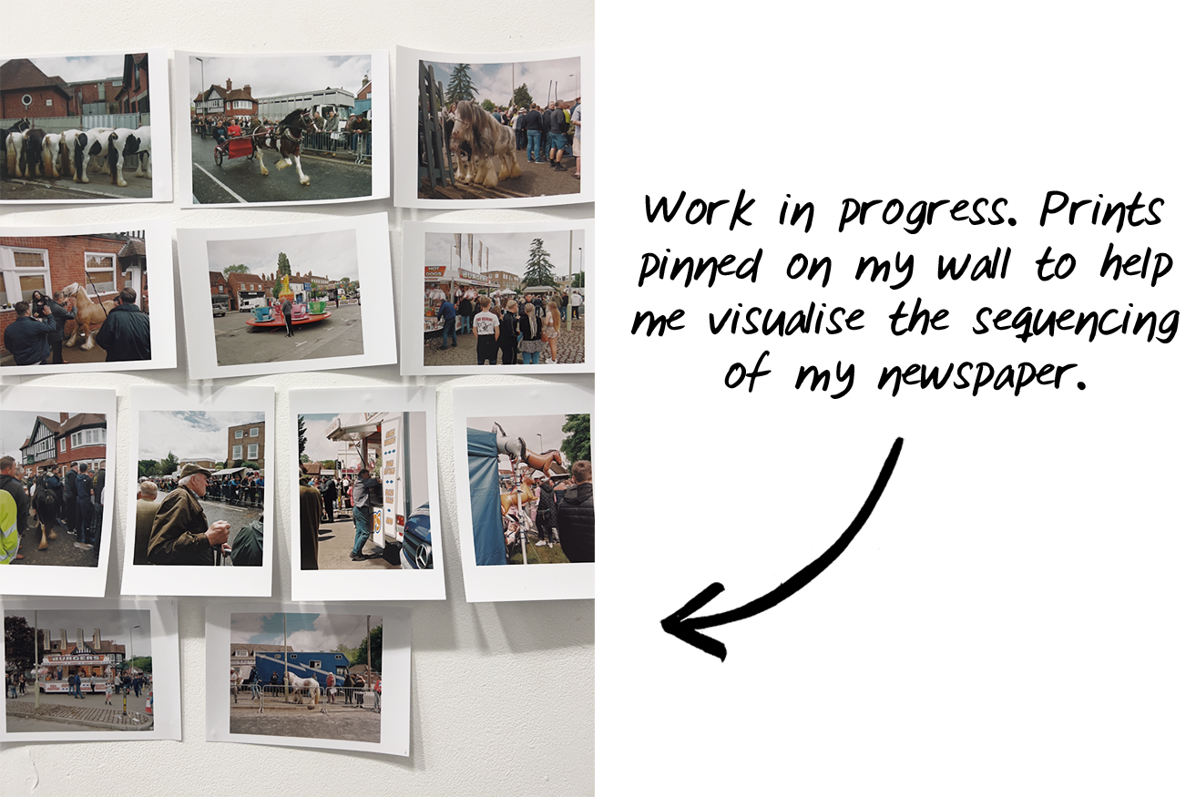
It’s important to really consider the sequencing of your images and how they create a visual narrative. My method is to place prints on the floor or pin them up on the wall (pictured below). Then I’ll sit with the images for days – or even weeks! – and move things around to see how different layouts could work.
When designing your layout, think about:
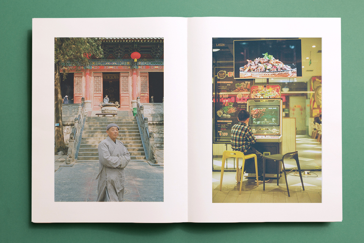
• Pairing colours, themes or compositions. Your images can play off of each other and create a narrative. For example, I juxtaposed images of old and new China (pictured below) by placing a portrait of an older man in front of a temple next to an image of a young boy in front of an arcade machine:
• Pacing your layout. Do your photos tell a story? Bear in mind that people tend to read from left to right (in English-speaking countries at least) so think about what your images are communicating as the eye travels across a spread.
You should also be mindful of the space between your images. There are 4 different photographic stories in Fascination, so I needed to make it clear where one finishes and another begins. This can be as simple as leaving a blank page before you start on a new spread with the new title.
• Balancing your text and images. Think about how your images and test work together. It’s important that they work together, rather than compete with each other. It should also be clear which image the text relates to.
I’m also constantly looking at photobooks and considering why images are presented in a certain way. For this project I looked to Alec Soth’s Dispatches newspaper and Martin Parr’s Fashion Magazine for inspiration – I even bought some daily newspapers to understand how the writing was laid out!
Fonts
I’m not a trained designer so when it came to fonts, I just followed my gut instinct. I did intentionally experiment and see what felt right, though – for the cover, I printed out 5 different fonts, pinned them on my wall and stared at them on and off for a month until deciding what I wanted to do. For the cover, I went with a free typeface called Old English Five in the end.
Using Newspaper Club’s templates
In the past, I’ve used Photoshop to design single pages and then collect them into a publication, which is hugely time-consuming.
This time, I downloaded Newspaper Club’s tabloid template for Adobe InDesign, which is set up with the correct dimensions and margins for printing. This made the process really easy, even though I hadn’t used Adobe InDesign in 10+ years. If you get stuck, there is an abundance of YouTube videos out there to help (or just email Newspaper Club at support@newspaperclub.com).
Printing a test copy
I ordered a test copy to make sure everything would print as I expected, which it did. I swapped some layouts around where you could see text from one side of the page on the other (called “show-through”) and it was great to get a sense of how the final product would look.
To print a test copy with Newspaper Club, just place an order for a single copy through their website. If you then print a larger run worth over £150/€200/$200, they’ll give you a voucher for the value of the test copy, effectively making the test copy free. Email support@newspaperclub.com once you've printed your test copy and they’ll send you the voucher code. (Just remember that with newspaper printing there will always be some variation between print runs.)
Sharing (and selling) your newspaper
Most of my promotion happens on Instagram. I share projects on my own account and get a knock-on effect when other people post about my work or share it in their Stories. When you’re promoting your publication, be sure to post regularly and keep your visibility high.
I’ve been using BigCartel’s free shop option to sell copies of Fascination, but I’ll be moving my shop over to my Squarespace site soon to keep everything in one place. I’ve also spoken to a few local bookshops who will stock copies and a few places further afield.
Some independent book and magazine retailers you could contact about stocking your publication include:
• magCulture (UK)
• doyoureadme?! (Germany)
• Photobook Cafe (UK)
• Akin (UK)
• Parallax Coop (UK)
• Photobook Junkies (UK)
• Casa Magazines (USA)
• Good Press (UK)
• Under the Cover (Portugal)
• Reading Room (Italy)
• Fatbottom (Spain)
• Art Metropole (Canada)
• Photoeye (USA)
…and that’s just scratching the surface!
Packaging and shipping
To make sure the newspapers arrive in good shape, I reinforce each copy in a clear sleeve and then use book mailers for extra protection. Newspaper Club has tips for packaging your newspaper (and where to buy different types of packaging) in their guide to packaging and shipping.
If you don’t want to handle distributing the newspapers yourself, Newspaper Club can do individual mailouts to your list of addresses. They have different packaging options ranging from polybags to book mailers – write to them at support@newspaperclub.com with the details of your order to find out more.
Further reading and inspiration
The Newsprint Photobook Archive run by Felix Koltermann is a great resource to learn more about (you guessed it) newsprint photobooks.
Photopedagogy: The Photobook. An overview of different types of photobooks with lots of great examples (including some newspapers!)
The Golden Age of the Photobook. Magnum Photos considers the evolution of the photobook through a conversation between Martin Parr and David Solo.
10x10 Photobooks. A non-profit organization with the mission to foster engagement with the global photobook community through an appreciation, dissemination and understanding of photobooks.
If you’re looking to create a newspaper using Canva, you’re in the right place. At Newspaper Club, we make it simple to design and print...
Weddings are full of stories – how you got engaged, why you chose your venue or the flowers in your bouquet and all the little decisions...
So much thought goes into every part of your wedding, from the venue to the playlist to the colour of the napkins. But there’s only so...