The ultimate guide to creating your own wedding newspaper (with LOTS of examples!)
Newspaper credit: Jami and Logan (Photo by Emma Knutson) Planning a wedding and thinking about making a newspaper? We're here to help!...
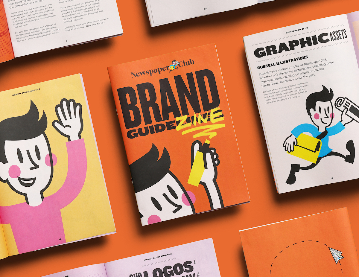
When Newspaper Club first started – way back in 2009! – our brand was a work in progress. Since then, we've introduced our mascot Russell, launched new sample packs and learnt a whole lot about what works (and what doesn't) when it comes to explaining just what Newspaper Club is all about.
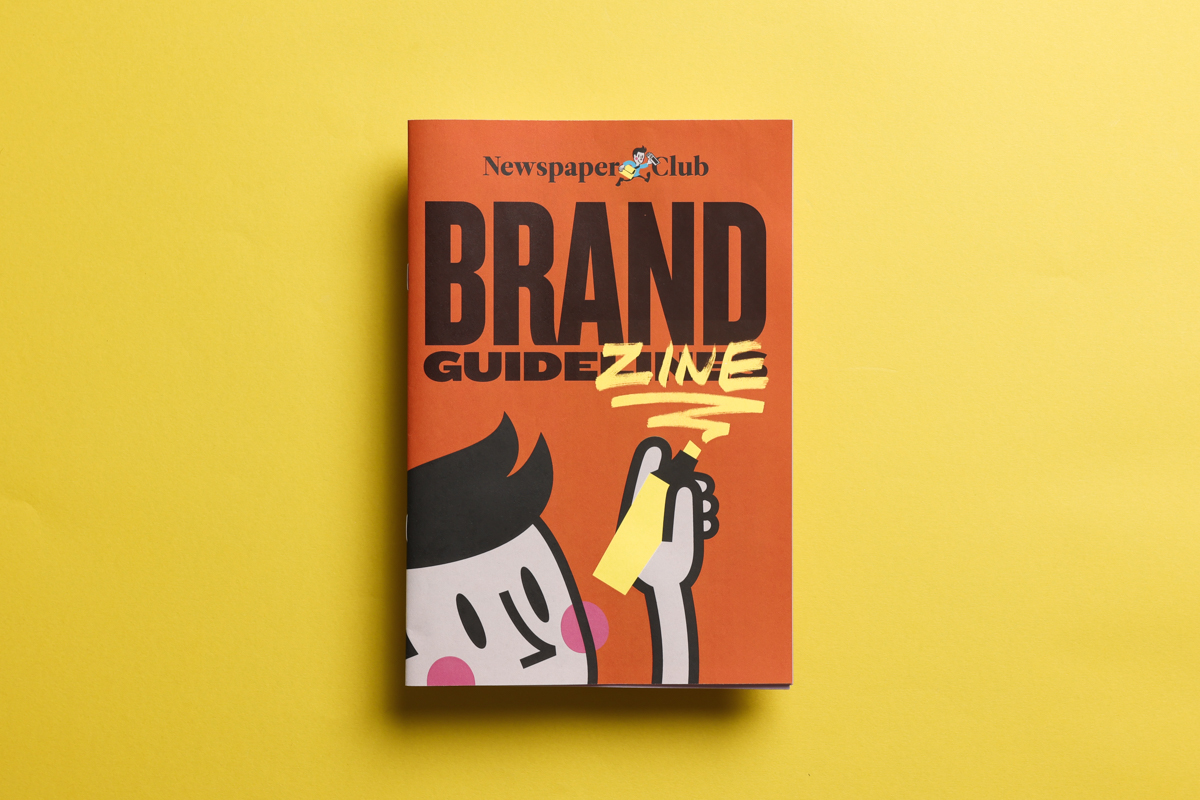
While our mission has stayed the same, how we communicate as a brand has evolved over time – from the terminology we use to the way we shoot our photography. We felt it would be a useful exercise to put all the decisions we've made about our brand into one place: a brand guide zine. And what better format for it than our very own mini newspapers!
We turned to our pal and longtime collaborator Euan Gallacher of design agency D8 to put together the zine. For years, Euan has helped develop the visual language of Newspaper Club and worked on countless graphic elements along the way (he even created Russell!)
Below, Euan explains how good guidelines help create a strong brand and walks through every step of designing the Newspaper Club brand zine. Take it away, Euan!

What are brand guidelines?
A good set of brand guidelines should contain the basic building blocks for the look and feel of your brand, and also set out how it communicates with your audience. The guidelines should give a sense of what your brand’s story is and what it wants to achieve. All of this hopefully leads to a confident brand that consistently hits the mark wherever and whenever people interact with it.
Most sets of brand guidelines take the form of a booklet, presentation or, increasingly, an online resource. You can find lots of great examples of brand guidelines online – like this collection put together by designer Lily Ludford, which features guidelines from Discord and the Guardian.
Regardless of the format your guidelines take, they’re important to have for many reasons:
• They allow you to create an overview of your brand and make sure it feels consistent all the way through, something that can be hard to see when you’re focussed as you work on one small part of it.
• They’re a great way to introduce new team members to your brand – think of them like a ‘cheat sheet’ for new members to learn the lingo of your brand and feel like they know it inside out from day one.
• They help you maintain a consistent quality across all of your communications. Rather than just comparing what you’re working on now to the last job, a set of guidelines sets the bar and outlines all the rules and advice required when creating new content for your brand
• They help you work with others. A set of guidelines that you can share with external people and organisations you're working with can give you confidence that they’ll represent your brand as you intended.
Why put your guidelines in print?
While you can have your guidelines as a PDF or online resource, nothing makes it feel more real than holding a set of printed guidelines. Having a physical resource to refer back to can prove invaluable and it helps add a sense of commitment – you need to make sure everything is just right before you send it to print.
That’s exactly what we did when we created Newspaper Club’s brand zine!
Designing Newspaper Club's brand zine
For the brand zine, we took all the elements you’d expect to see in a traditional set of guidelines and reimagined them as a printed zine. One advantage of this approach is that the zine itself becomes a reference point for best practice brand guidelines. All the guidance on which fonts and colours to use, the right tone of voice for writing copy and how to visually format everything is applied practically.
We chose Newspaper Club’s mini size as the smaller pages allow us to split the sections up into their own spreads with easily digestible information. It also helps that it’s stapled, so the pages won’t fall out of order!
Depending on your creative direction, a bigger tabloid or broadsheet size could also be a good choice – for example, if you have beautiful imagery you want to show on a larger scale.
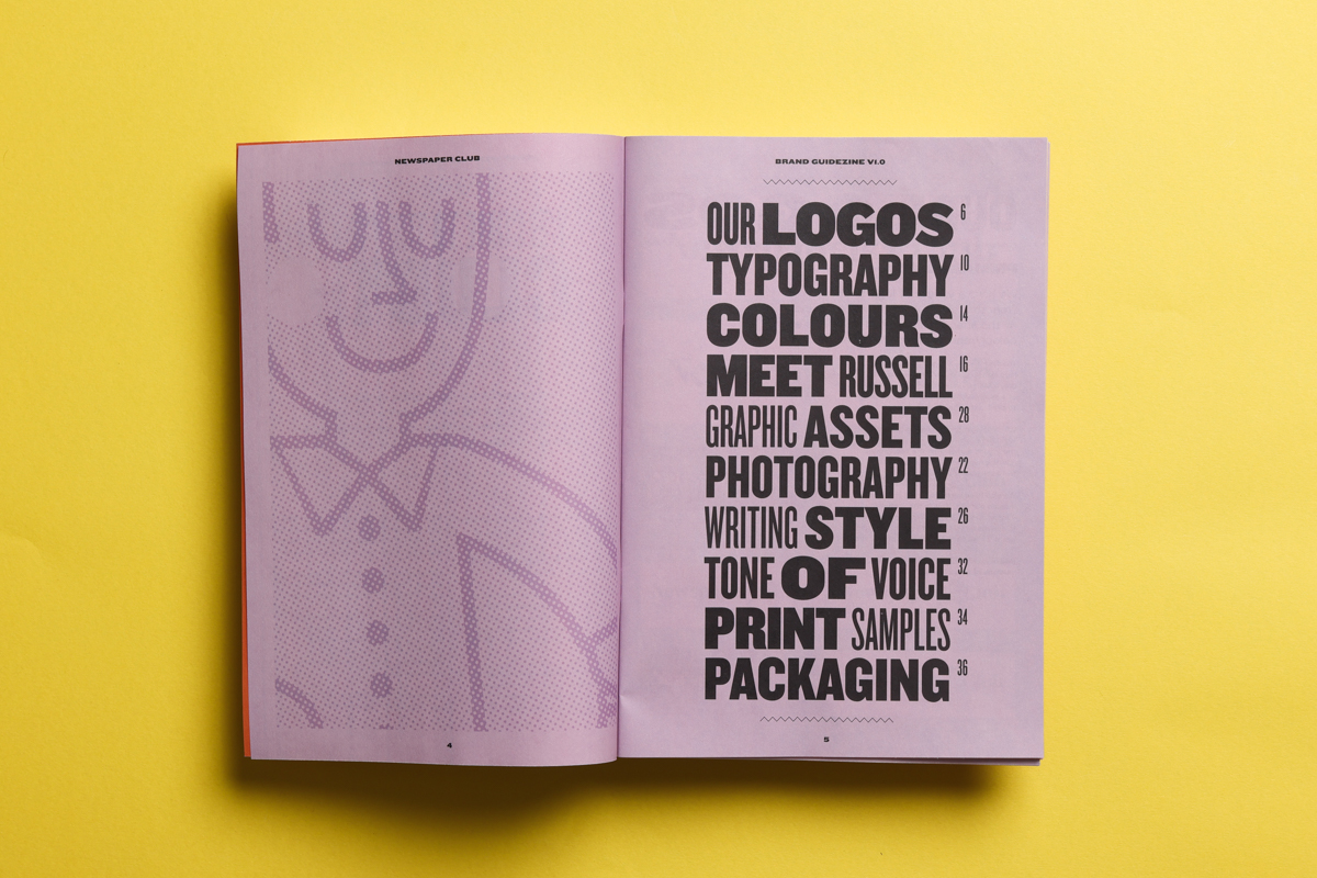
The Newspaper Club brand zine is made up of the following sections:
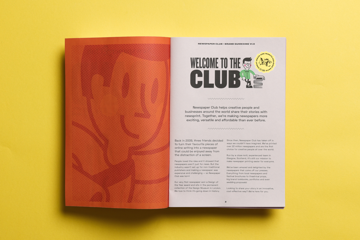
• Brand History. This is where we share the story of what the brand is all about. From how it began to what its goals are. Everything here is core to the brand’s very reason for existing and helps inform all the creative decisions that follow.
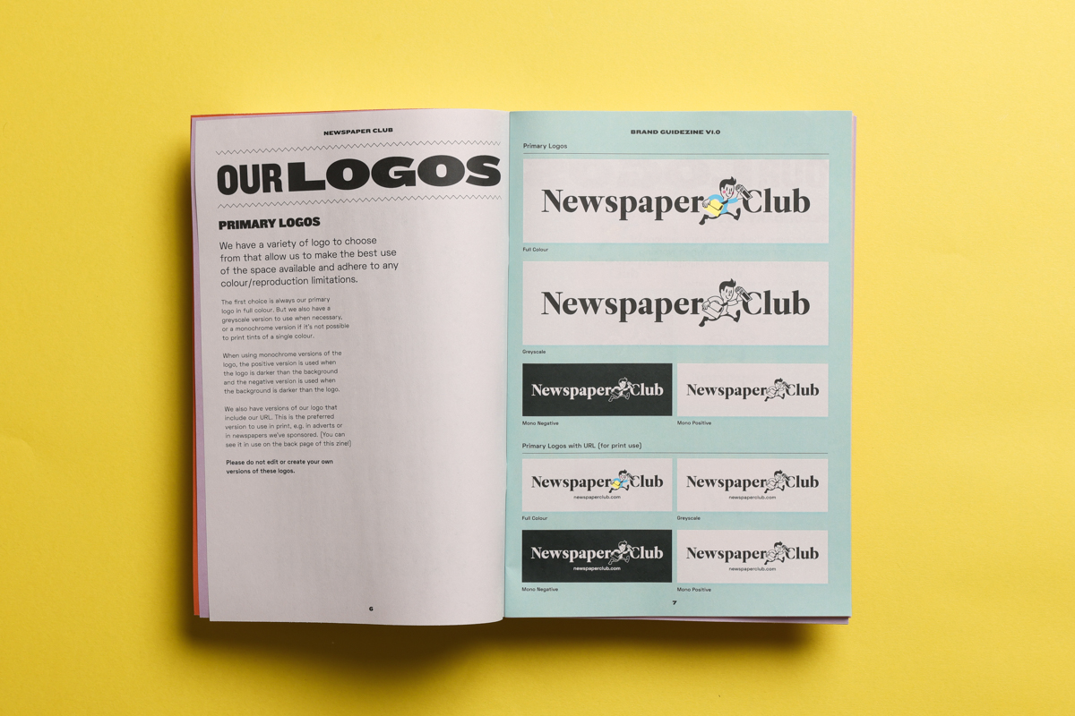
• Logos. It’s not unusual for a brand to have more than just one logo. In Newspaper Club’s case, there are multiple versions to choose from. We have a primary set of logos that are always our first choice, but we also have a secondary set for when certain design restrictions make the primary options unsuitable. And across all these versions we have full-colour and single-colour options, so we’re ready for any design or print challenge.
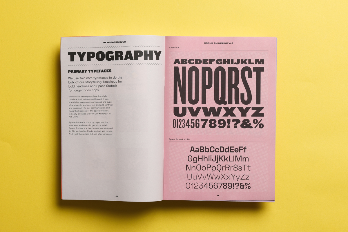
• Typography. It’s important to be consistent in how you present your brand and one way to ensure this is to stick to the same typefaces across your communications. We have a bold headline typeface that we use for, well, headlines, and a supporting typeface that’s better suited for longer paragraphs of body copy.
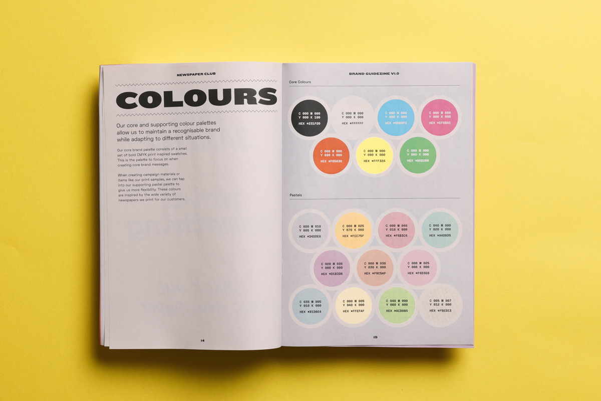
• Colour. Another way to ensure your brand feels consistent and recognisable is to have a colour palette you dip into for all your communications. The important thing here is to strike the right balance between having enough options to allow for flexibility, but not so many that it starts to feel messy.
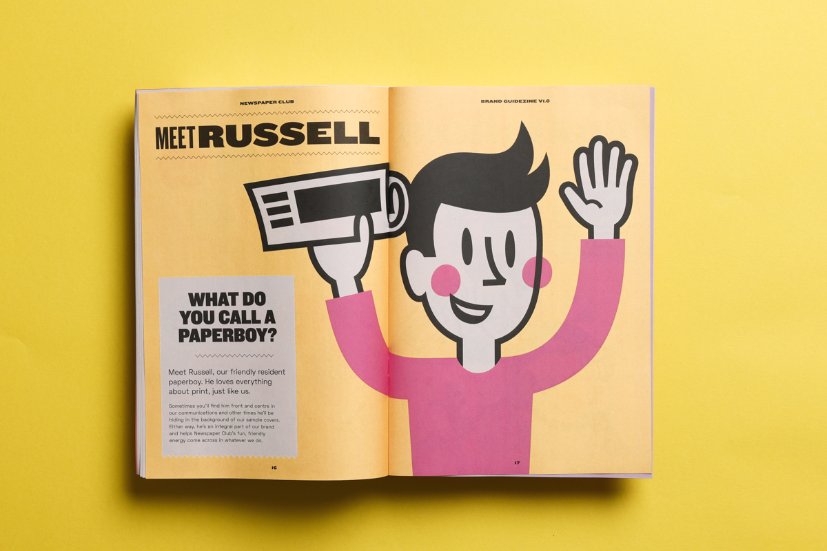
• Mascot. Not every set of brand guidelines will have a mascot section, but in my opinion, all the best ones do. Russell is arguably even more important than the Newspaper Club logo in terms of how the brand is presented to its audience. He’s the friendly face of Newspaper Club (and was recently included in a book about contemporary mascots!)
• Graphic Assets. As well as our logos and mascot illustrations, we have a suite of other graphic assets that give all of our communications their distinct look and feel. Everything from ‘stickers’ to graphic patterns and hand-made markings.
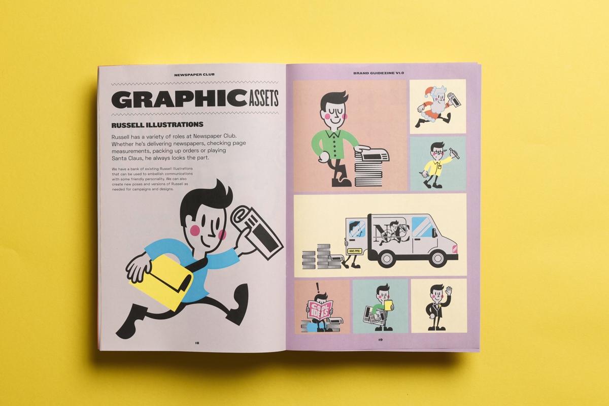
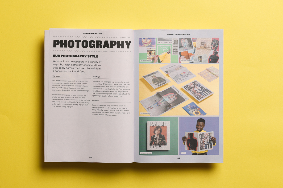
• Photography. To ensure that our images look consistent whenever we shoot our newspapers, we set up a basic set of rules for how we light and arrange them in the shot. From the angles we use to the paper colours we use in the background.
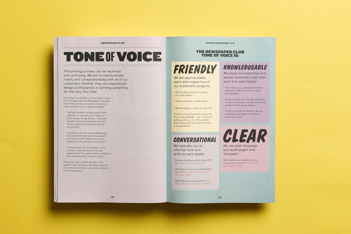
• Writing Style. The printing process can be technical and confusing, so it’s important for us to be clear and consistent in the language that we use. Our writing guidelines keep everyone on the same page about our terminology and voice, whether we’re responding to an email or writing a blog post.
• Packaging. We set out our approach to how we package up our newspapers, ensuring a dependable experience for our customers when they receive an order.
The saying goes that if something’s worth doing, then it’s worth doing well. A set of brand guidelines helps you do exactly that. When you create them it forces you to consider every creative decision you make as it will be the standard going forward. And when you refer back to them in the future, they give you the confidence to create great content that feels intrinsically like your brand.

Make your own newspaper with Newspaper Club. Print runs start at 1 copy!
Newspaper credit: Jami and Logan (Photo by Emma Knutson) Planning a wedding and thinking about making a newspaper? We're here to help!...
As Newspaper Club’s digital product manager, Billy Whitehouse spends his days helping others bring their print ideas to life. But...
If you’re looking to create a newspaper using Canva, you’re in the right place. At Newspaper Club, we make it simple to design and print...