This print newspaper is reviving the lost art of personal ads
Nilly von Baibus gets three or four handwritten love letters every week. But she doesn’t read any of them. They’re responses to ads...
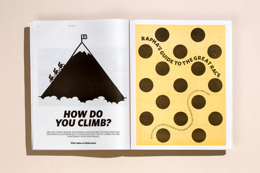
In 1903, a French sports paper called L’ Auto was in trouble. They’d lost a costly lawsuit against a competitor and readership was dwindling. Over lunch at a cafe in Paris, the writer Géo Lefèvre proposed a publicity stunt: L’Auto would organise the longest, most grueling cycling race in the world.
It would take place in stages on a route circling the country – a Tour de France. L’Auto no longer exists, but cyclists still fight for the jersey inspired by its distinctive yellow pages.
For this year’s Tour – the 104th edition – we printed a tabloid for cycling brand Rapha that pays homage to newsprint’s role in the sport's history. We talked to editor Harry Dowdney and designer Eve Izaak about the project and how Rapha brings cycling traditions into the 21st century.
Founded in 2004, Rapha has woven the history of cycling into its brand – literally. Attached to nearly every product, from bib shorts to saddle packs, is a label with a snippet of cycling lore.
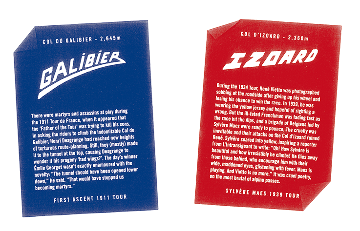
Much of that lore involves climbing – “one of the most important, and difficult, parts of cycling,” according to Dowdney. "It’s really hard, but it’s also the most rewarding part of the sport.”
In July, Rapha teamed up with fitness app Strava for Rapha Rising, which challenged amateur cyclists to conquer a 4,600m climb – the equivalent of one of the toughest legs of the Tour. Nearly 150,000 people, from Iceland to Kenya, took part and climbed a combined 905,625,891 meters over the month.
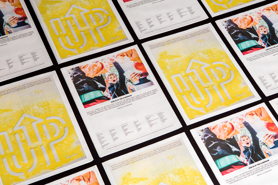
To tie in with campaign, Rapha published a guide to the Tour with a focus on the age-old art of riding uphill. On the cover of the newspaper is the word “UP” in stenciled lettering – a reference to the historic practice of painting messages of encouragement for cyclists on the roads. Tapping into the tradition, Rapha encouraged readers to add some chalk to the tarmac of their local rides.
"We wanted to tell interesting stories, but ones that gave the readers a place to go, or something to do afterwards,” explains Dowdney.
The newspapers were distributed at Rapha Clubhouses around the world, where the Tour is screened live every year. Dowdney also brought a handful of copies along with him to France as he followed the Tour. He hoped to hand them out for cyclists to stuff down their jerseys as they crested a climb – another time-honoured tradition that protects riders against a chilly descent.
As outfitters to some of the most elite teams in cycling, like Canyon//Sram and Wiggins, Rapha has mastered the design of performance apparel. But putting together a newspaper – that's another story.
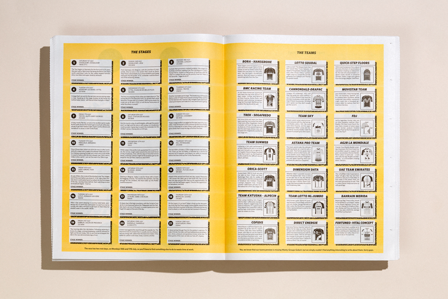
“We’re not newspaper makers – we’re copywriters and graphic designers,” Dowdney says about the Rapha creative team, which is all based in-house. He emphasises that the environment at Rapha is "really, really collaborative” and they embrace learning curves together.
Designer Eve Izaak, who also worked on the newspaper, echoes the sentiment. “The strongest projects are often accomplished when we have the time to overlap our skill sets and exchange ideas early on in the process,” she says. “There's a symbiotic relationship between the designers and writers at Rapha.”
But that doesn’t mean they’re always on the same page. Dowdney says that when he first pitched a content-heavy layout, the design team told him: "There’s too much. Let’s let it breathe and create something that people can engage with."
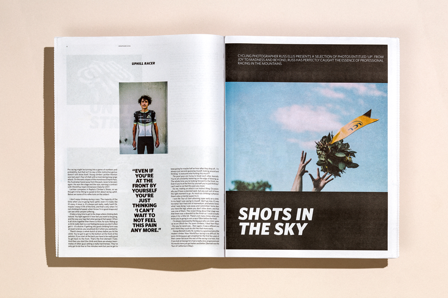
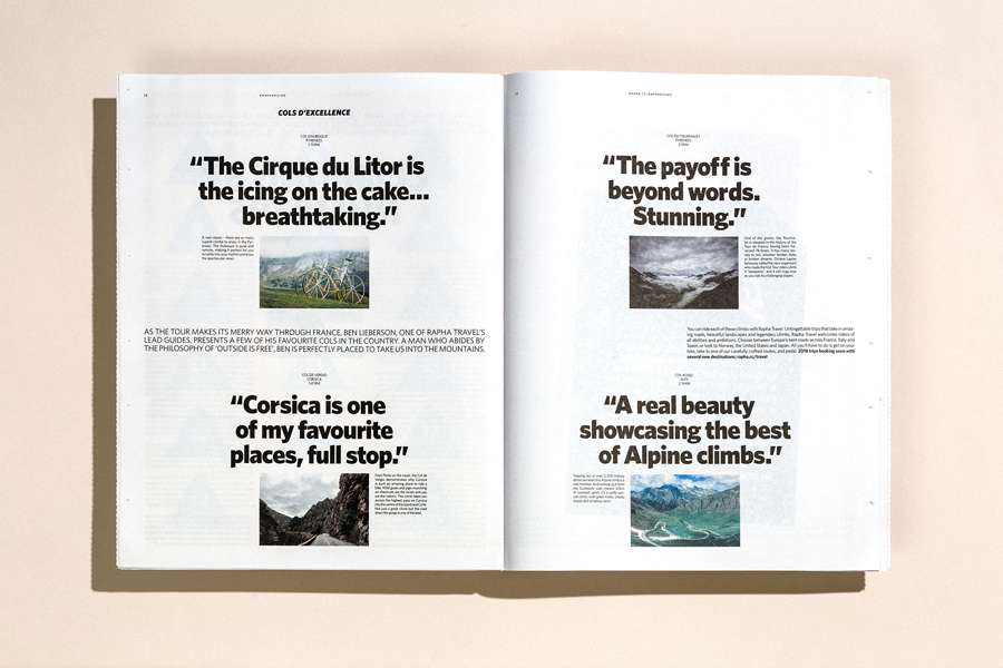
That meant being comfortable with more white space on the page. "I’m really happy that we took some of the content out,” Dowdney admits. “It’s more interesting and means that every double page spread has more of an impact.” It also allowed Rapha to better showcase photography they commissioned from Russ Ellis. His bold, energetic images “really bring to life what makes watching climbs in the mountains such a special thing," says Dowdney.
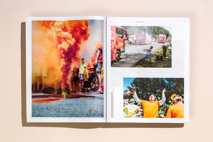
For Izaak, the newspaper was an opportunity to experiment with a more playful style. "Usually the print work we produce at Rapha is quite high-spec and intricate,” she says, referring to projects like the impeccably designed Mondial magazine, which the brand publishes twice a year. "This newspaper is a more light-hearted format and the content has a tongue-in-cheek tone. It's loose, fun, and can be picked up and read at any interval.”
Dowdney agrees. “More than anything it was fun to do something like this. We’re so lucky to work in a sport as exciting as cycling and to create newspapers that celebrate it."
Nilly von Baibus gets three or four handwritten love letters every week. But she doesn’t read any of them. They’re responses to ads...
The first issue of Deluxe was, in Rupert Morrison’s words, “lumpy.” He’s the owner of Drift, an award-winning record shop in Totnes – not...
Spring is in the air and a new season of print is upon us! In this roundup, we've got a creative pick-me-up from Papier, a peek behind...