How making a newspaper helped a small record shop find its voice
The first issue of Deluxe was, in Rupert Morrison’s words, “lumpy.” He’s the owner of Drift, an award-winning record shop in Totnes – not...
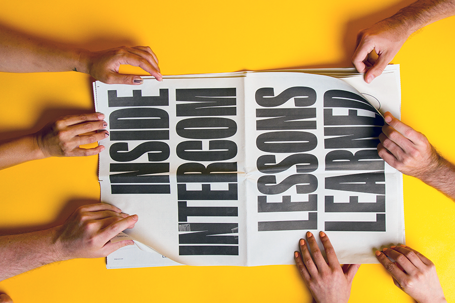
More than 500,000,000 conversations happen every month with help from Intercom, the customer messaging platform. Beyond the company's cutting-edge software – used by the likes of Spotify, Microsoft and Shopify – there's some seriously delightful design supporting all their content thanks to Intercom Brand Studio.
The team of 16 designers, writers and producers is tasked with "keeping things weird" on projects across the company – from marketing to products to events, like the worldwide Inside Intercom tour.
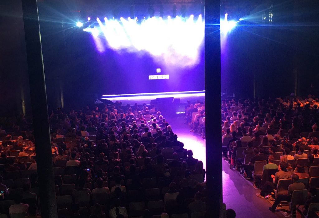
Below, we talk to Ryan Hubbard, a senior designer at Intercom Brand Studio, about why they replaced slides with newspapers at this year's tour and how Intercom communicates big ideas through friendly design.
We’re a relatively young part of the company, only really getting our footing in 2015. In that time we’ve grown from 3 people to a group 16 designers, writers and producers that work on projects across the company: marketing, content, events, product – you name it.
First and foremost is that it looks like was made by a human being. It needs to feel personal.
We are technically a technology company, but at our core we’re a company that cares about people and finding ways to make modern communication between businesses and their customers more about those people. Everything we do needs to communicate that personal and human nature.
The defining features that come to my mind are variety, exploration, and feeling personal or human.
Outside of our very core marketing material (i.e. anything on our marketing site), things usually look a little different from instance to instance. The exact style that we work in is secondary to the ideas that we’re communicating, so long as it always feels like it’s coming from the same place or building on a common foundation.
We try not to get too comfortable doing one thing, and are always looking for new and better ways to communicate the things that Intercom values.
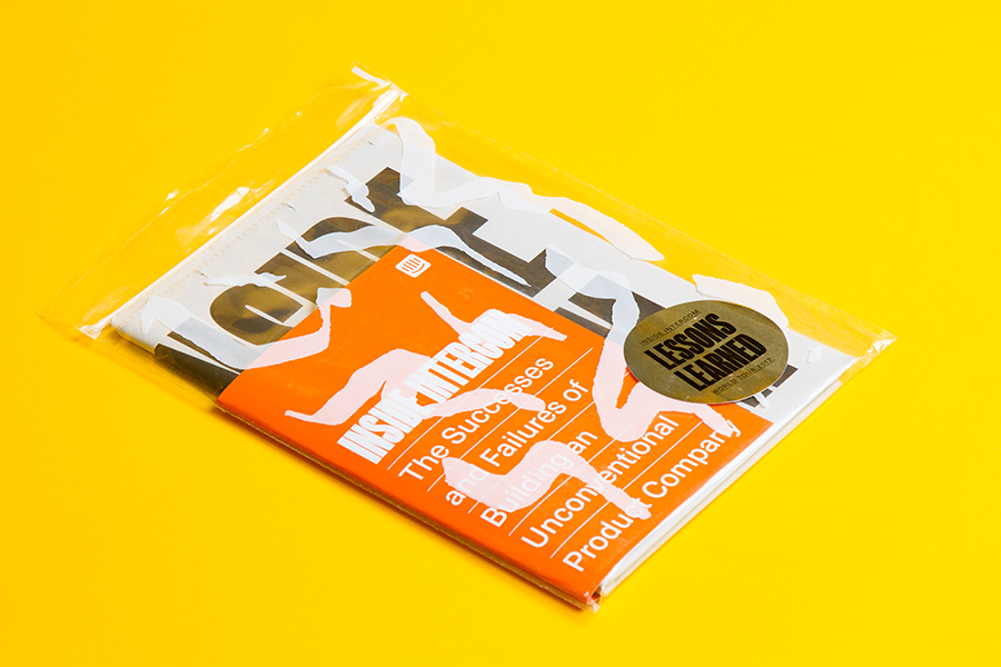
The tour was primarily our chance to be very honest and open about our successes and failures from the past couple of years and discuss the lessons that we learned the hard way in that span of time. Putting those lessons down on paper as a keepsake for our attendees is something we knew we wanted to do from the start.
We thought that using newsprint as our medium made sense because it provided a really big canvas that could provide a lot of visual impact all while not feeling too precious. The tour was about being imperfect, and a one-color newsprint fits that vibe really nicely.
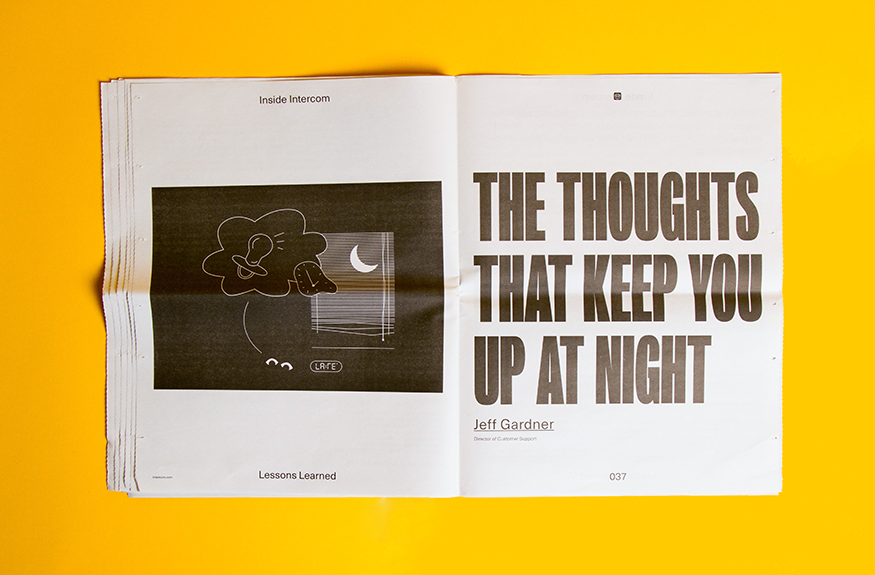
There were a couple of reasons, the first being that we thought having some kind of keepsake for our attendees would be a nice touch from an overall experience standpoint.
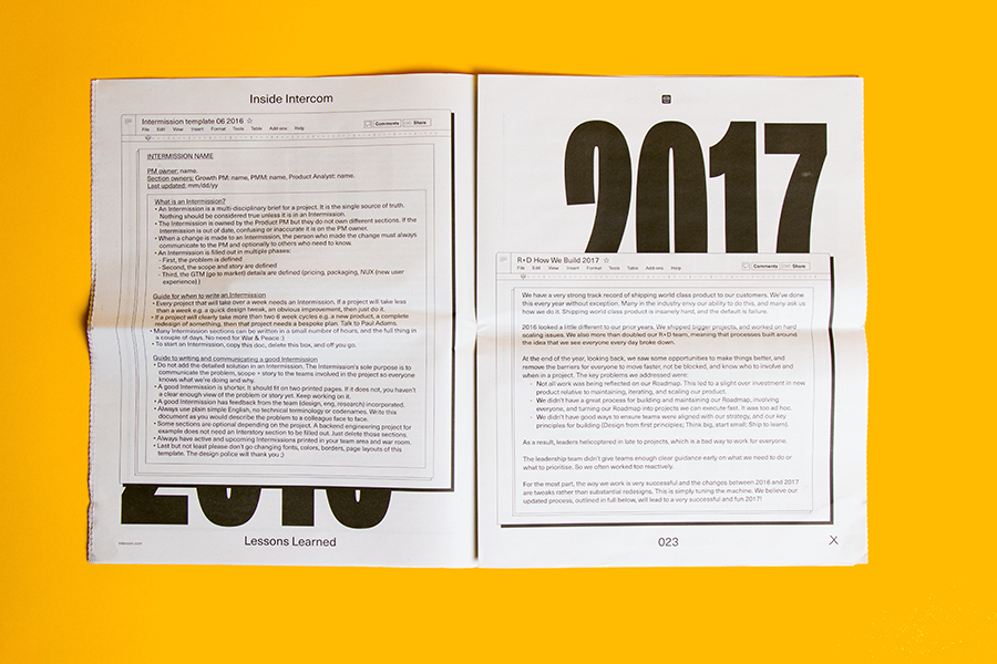
The second reason was because we had decided to not produce traditional slides with lot of text for our each of our talks on the tour, instead leaning more on conceptual illustration, data visualization and video to visually support what the speakers were saying.
The print piece was our way of providing notes and information that typically would be crammed on to a slide to our attendees for them to take home. Hopefully it allowed them to be more fully immersed in the talks and to be able to sit back and enjoy the evening.
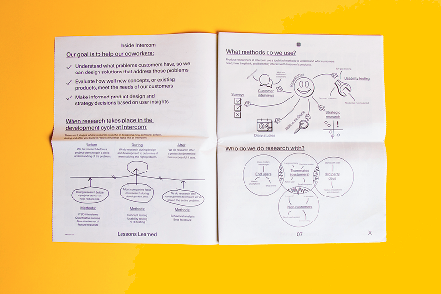
The newspaper was one of the last things we did on this project, actually. We did a lot of work up front to establish a general look and feel for the tour, so by the time we got to creating the newspaper, most of the decisions on the visual direction had been made.
Most of the work came in collaborating with our contributors and a couple of design partners to establish the best ways of telling the stories that we wanted to tell. We worked with contributors from all across the company – from product research to marketing to product engineering to customer support and on down the line. It was for sure a pretty collaborative project.
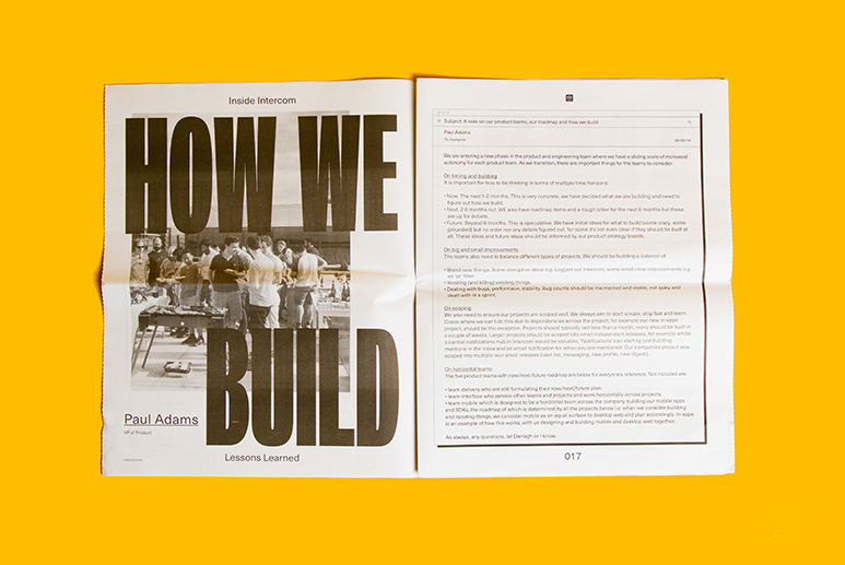
I think the #1 lesson I’ve learned in my time at Intercom is that nothing is ever finished. There are always ways to improve and learn from the work that you’re doing. When you get too comfortable or stuck in your ways, you’re probably not learning or getting better.
Some place where I can really spread out and be comfortable, I think. Maybe a quiet Sunday morning at home on the couch, or the rare moment when you’re able to get a whole table to yourself at a coffee shop at a random time in the middle of the afternoon. A cup of black coffee is present in either of those situations, obviously.
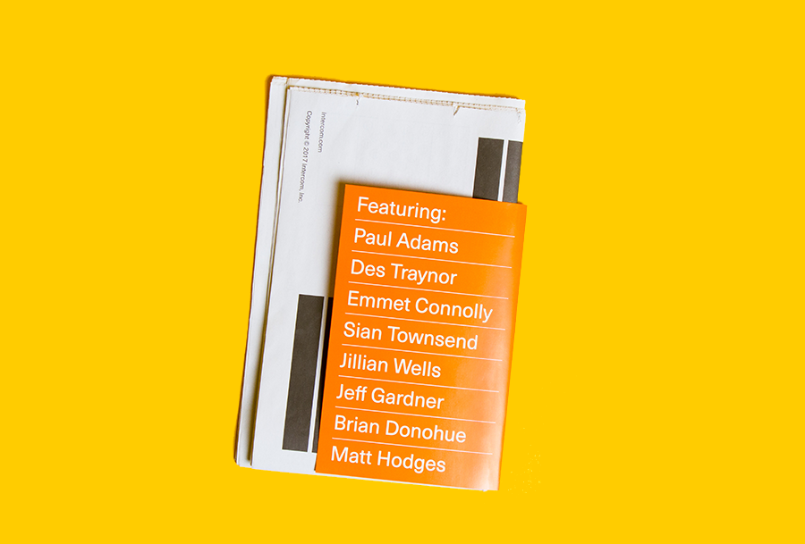
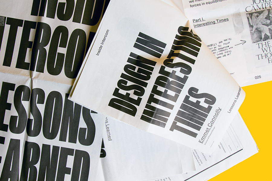
All photos of Lessons Learned newspaper courtesy of Intercom Brand Studio.
Newspapers are a fast, flexible way to share your story. Print runs start at 1 copy.
The first issue of Deluxe was, in Rupert Morrison’s words, “lumpy.” He’s the owner of Drift, an award-winning record shop in Totnes – not...
Spring is in the air and a new season of print is upon us! In this roundup, we've got a creative pick-me-up from Papier, a peek behind...
As Newspaper Club’s digital product manager, Billy Whitehouse spends his days helping others bring their print ideas to life. But...