This print newspaper is reviving the lost art of personal ads
Nilly von Baibus gets three or four handwritten love letters every week. But she doesn’t read any of them. They’re responses to ads...
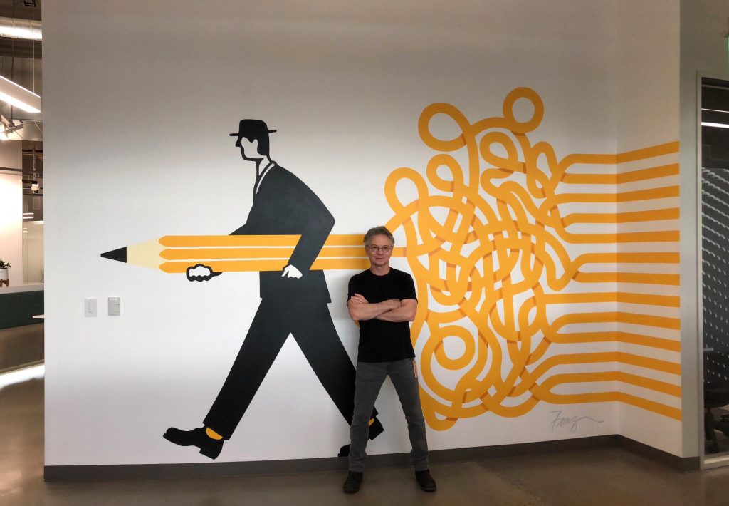
Craig Frazier's resume reads like an illustrator's bucket list. He's painted a mural for Google, contributed to The New York Times, Wall Street Journal and Time, designed a postage stamp (actually, he's designed 7) and in 2003 he published a 176-page monograph, The Illustrated Voice. His work has been described as "impressive and memorable" by esteemed designer Ivan Chermayeff. Somehow, he also found time to illustrate 10 children's books. Is there anything he hasn't done?
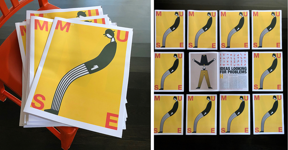
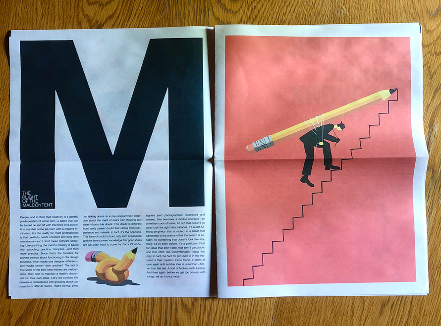
Well, until recently, Craig had never created his own newspaper. Making his newspaper of illustrated essays titled MUSE, printed as a digital tabloid, is an experience that he says "reminds me of why I got into this business." Below, Craig tells us how he translates complex ideas into clear illustrations and gives us a peek inside the sketchbook he carries everywhere.
I loved to draw as a child and managed to stay interested long enough to pursue a college degree in graphic design, with a strong interest in illustration. I had a 20-year long career as a designer before taking up illustration as a second career (another 20 years). In hindsight, I wouldn’t have done it any differently with the exception of an added stint in NYC.
My portfolio is always comprised of work that represents what clients will hire me for. I feel fortunate that so much of my early work is still on my portfolio and that my very latest work still holds up to my standards. My works is both corporate and editorial. I’ve got recent work for Merrill Lynch and San Francisco Fillmore Jazz and The New York Times and Google and a poster for the Sonoma Wildfires.
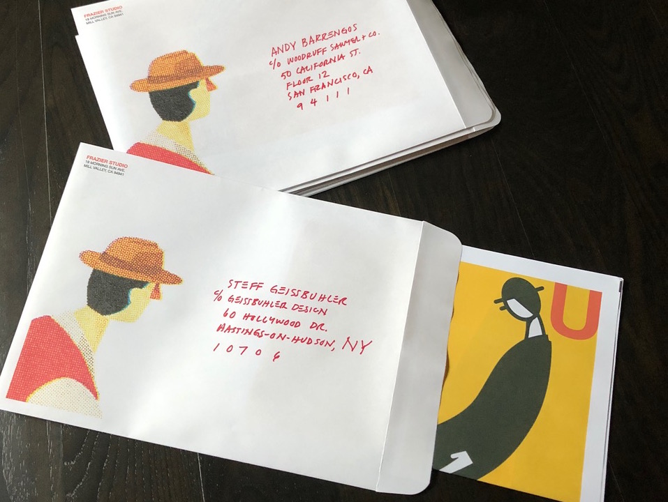
I was trained as a print designer starting in1978. We made all our work to be presented as ink on paper. The computer is remarkable but nothing like the experience of paper in hand. The newspaper engages all of our senses, including smell. The scale, the color, the pace are within your hand’s control. The work that I put into an illustration is often lost on the screen. On paper, it’s all there and it won’t go away until the recycling bin.
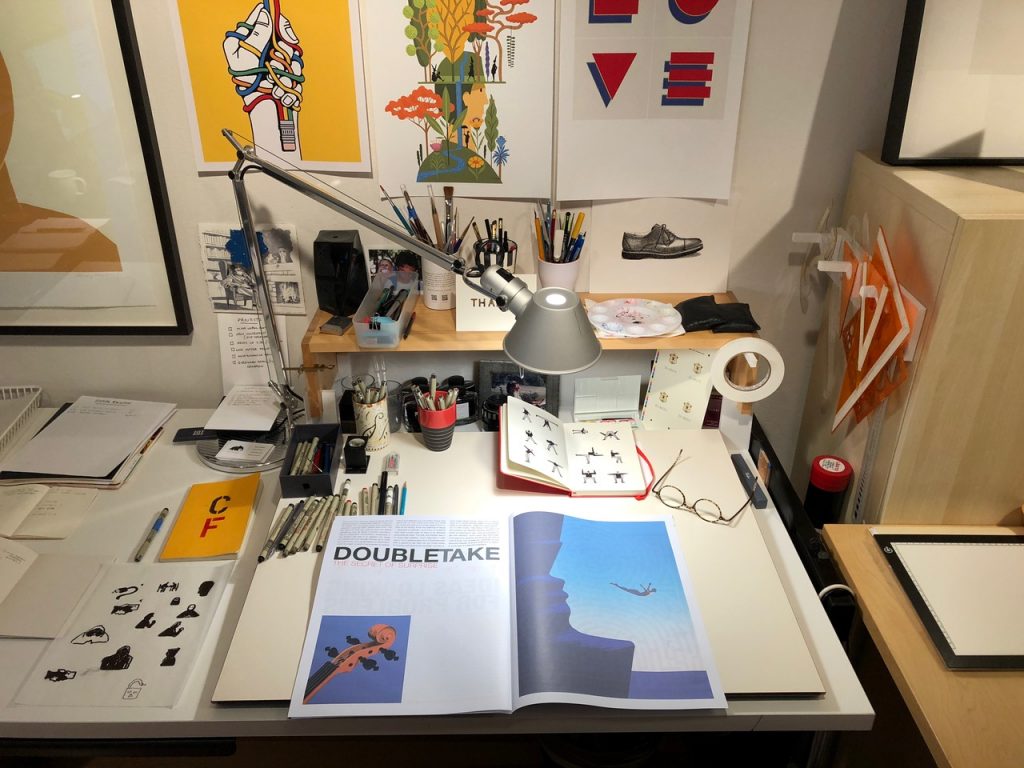
I use basic analog tools. I have old circle templates, triangles and tissue paper. I also have a roll of amberlith that I cut my illustrations out of.
I always have a sketchbook with me. I take notes in meetings, plan projects, sketch for assignments and just do random sketches. They are a repository for ideas in various stages of maturity.
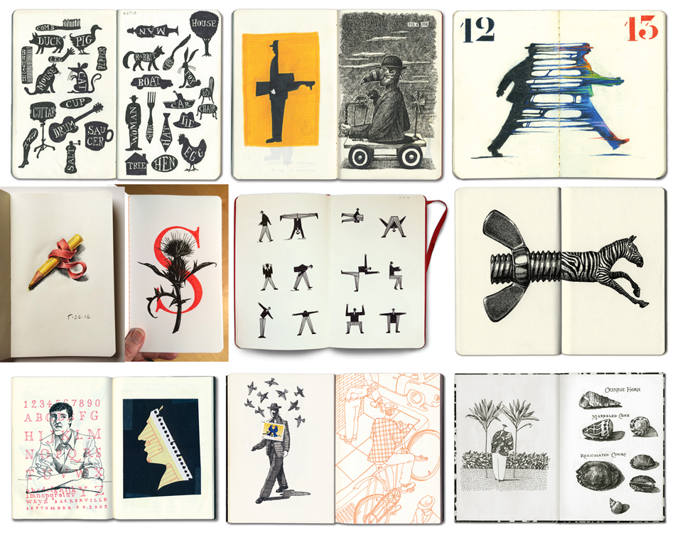
There isn’t a typical day. Some days I work several hours on drawings. But others I write proposals, do billing or mundane paperwork. Others I’m working on projects that keep me visible: my website, personal projects, kids books, newspapers!
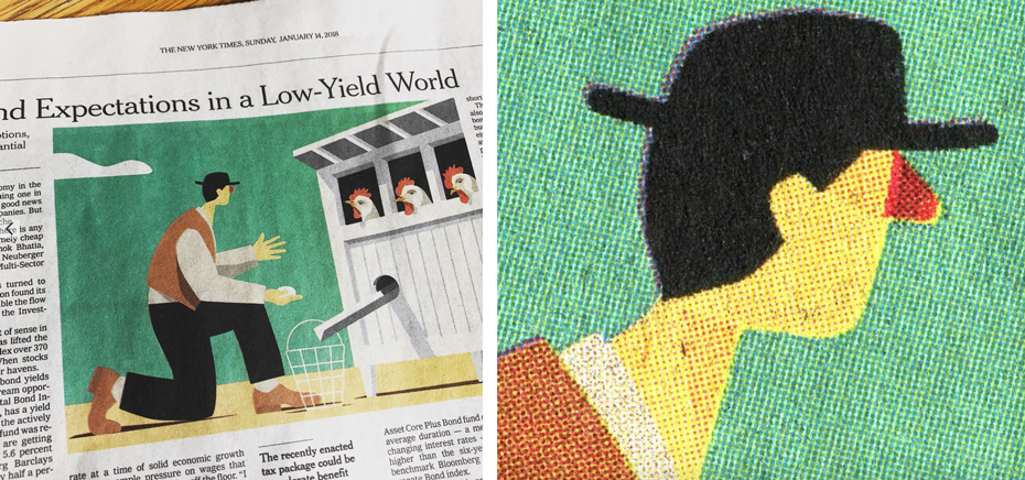
I first try to boil the message down to one statement – sometimes the article is presented to me this way, other times I do it. Then I sketch an obvious solution and slowly work my way out toward something that explains the message in other terms. I find myself scavenging for symbols that are universal and strip away the obvious traps.
When I’m illustrating business and financial subjects I have to speak abstractly if I’m to make the story interesting and add meaning. I think about metaphors that help me understand the topic – I never draw money or briefcases. In this case I was asked to explain the poorly performing bond market. What better than the farmer holding a near empty basket looking at the hen thinking “this the best you can do!”
I have to leave enough things unsaid, or undrawn, so that the reader gets to interpret the story. I think of leaving breadcrumbs.
Milton Glaser’s Drawing is Thinking and Milton Glaser: Art is Work are good. A Smile in the Mind by Beryl McAlhone is an exemplary display of wit in design. Bill Bernbach's Book: A History of Advertising That Changed the History of Advertising teaches messaging, wit and restraint. The Dictionary of Graphic Images by Philip Thompson is a great little look at universal symbols. Craig Frazier’s Illustrated Voice is decent.

Painting a wall in the virtual reality building at Google was a lot of fun. The idea of painting a huge unraveling pencil in the halls where there’s not a pencil in sight is pretty satisfying.
Pablo Amargo, Lorenzo Gritti, Bill Mayer, Tibor Karpati, Rob Baily, Malika Favre and Christoph Neimann.
I go back to the message I’m trying to illustrate and try to restate it. I then draw with a fatter pen.
Do work that you want to do and the clients will find you. Don’t work for low fees under the premise that the exposure will be good for you. This notion is the great boondoggle and dismantling of the creative industry.
You have to strive to find your unique voice and command your career in terms of money, clients and experience. Be vigorous and be patient and work very hard at enjoying every day at the drawing board. Heed the signals when it ceases to be fun.
Do work that leaves room for the reader. Whether illustration or design, work that is overstated serves no one. Exercise restraint and stand up to your clients to defend it. Work with ambiguity, wit and wonderment is work that is remembered.
Sketch all of the time—whether for assignments or practice. It will never fail you.
Kitchen table at 6:00am.
Learn more about digital tabloids
Nilly von Baibus gets three or four handwritten love letters every week. But she doesn’t read any of them. They’re responses to ads...
The first issue of Deluxe was, in Rupert Morrison’s words, “lumpy.” He’s the owner of Drift, an award-winning record shop in Totnes – not...
Spring is in the air and a new season of print is upon us! In this roundup, we've got a creative pick-me-up from Papier, a peek behind...