This print newspaper is reviving the lost art of personal ads
Nilly von Baibus gets three or four handwritten love letters every week. But she doesn’t read any of them. They’re responses to ads...
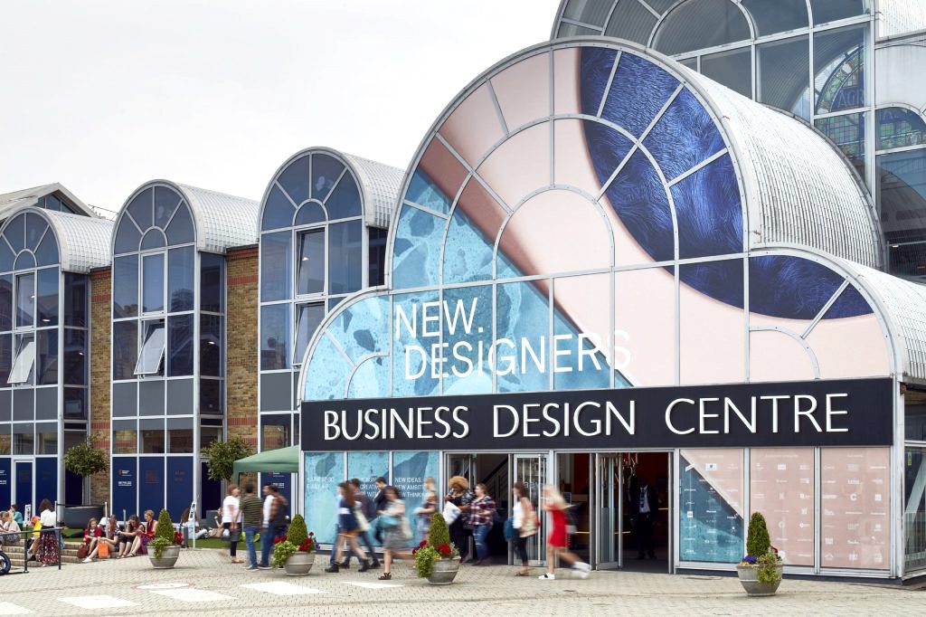
New Designers is the UK’s leading graduate design show. Since 1986, the exhibition has helped launch the careers of thousands of emerging designers across the industry.
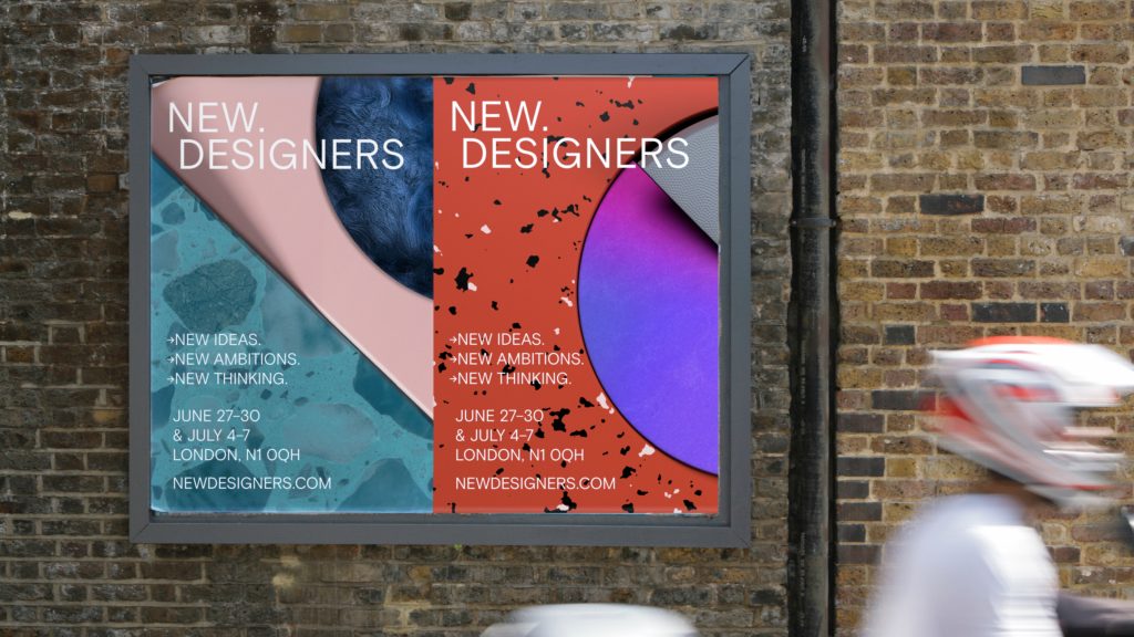
Ahead of this year's event—which introduced over 3,000 exhibitors from 200+ creative courses—New Designers revealed a fresh visual identity. It's the work of London-based design studio Village Green, whose past clients include Nike, Tate and the V&A. Below, Village Green tell us about the project and how the event programme, printed as a tabloid newspaper, supports the new visual language they've developed for New Designers.
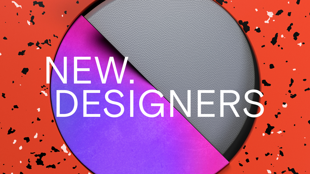
This was our first time working with the team behind New Designers. Our task was to update the brand’s visual identity and reposition the event to a “design aware” audience.
We started with a comprehensive review of all New Designers’ touch points—from identity and brand language to campaign and marketing creative. From there we devised campaign images and animations that would represent the broad range of disciplines and mix of ideas behind the show. Our main emphasis with the rebrand was to declutter the visual language and return the event to its core values: newness, design and innovation.
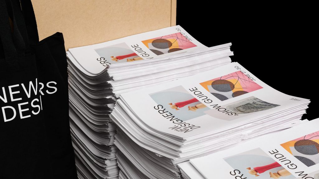
The newspaper was one of several pieces of brand communication used to establish a point of engagement with the audience. The format gave us space to weave together practical show guide information with editorial content—a mix of exhibitor highlights, interviews, event schedules and a floor plan.
With a relatively short piece of print, we want the reader to be able to drop in and out of content without facing a repetitive wall of words on every page. We established a flexible grid format that allowed us to break up each page with short pieces of text and create a visual balance. Bold titles give an instant impression of the content, so the newspaper feels easy to navigate.
We worked closely with New Designers and their press team to build up ideas for content outside of the usual listings and events, and then began working this into the layouts through sample spreads to get an idea of the look and feel. This gave us a guide to the scope of content and extent of imagery that we could use to brief the editors.
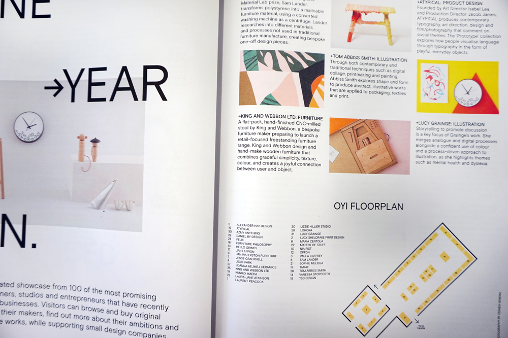
The scale and page count of the final piece is really important and it’s vital to engage with this from a reader’s perspective—to agree on a direction for the visual “voice” of the newsprint before starting the design process. We didn’t want the layout to feel predictable or to overload the spreads with too much text, otherwise the newspaper can feel like a chore to get through.
Getting to know all the exhibitors at the show by looking through and selecting their content was probably the best part of the process. The slightly lower image resolution required for newsprint also comes in handy when you are working through a broad range of image submissions.
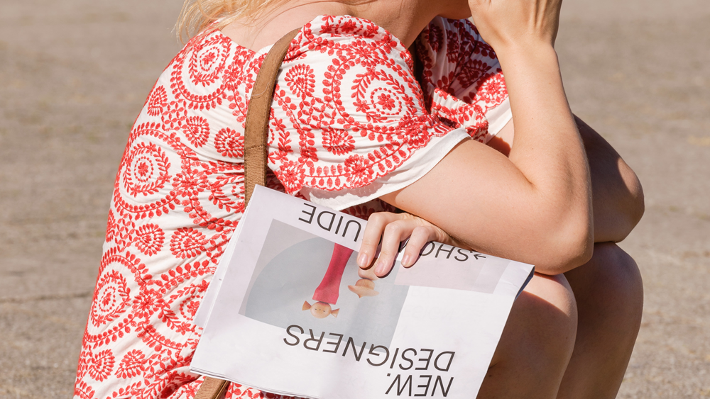
Working with the New Designers team and getting their backing at pretty much every stage of the process was really rewarding. It’s great to work with a client who is so supportive of new ideas and fresh approaches. In the end, the New Designers team were really happy with the results and the newspaper format felt like a perfect fit for the event.
Print your own newspaper with Newspaper Club.
Nilly von Baibus gets three or four handwritten love letters every week. But she doesn’t read any of them. They’re responses to ads...
The first issue of Deluxe was, in Rupert Morrison’s words, “lumpy.” He’s the owner of Drift, an award-winning record shop in Totnes – not...
Spring is in the air and a new season of print is upon us! In this roundup, we've got a creative pick-me-up from Papier, a peek behind...