How making a newspaper helped an indie record shop find its voice
The first issue of Deluxe was, in Rupert Morrison’s words, “lumpy.” He’s the owner of Drift, an award-winning record shop in Totnes – not...
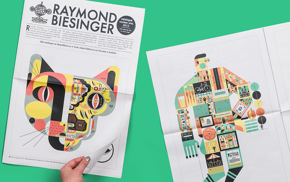
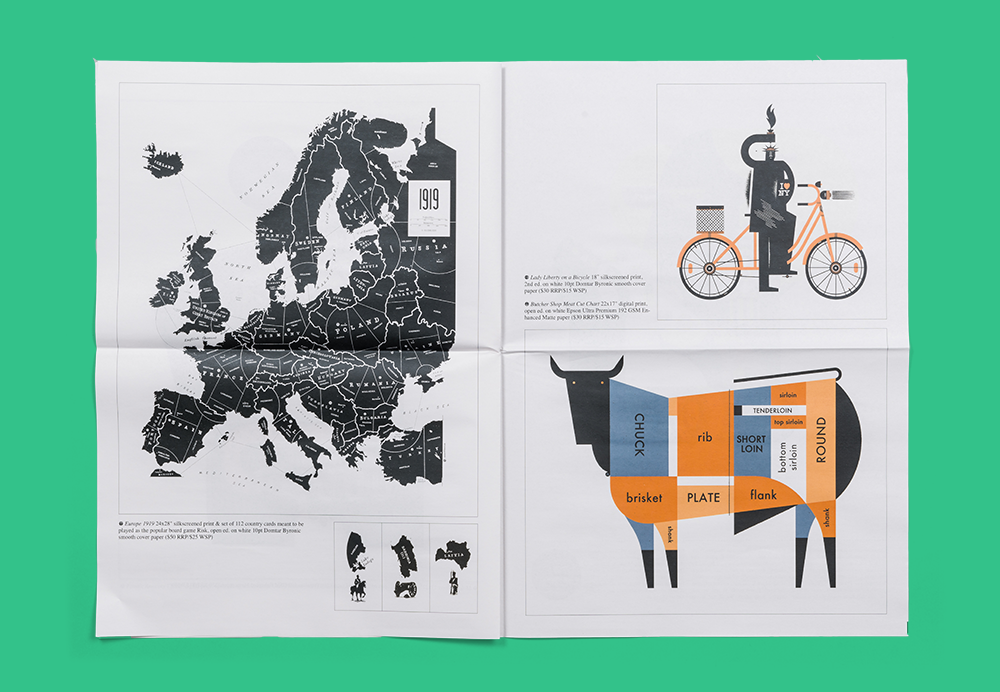
While studying to be a historian, Canadian artist Raymond Biesinger fell into illustration through his university newspaper. "They needed comic strips far more than they needed another arts writer," he tells us. He hasn't stopped drawing for newspapers since, and his witty, detail-oriented style is regularly commissioned by the likes of The New York Times, The Guardian, The Financial Times and The Washington Post.
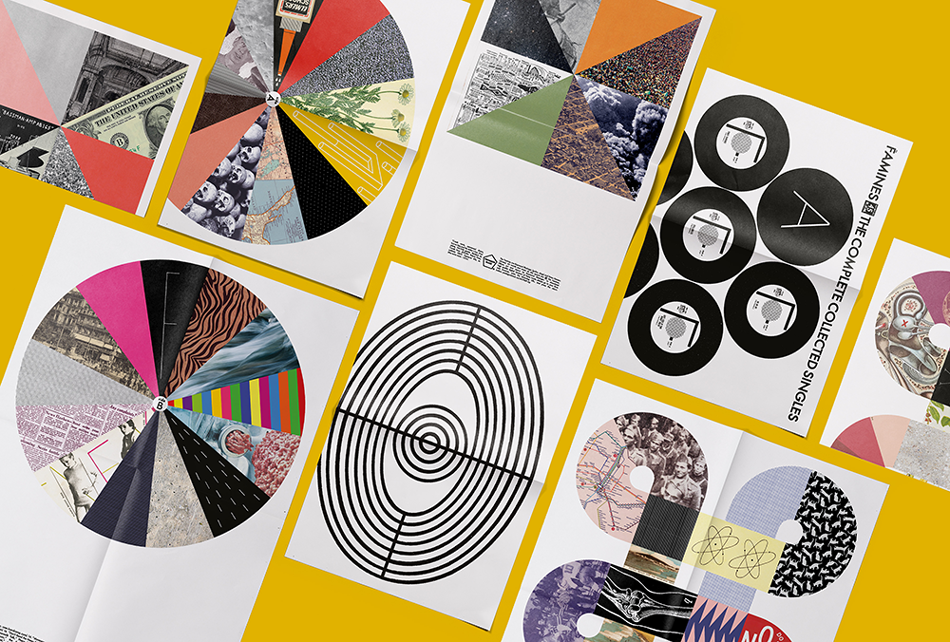
It is fitting then that Biesinger was chosen to illustrate the cover of Newspaper Design, a new book published by Gestalten showcasing the best editorial design in the news context. He's also printed several newspapers of his own with Newspaper Club, including a series of "paper LPs" for his band, the Famines. "You could call it our response to vinyl being gentrified by a few million bands more popular than us," he says.
Below, Biesinger tells us about his research-driven illustration process and why his biggest inspiration is the clock.
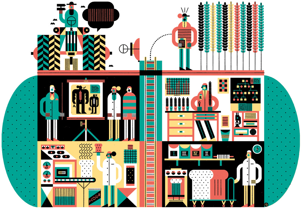
In university I first studied to be a historian, was seduced by journalism at the student newspaper, and then was stolen by that newspaper’s comics department—they needed editorial cartoons and comic strips far more than they needed yet another arts writer.
When I was passed up for an editor position there, I sent a small collection of comics and house party invitations to all the big publications in Canada, and most of them hired me. Then The New York Times hired me and I was picked up by Monocle when it first started publishing, right when every art director in the world was excited by it.
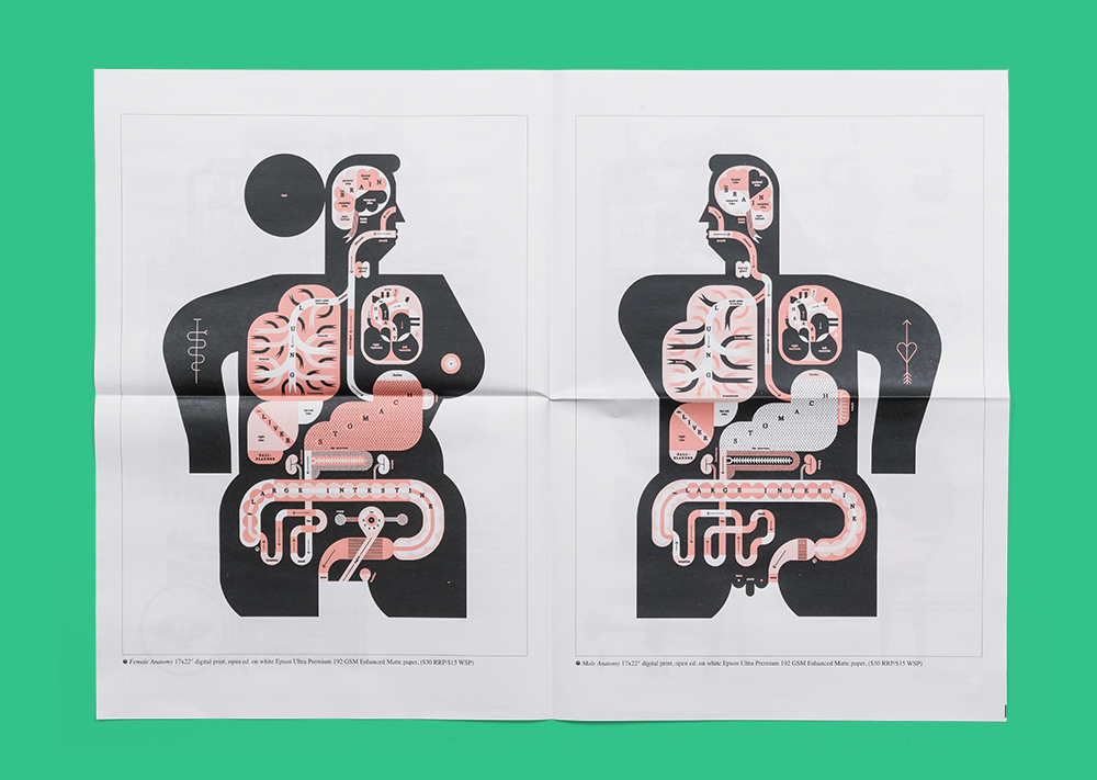
It’s a 240-square-foot room at home, with half of it occupied by myself, the other half by my assistant, Zinta. I do the creative things, she makes sure I don’t get headaches from all the practical things like pre-press, mailing print orders, bookkeeping, etc.
We’re surrounded by paintings, maps, prints and visual ephemera that slowly adjusts to new acquisitions. Also, there’s a giant blueprint file that’s threatening to collapse under the weight of its contents.
I do not—sketching for me is a very practical step to producing a specific image, but it’s not something I need to have access to at all times. My sketches end up on large sheets of scrap, most of which are drawn while I’m lying on the floor. How’s that for eccentric?
Gestalten and I have worked together a few times, and the origin of Newspaper Design actually goes back to an illustration of a woman popping music pills I made for a Swedish hospital magazine published back in 2014.
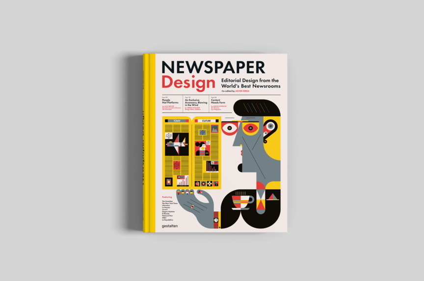
Gestalten wanted this illustration for the cover of 2017’s Visual Journalism, and I gave it to them. They wanted Newspaper Design to have a companion illustration of a man reading a newspaper and enjoying a coffee, one drawn to match the woman. A few sketches and minor adjustments later, he was born. It was quite easy, since all the main aesthetic decisions were already made back in 2015.
This may come as a shock, but I haven’t read it yet. Ha! It looks great, but I just haven’t had the time to give it the examination it deserves.
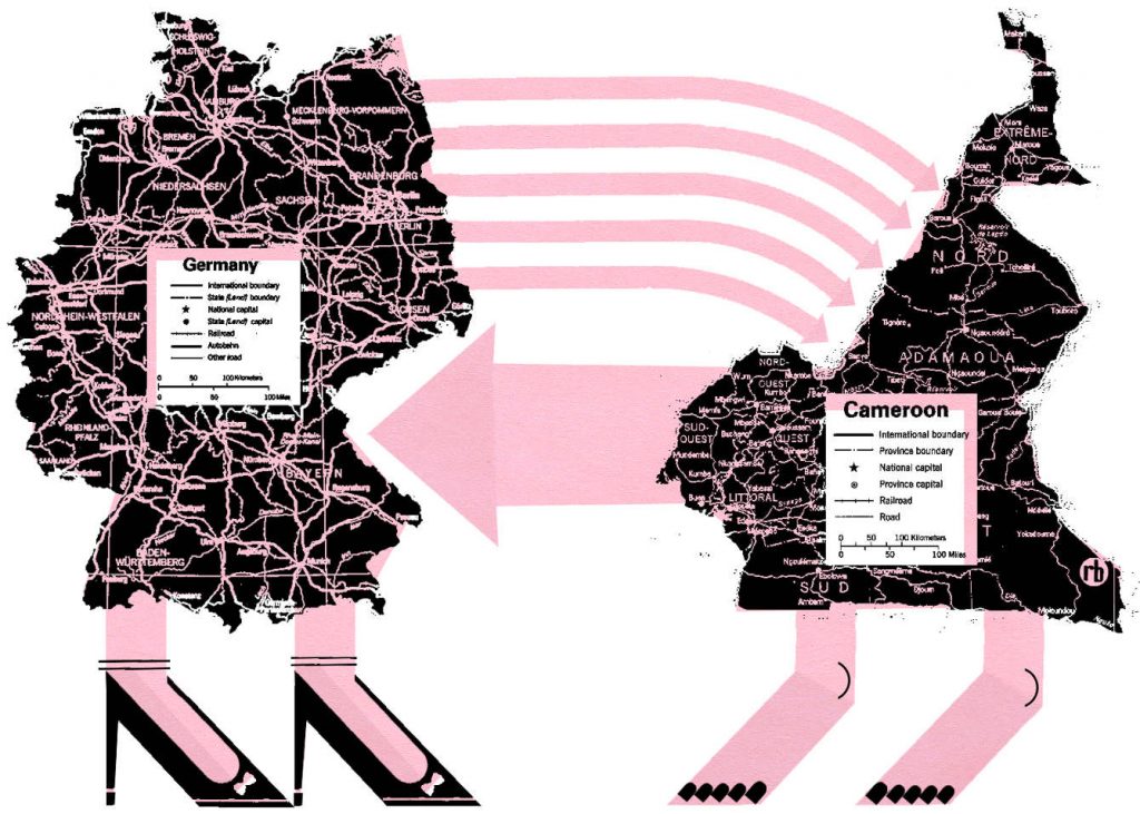
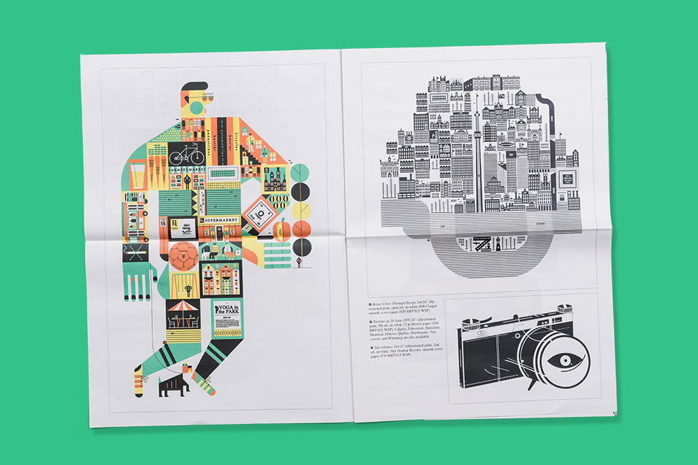
I come from the “more information is better” school of thought, so I read the article thoroughly and research all the possible visual elements I could work with.
The first step is to build the possible visual vocabulary out of things I know I can draw and want to draw. Then I find a relationship between those things that runs in parallel to the article.
Usually I produce three roughs and suggest one is my favourite. The art director may or may not agree with that favourite, but I’m careful to only propose things I’d be comfortable drawing. The final is almost like a collage that doesn’t look like a collage – like found and made geometric pieces combined until they assume another identity.
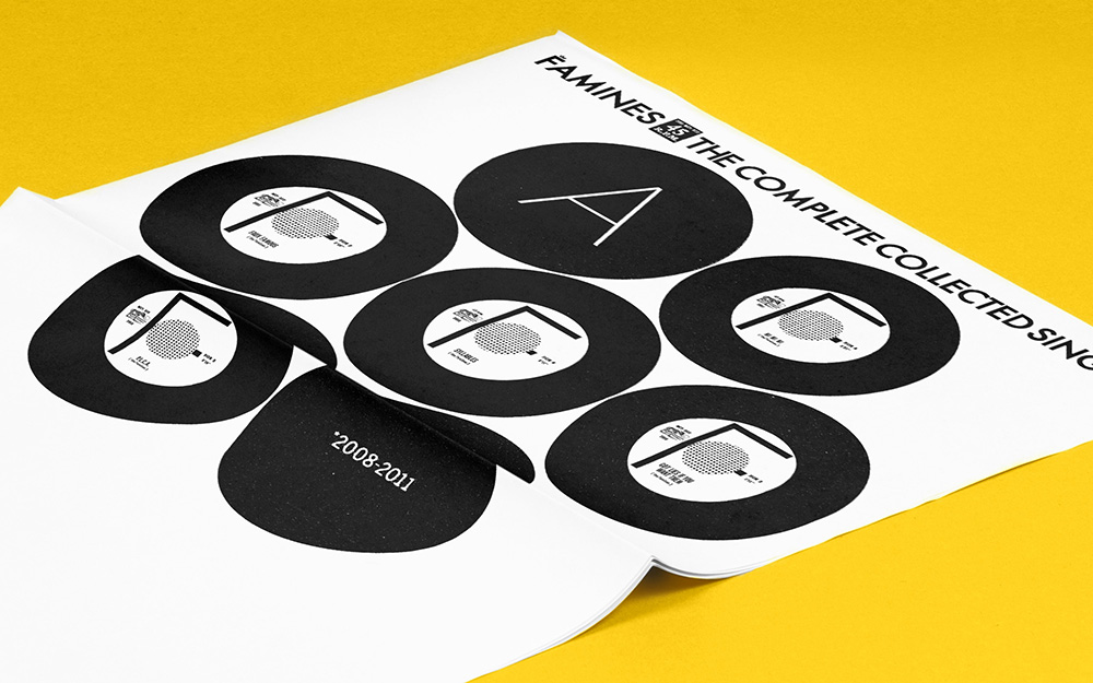
It’s inexpensive, fast, large, and recyclable. It’s really a unique and practical way to make impressive printed material.
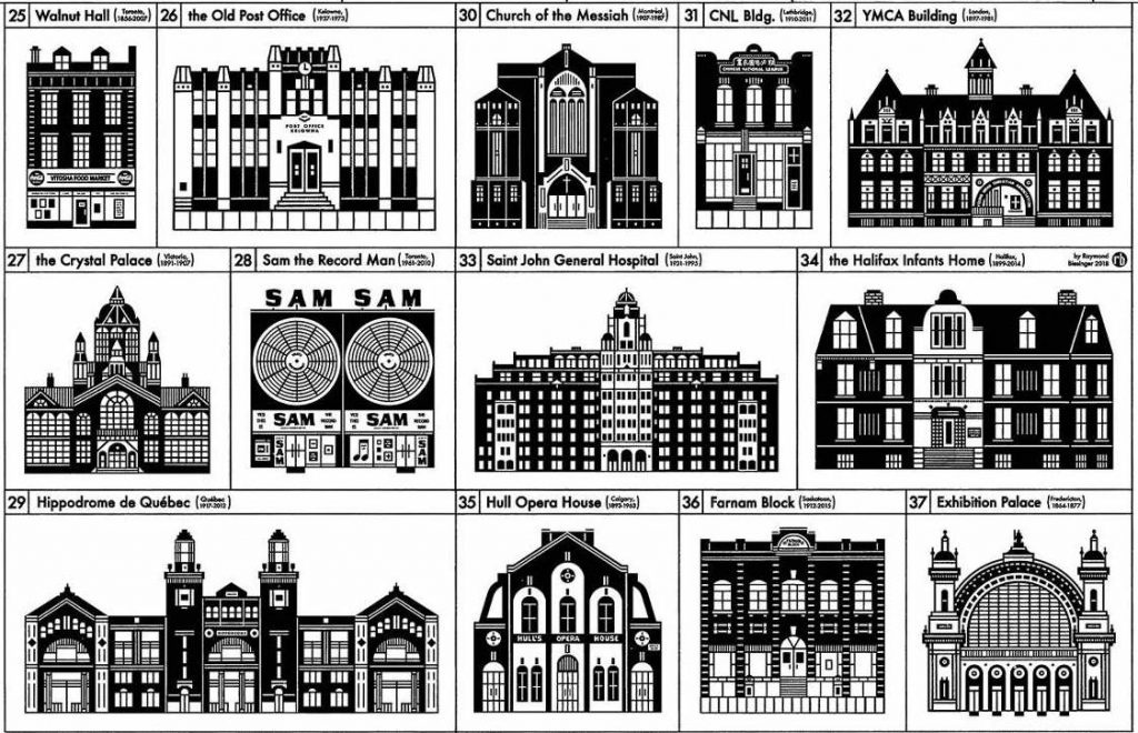
Since January I’ve been drawing my way through the “lost buildings” of North America starting with Canada and now hitting the United States. These are notable and interesting buildings from the last 150 years that have been knocked down, burned down, or otherwise lost before their time. It’s required a tremendous amount of research and time, but it’s been worth it.
Three books that have nothing to do with illustration. Sometime the worst designers and illustrators have the best design and illustration libraries. Find inspiration other mediums, not just in other examples of what you’re trying to create.
I actually keep my head down and don’t pay much attention to who else is doing what, but I always love Josh Holinaty, Lisa Czech and Jenn Kitagawa.
The clock. It reminds me that I do not have the option of creative block. Deadlines can’t wait.
When you’re first starting out, you may feel pressure to accept horrible working conditions for exposure. Don’t. Just do your own project on your own terms and push it as far as you can. It’s a much better way to get known and express yourself.
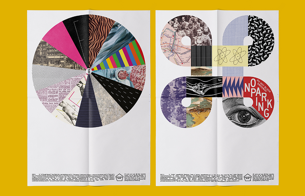
New photocollage art for a new Famines “paper EP.” It’s just so easy and fast compared to my usual image-making.
The kitchen table. Every Saturday morning. I think we’re the only people in Canada under 60 with a Globe & Mail subscription. Ha!
Print your own newspaper with Newspaper Club.
The first issue of Deluxe was, in Rupert Morrison’s words, “lumpy.” He’s the owner of Drift, an award-winning record shop in Totnes – not...
Spring is in the air and a new season of print is upon us! In this roundup, we've got a creative pick-me-up from Papier, a peek behind...
As Newspaper Club’s digital product manager, Billy Whitehouse spends his days helping others bring their print ideas to life. But...