Inside the Making of a Fashion Week Newspaper with Ronan Mckenzie
In the corner of Ronan Mckenzie's desk, near to her sewing machine, there's a stack of folded, faded newspapers. "I'll fold them and as...
After honing her skills in the design departments at Lucky and DETAILS magazines, Brooklyn-based designer Alison Matheny launched her own creative studio in 2014. BEST provides full-service branding work, which means they do everything from photography to copywriting to coding a website from scratch.
This summer, the BEST team used our broadsheet newspapers to create a publication for Scribner's Catskill Lodge, a former motor lodge transformed into a modern mountain retreat in Hunter, NY. Spotlighting local Catskills creatives, Matheny says the project was a chance “for different people to come together and make something really gorgeous and useful.”
Below, Matheny walks us through the design process and explains why a newspaper was the right format to showcase an eclectic community.
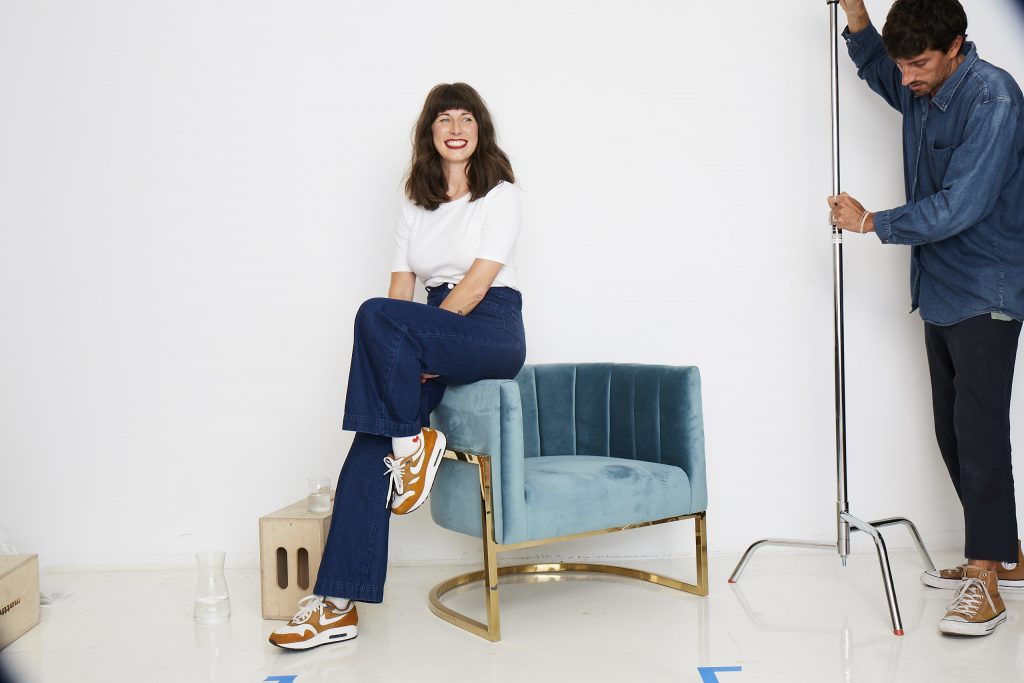
BEST was formed about four years ago when I quit my office job to work for myself. We're a full-service creative studio and like taking on projects that require fresh new thinking. We work at a steady clip on all types of projects from branding to photoshoots to digital campaigns to promotional print pieces.
Right now we're working on a new wellness app, developing a visual language for an eco-friendly laundromat, and shooting a digital holiday campaign!
We partner with a wide range of clients large and small like Lo&Sons, Planned Parenthood, Boom! Skincare + Cosmetics, Boroughs Athletic Club, Aisle 9 and Scribner’s Catskill Lodge, our client for this latest newspaper project.
Mia Fabbri was my art director for the Scribner’s project, and works with me on a lot of our big out-of-the box thinking. We've been collaborating for years and are also fantastic friends, so big projects like this are a cinch.
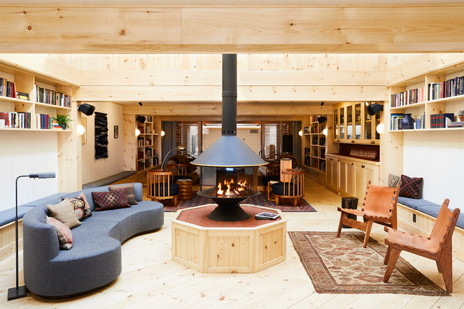
Scribner’s Catskill Lodge is a mountain getaway in Hunter, New York. Whether you’re looking to ski, hike or just relax by the fire, Scribner’s is a retreat that everyone can enjoy. Our favorite parts are the comfy, clean beds and backyard fire pit for roasting s’mores.
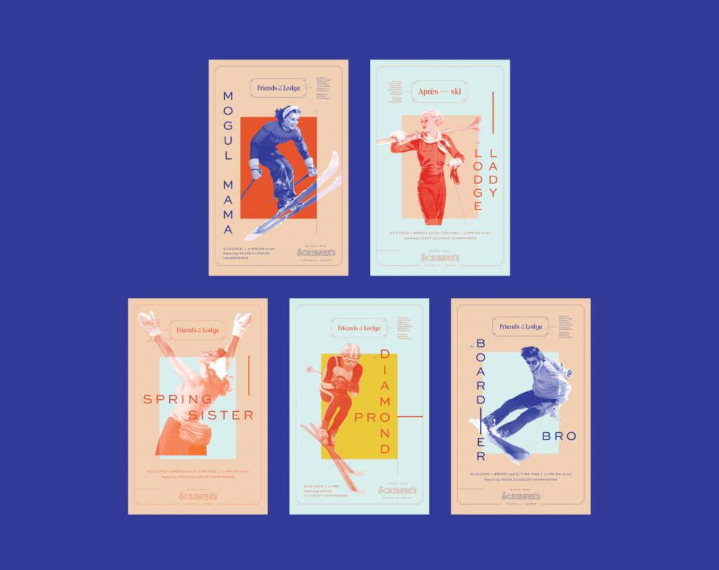
We work with Scribner's on a lot of their big initiatives that could benefit from that extra creative touch, like new program launches, in-room print promotions, and digital marketing materials. Previously we had done an illustrated Guide to Surviving the Catskills zine and a poster series for their Aprés Ski program (pictured below).
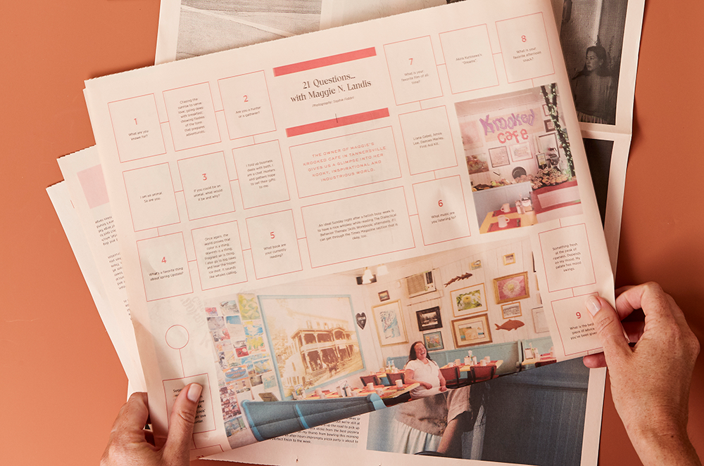
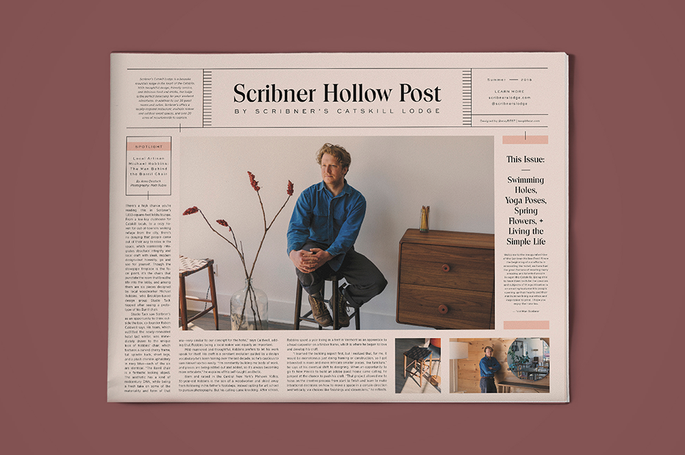
The idea behind the Scribner Hollow Post is to spotlight all of the amazing talent in the Catskill region – from the artists, chefs, and businesses featured, to the photographers and editors who shot and wrote about them. Upstate New York is a melting pot for creative New York City expats, and we're proud of that.
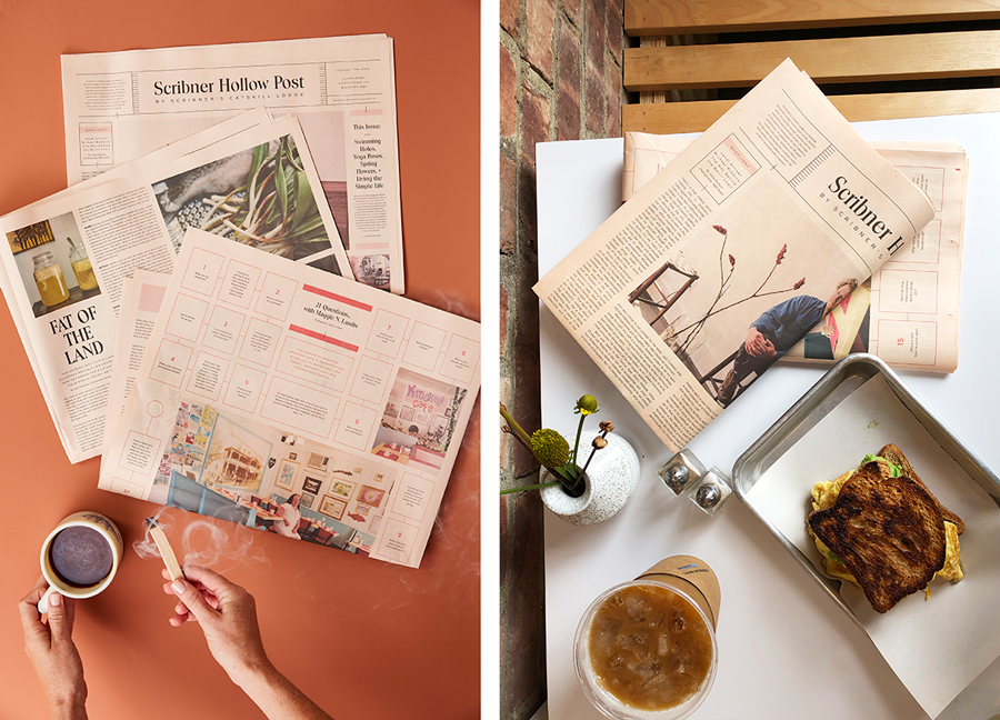
We love working with newsprint and this project was a perfect fit for the medium. In particular, the warmth of salmon newsprint was appropriate for the setting of Scribner’s. Newsprint is also unexpected compared to a brochure or digital content that we are so used to consuming rapidly. It’s nostalgic – something you spend time with and share. And that's exactly what we were trying to achieve with the Post.
This project was definitely a team effort. We worked directly with the team at Scribner’s, helping them brainstorm and organize their content. Once the stories were written, edited and shot, it was handed off to us and we went through a few rounds of layout before landing on the final design piece.
Oftentimes a project calls for us to create content on our end rather than just design it. In this case the illustrations for the map and writing for News from the North section were supplemented by BEST, which just makes us all the more connected to the work as a studio.
I asked art director Mia Fabbri to expand on the process:
The first thing I do is find inspiration. Whether that’s a single image or creating a full moodboard, it helps me come up with a starting point for my design.
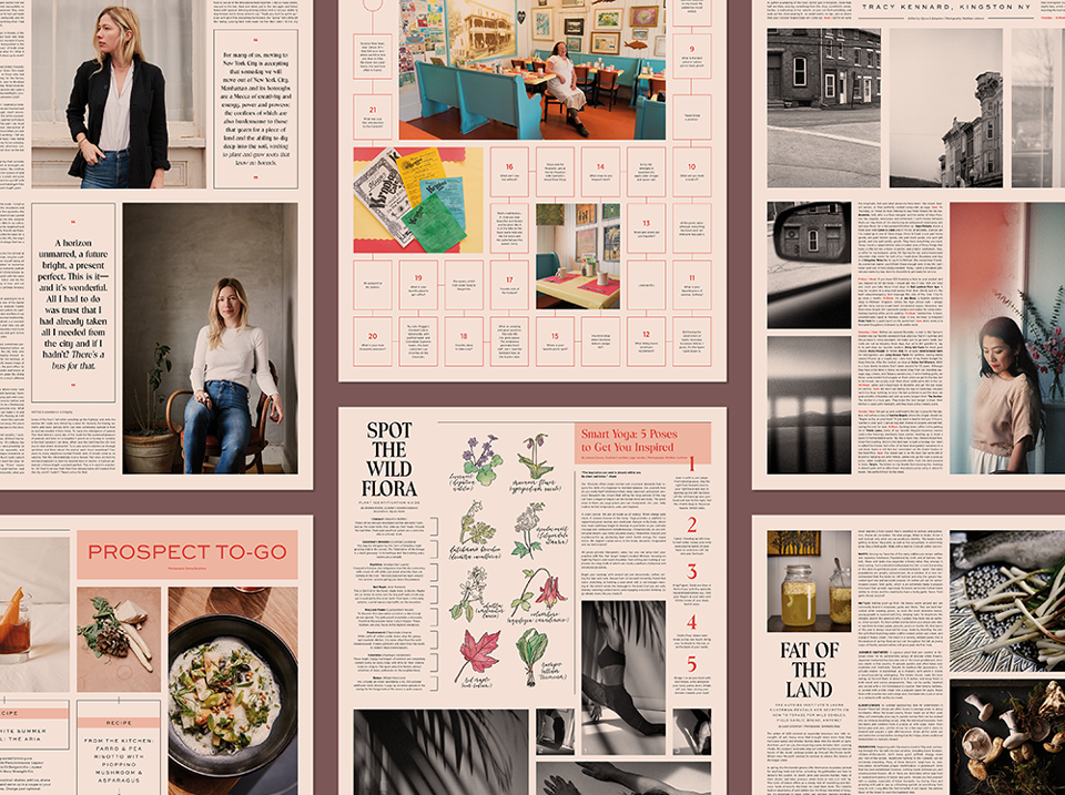
In designing the Scribner Hollow Post, I looked at old newspaper layouts and some new, more modern editorial spreads. I came up with a modular grid that shows off a lot of the really nice imagery we were given.
Most of my sketching and designing is dependent on the content we get for each project. For this project, I messed around with grids in INDD before deciding on a final layout.

In the example of the Maggie Landis interview (pictured above) I let the content dictate the layout. Since I had a long list of short Q & As, I thought: “How could I make it more fun for the reader?” The game-board tile layout seemed like a good fit—and an exciting surprise for the last page.
Scribner's has been using the newspaper to expand the brand in a way that highlights the area and members of the community. The response has been amazing! People who were instrumental in creating the newspaper have increased the Post's reach by sharing it with their own communities (like the restaurant Brushland Eating, pictured above).
It was great to see how willing everyone was to contribute to the newspaper project. So often, especially working out in the woods or from your home studio, we get siloed in our own art, so a project like this was an opportunity for different people to come together and make something really gorgeous and useful.
Print your own newspaper with Newspaper Club
In the corner of Ronan Mckenzie's desk, near to her sewing machine, there's a stack of folded, faded newspapers. "I'll fold them and as...
Nilly von Baibus gets three or four handwritten love letters every week. But she doesn’t read any of them. They’re responses to ads...
The first issue of Deluxe was, in Rupert Morrison’s words, “lumpy.” He’s the owner of Drift, an award-winning record shop in Totnes – not...