This print newspaper is reviving the lost art of personal ads
Nilly von Baibus gets three or four handwritten love letters every week. But she doesn’t read any of them. They’re responses to ads...
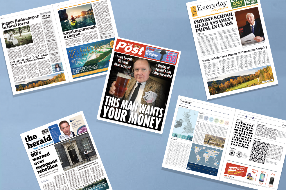
Clare Winkworth is a graphic designer for film and TV and recently used our digital tabloids to create prop newspapers for Press, a BBC series set in the newsroom.
"We did a huge amount of research to create realistic-looking newspapers," says Winkworth. "And not just for the two main titles, but for other fictional publications we had to create." In the end, she designed over 90 mastheads and logos for the series.
Below, Winkworth tells us how she shifted from a career in animation to graphic design for film and TV and why, as a prop designer, she can never know when an old beer mat or rail ticket might come in handy.
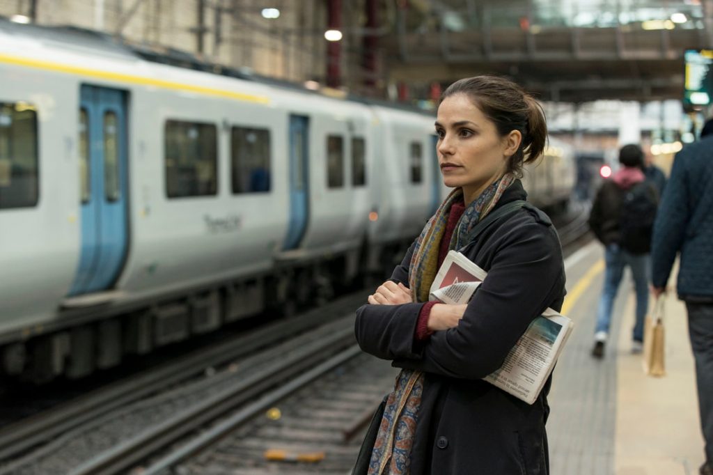
I originally studied animation at university and worked in animation and television production for 5 years. Then I decided to do an MA in Production Design at the National Film and Television School. I’ve been working in the art department in film and TV since I graduated in 2011 and am now a Graphic Designer for film and TV.
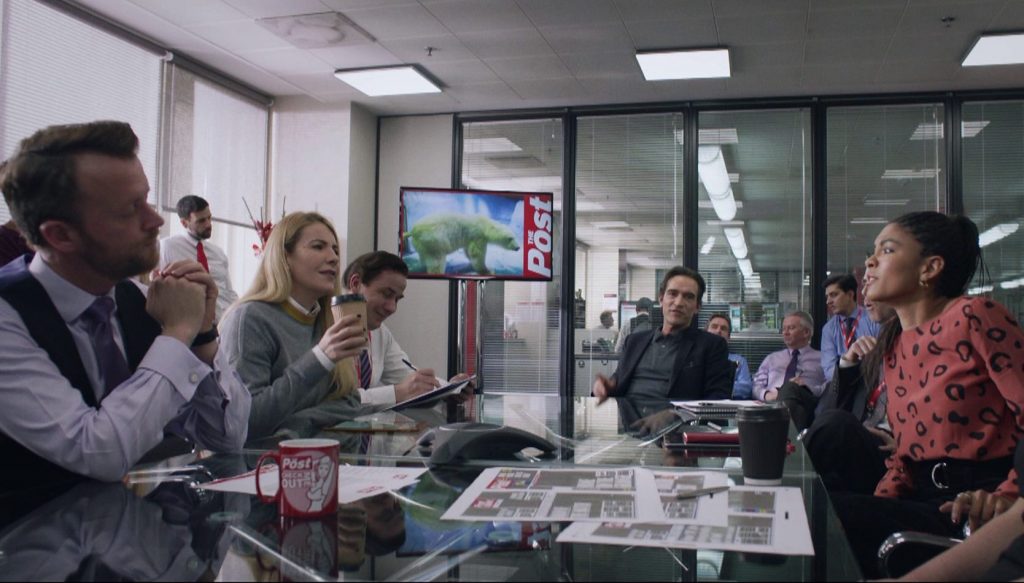
The newspaper was for a 6-part drama series for BBC One written by Mike Bartlett and directed by Tom Vaughan. It stars Ben Chaplin and Charlotte Riley and is set in the fast-paced and challenging environment of the British newspaper industry.
The series follows two fictional newspapers: a tabloid newspaper called The Post and their competitor The Herald. It exposes the world of news reporting in a very challenging era in the print industry and the effect of the 24-hour global news network we are used to having in our daily lives.
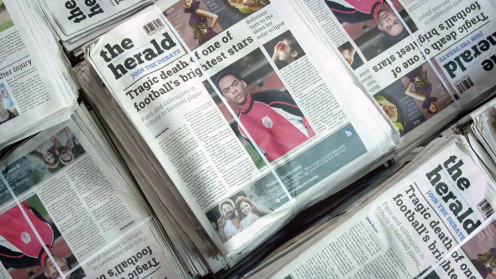
It was great to research the actual process of designing a newspaper. We did a huge amount of research into the look, style and design of newspapers—not just here in the UK but also editorial design from around the world—to create realistic-looking newspapers. And not just for the two main titles, but for other fictional publications we had to create in this fictional world of the news.
It fascinated me on how much work goes into the design of a newspaper layout, the different typefaces, wording, spacing and photography that goes into just one edition of a newspaper. At times it can be very time-consuming designing the layout with text but you feel a great sense of achievement when you have finished it!
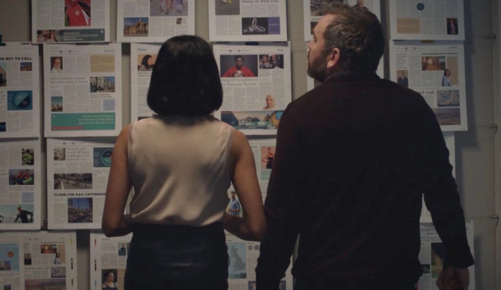
I usually start my research by either looking online or by looking in books and libraries (they are still my favourite method for researching!)
I also research other design methodologies and art practices, especially if I am doing graphics from a particular period—I will look at the printing processes for that era and how we can create them in this digital world. For Press we bought a variety of newspapers from the UK and around the world so we could look at the layouts and typography.
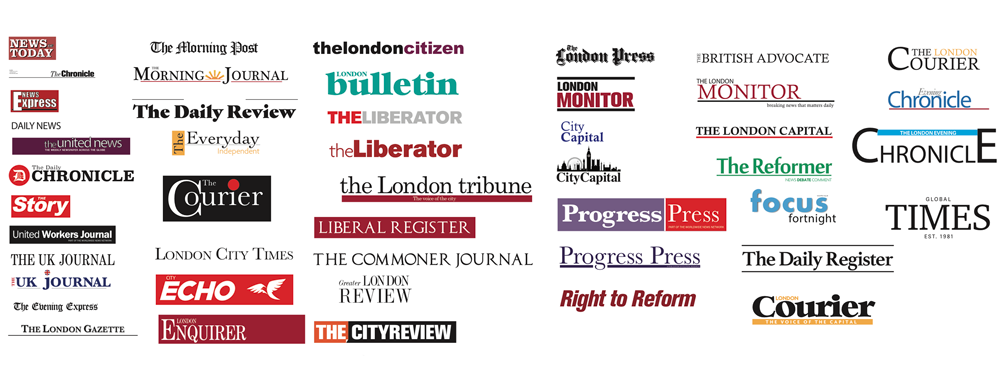
I tend to do very rough, hand-drawn thumbnail designs for logos and then move onto the computer to do the final design work. Once I get a selection of designs completed I’ll show the art director/ production designer and they’ll eventually get offered up for approval to the director and writer. For Press I think we created over 90 different designs for mastheads/titles for newspapers and magazines.
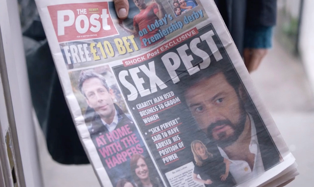
I find references from all over the place, as I never know what I will be asked to design on the job. Anything that catches my eye I tend to pick up and keep, be it a drink carton, rail ticket or a magazine.
I have folders at home full of tickets, flyers, beer mats, sweet wrappers and newspapers from around the world. I love anything from years ago. My dad gave me some documents and printed ephemera from my grandparents: a WW2 ration book, national insurance card, handwritten postcards written during WW1 between my great grandfather and great grandmother. The collection just keeps growing!
I must admit I am a little obsessive over books. I cannot go in a bookshop without buying at least one book, be it a book on airline design or American architecture.
Usually one of the biggest challenges is time and money! We never usually have enough of either. So it comes down to compromising on what we can achieve with limited time and budget, while still creating something we’re all proud of and that works with the narrative.
Also the filming schedule is constantly changing, so sometimes we get very little time to design and create a specific set or prop.
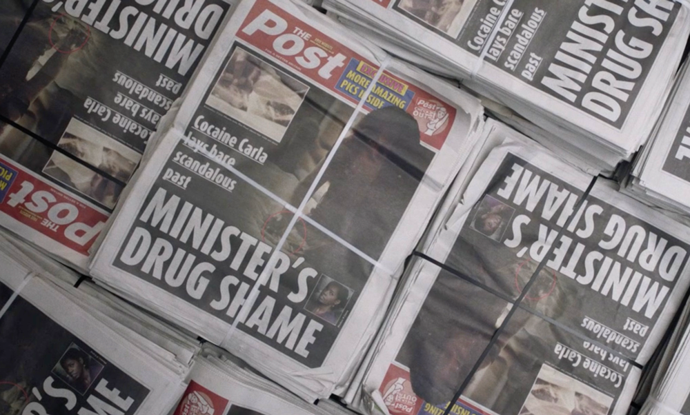
I spend very little time on the actual set as I am always busy prepping/designing for the upcoming sets and props—I always need to be ahead of the shooting crew.
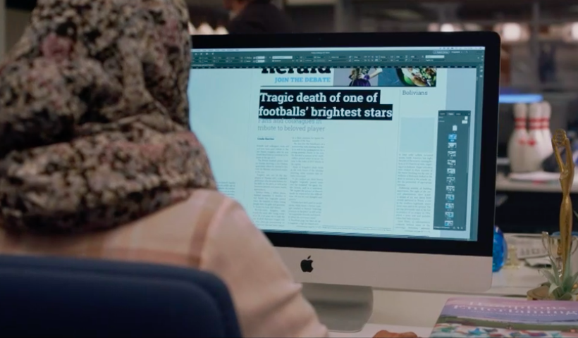
The only time I tend to be on set is when a lot of graphics need to be dressed in. On Press we had a massive set of the newsroom with many graphics needing to be dressed in, as well as graphics that needed to go on screens.
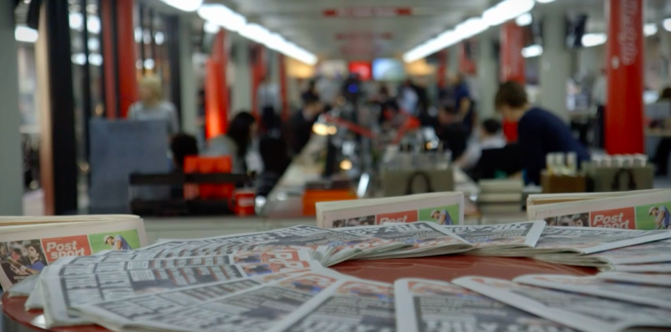
You have quite a bit of artistic license, but you need to keep a balance. You want it to look great, but you also want it to look believable.
Paul Cross, the production designer on Press, likes us to look at real world references and then us put our own design spin on it. We also have to send artwork through clearance to make sure it is an original piece of work and that you have not copied it from an existing design.
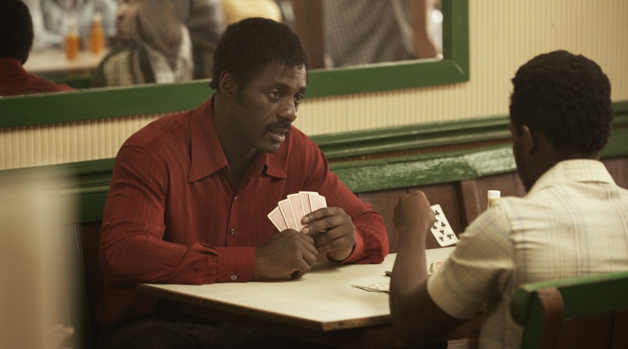
I love designing for period dramas. One of my favourite eras was the 1970s—I worked on a drama for Sky Atlantic called Guerrilla, starring Idris Elba and directed by John Ridley, which was set in 1971 in London. That was a great period for posters, packaging and signage as you still had remnants of the 1950s and 1960s, so I got to incorporate that into the design of beer labels, tickets, signage, newspapers and magazines.
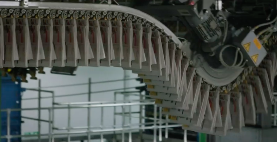
I'm currently working on a contemporary BBC drama called MotherFatherSon, about self-made media tycoon Max (Richard Gere) and his estranged wife Kathryn (Helen McCrory) as their 30-year-old son Caden (Billy Howle), is primed as the heir to his throne, enters a self-destructive spiral that threatens to topple the family’s empire.
Print your own newspaper with Newspaper Club.
Nilly von Baibus gets three or four handwritten love letters every week. But she doesn’t read any of them. They’re responses to ads...
The first issue of Deluxe was, in Rupert Morrison’s words, “lumpy.” He’s the owner of Drift, an award-winning record shop in Totnes – not...
Spring is in the air and a new season of print is upon us! In this roundup, we've got a creative pick-me-up from Papier, a peek behind...