Inside the Making of a Fashion Week Newspaper with Ronan Mckenzie
In the corner of Ronan Mckenzie's desk, near to her sewing machine, there's a stack of folded, faded newspapers. "I'll fold them and as...

Hudson Valley Brewery in Beacon, New York has amassed a following for its experimental flavours and distinctive illustrated packaging. Evan M. Cohen is the brand's longtime label illustrator, collaborating with the craft brewers to create intricately drawn stories around each beer they release. The artwork is "meant to pull the viewer in and live beyond the time spent drinking the beer," Cohen explained on Booooooom.
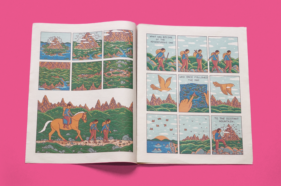
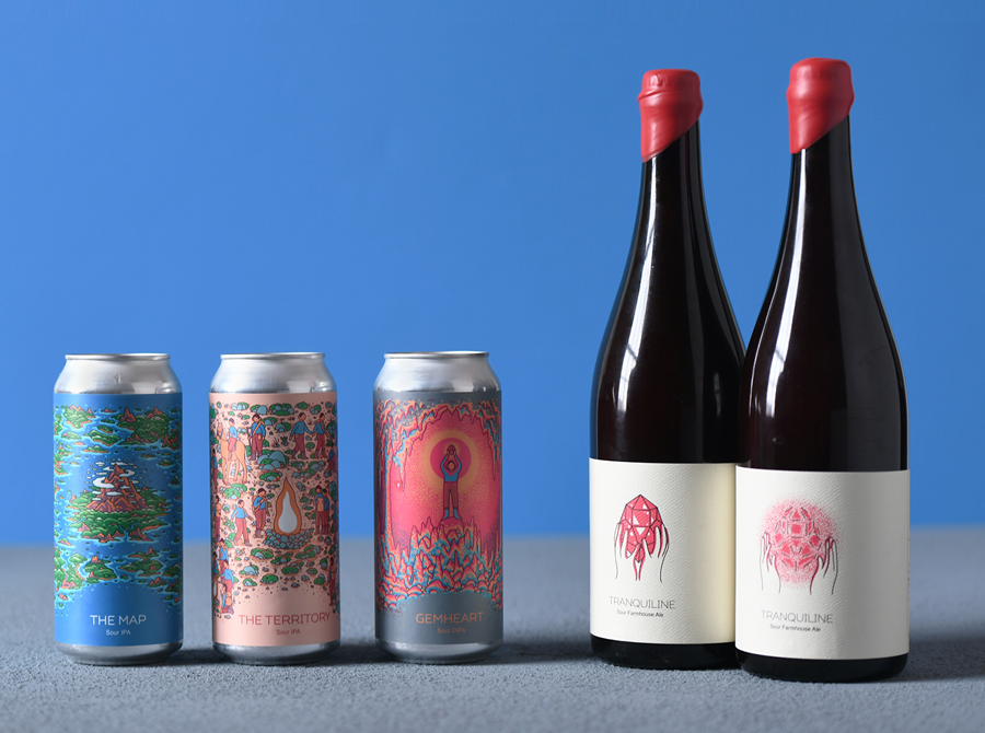
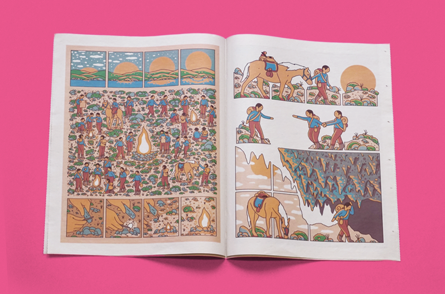
Earlier this month the brewery launched The Gemheart Cycle, a collection of limited-edition beers inspired by a fantastical journey. To accompany the release Cohen published a Gemheart Cycle comic, printed as a traditional tabloid newspaper. The comic follows a traveller through the landscapes depicted on each beer can, building a narrative around the design. Below, the illustrator describes how the project came together—and scroll down to watch a video flip-through of the comic!
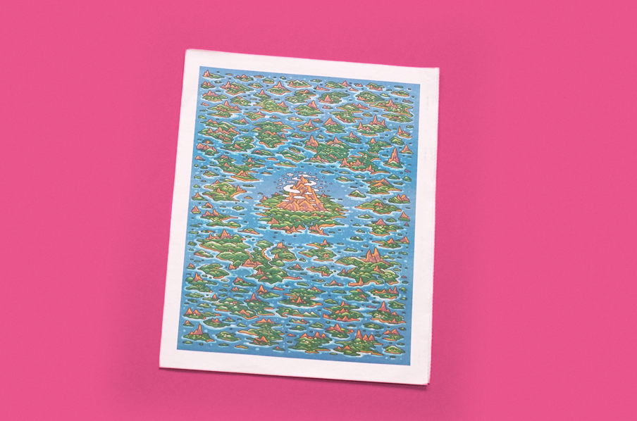
I’ve been the illustrator for Hudson Valley Brewery since they opened a few years back. Beacon is a small town in New York and I have known the owner of Hudson Valley Brewery since I moved here in 2013. When he started the brewery I came on board and now we're here. It's grown from a very small team to a large operation that all comes together to make each beer really special.
I am usually given a name and concept that I then sketch out and build on until it is a finished idea that everyone is on board with. Over time the process has gotten easier as we have found our voice and I am able to focus more on ideas and stories behind each illustration over just style.
For the “Gemheart Cycle” release, the story we are trying to tell is very mythical/fantastical, which is pretty common theme in most of my work. Thankfully I am given a lot of freedom to work out my ideas but we have an aesthetic and mission at the brewery that I stick by to create a cohesive aesthetic.
Once I have an idea, I try to start with a larger illustration and then break it into parts to create the labels and any other merchandise we end up making.
Each beer release is a full experience and for the “Gemheart Cycle” release we wanted to give something extra to those who came out to the event. The story in the comic delves deeper into the meaning of the “Gemheart Cycle” and intertwines the illustrations on each beer label.
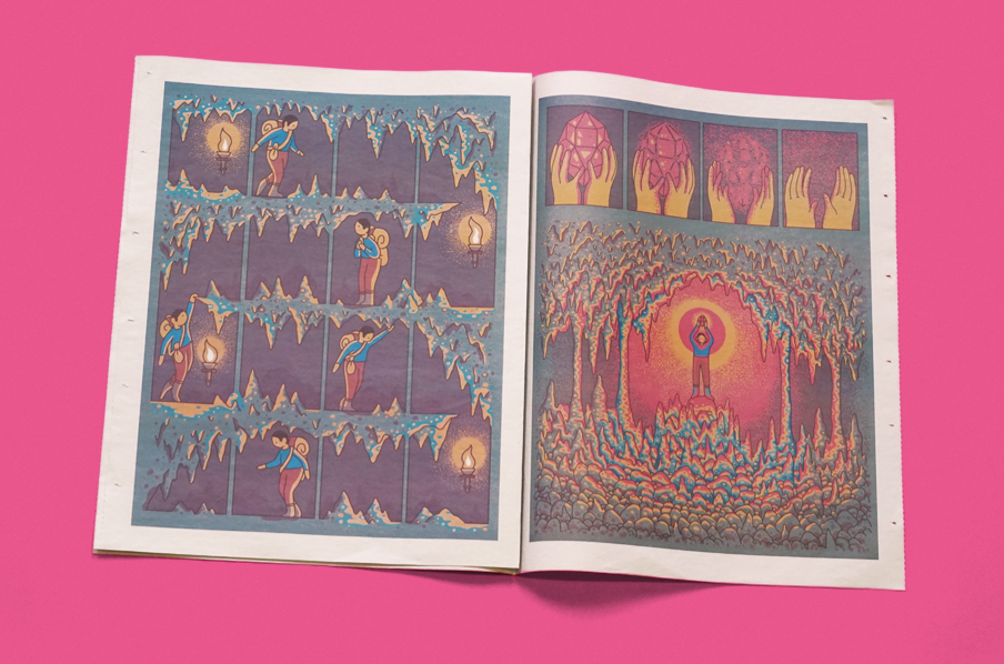
I’ve printed comics on newsprint before and I thought it would be a perfect fit for this project—plus the newspaper feels like a map, which is the name of one of the beers. We handed them out for free to anyone that came to the release.
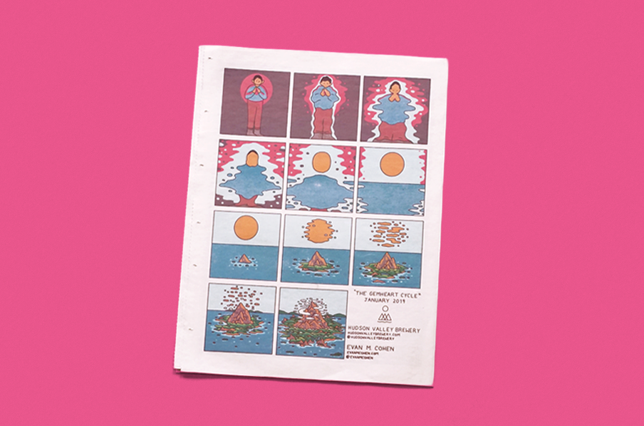
People come from all over the area and it was a fun way to interact with them and give them a larger story to the beer they were getting. The release was a great success and everyone really loved the newspaper. Looking forward to doing it again soon!
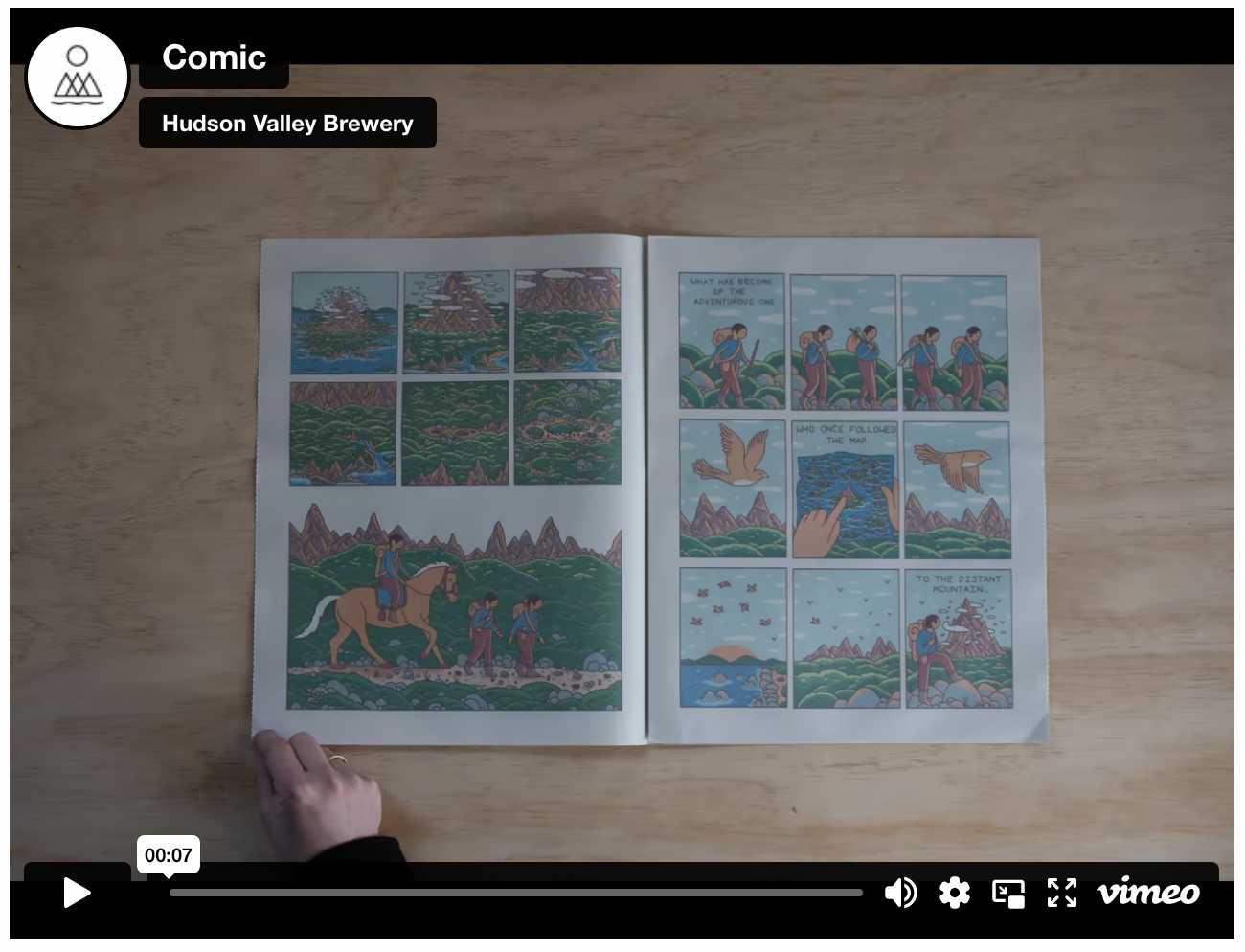
Flip through the Gemheart Cycle newspaper on Vimeo:
Print your own newspaper with Newspaper Club.
In the corner of Ronan Mckenzie's desk, near to her sewing machine, there's a stack of folded, faded newspapers. "I'll fold them and as...
Nilly von Baibus gets three or four handwritten love letters every week. But she doesn’t read any of them. They’re responses to ads...
The first issue of Deluxe was, in Rupert Morrison’s words, “lumpy.” He’s the owner of Drift, an award-winning record shop in Totnes – not...