Inside the Making of a Fashion Week Newspaper with Ronan Mckenzie
In the corner of Ronan Mckenzie's desk, near to her sewing machine, there's a stack of folded, faded newspapers. "I like to see them...
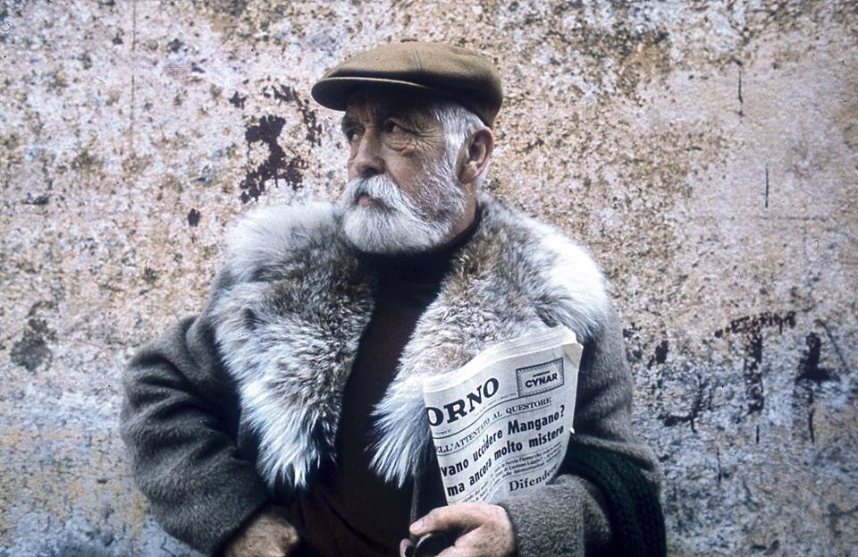
Antonio Calderara was a Modernist artist from Lombardy, Italy. In 1925, he abandoned his university studies in engineering and dedicated the rest of his life to experimenting with colour and form. Much of Calderara's work was made on a small scale – the critic G L Luzzatto has described him as a "master of the little painting."
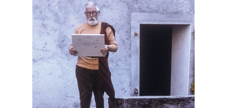
Here he is with a fabulous fur collar and a copy of the Italian newspaper Il Giorno:
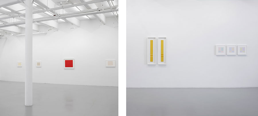
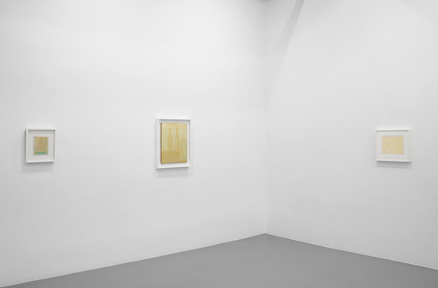
In March, Lisson Gallery (which represents the artist's estate) staged the first ever solo exhibition of his work in a New York gallery. "Antonio Calderara: The Double" explores the painter's lifelong affinity for duplication – from an early self portrait showing the artist reflected in a mirror to his later abstract geometric compositions.
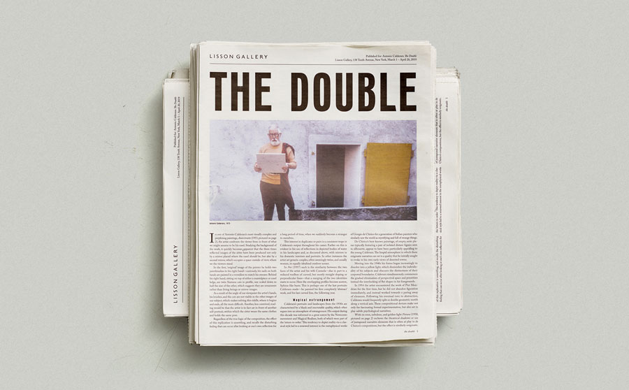
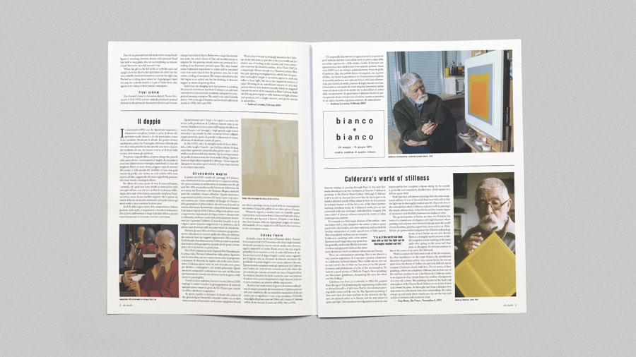
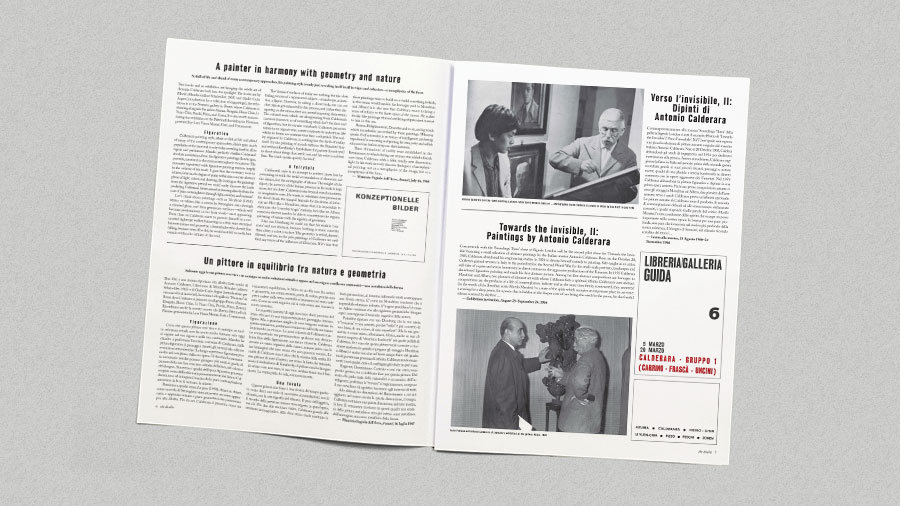
The exhibition catalogue, which features archival reviews from the 1950s through 1970s and rarely seen photographs of the artist, was printed as a traditional tabloid newspaper. It was available for free at the show, which ran through 20 April 2019.
Below, we talk to Zoë Anspach, Design and Digital Producer at Lisson Gallery, about the exhibition and how a vintage leaflet found in Calderara's archive inspired the typeface they used for the newspaper's headline.
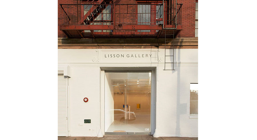
Lisson Gallery was established in 1967 by Nicholas Logsdail and is one of the most influential and longest-running international contemporary art galleries in the world. It pioneered the early careers of important Minimal and Conceptual artists such as Carl Andre, Daniel Buren, Donald Judd, John Latham, Sol LeWitt, Richard Long and Robert Ryman among many others.
Today the gallery supports and develops 60 international artists – including Marina Abramović, Ai Weiwei, Cory Arcangel, Ryan Gander and Laure Prouvost – across two exhibition spaces in London and two in New York, as well as its new space in Shanghai.
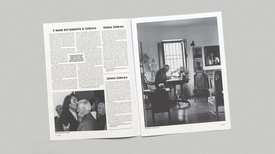
Who was Antonio Calderara?
Antonio Calderara was a self-taught artist born in Abbiategrasso, Italy in 1903. His early work depicts the people, scenes and objects in his native Italy, particularly around Lake Orta in Vacciago where he moved in 1934 and worked for most of his life.
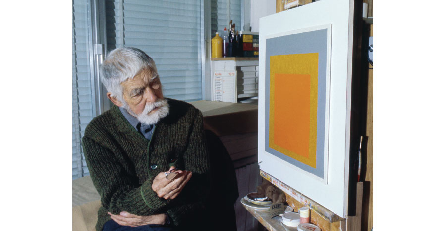
Later, Calderara embraced a more geometric approach that positioned him closely with minimalist painters at the time, including Piet Mondrian and Josef Albers (both of whom the artist admired greatly). He continued to work up until his death in 1978.
His work was included in the Venice Biennale in 1948 and 1956 and most recently in the 33rd São Paolo Bienal in Brazil in 2018. It is also featured in P420 Art Gallery in Bologna, Italy and the Josef Albers Museum in Bottrop, Germany.
This is the second exhibition of Calderara's work the gallery has organised since working with his estate. The inaugural exhibition was held in January 2018 in one of our London spaces.
The show centred on Calderara’s predilection for "doubling" or mirroring forms in his work, as seen in an early self-portrait, a canvas featuring twin girls with matching ponytails or in many of his later, vertically split geometric compositions.
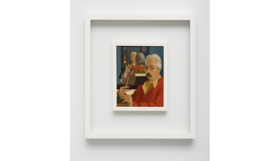
The motif of the double can be seen in both the 1953 "Autoritratto" (shown above) featuring the artist’s doppelganger and a pair of Siamese cats reflected and refracted in a studio mirror, as well as in the 1957 double portrait entitled "Noi" ("we" in Italain), featuring Calderara and his wife, Carmela, superimposed on top of one another.
That's a very difficult question! Speaking more generally, I find his delicate colour palette and minimal approach to painting just beautiful. He had a great sense of style too – only very few people can pull off the belt over jumper look (shown below)!
As we'd already made a more formal exhibition catalogue for our last show of Calderera's work, we wanted to make something a little bit more ephemeral and we felt that a newspaper format complemented all the great materials and images we've come across in the Calderara archive.
Can you talk about the process of designing the newspaper?
One of the things we found in the archive was a gallery leaflet from 1966 (shown below). I couldn't really find out much about it but the typography really caught my eye – especially the letter L! – so I set about trying to find a similar typeface.
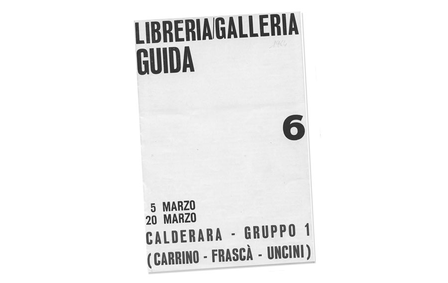
From doing a bit of research we established that the leaflet was almost certainly printed by letterpress and probably with a mix of different characters. Apparently wood type manufacturers used to interpret styles quite freely and copy one another so trying to identify this as a single typeface was tricky.
One of the places that helped me to try and identify the font were studio 2356 who are a type and graphic design studio housed within Archivio Tipografico in Turin, Italy. In the end they very kindly drew us a custom typeface for "THE DOUBLE" headline and we are very happy with the result!
The Fondazione Antonio and Carmela Calderara is the artist’s former home and studio housed within a 17th-century villa-cloister of Vacciago, North of Milan. It was established in 1979 by Giuseppe Alemani and organises an annual programme of exhibitions and is open to the public from May until October each year.
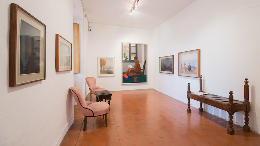
The collection includes many of Calderara’s own works, plus more than 300 artworks by dozens of international artists with whom he had friendships, all joined together by a general tendency towards abstraction.
Take a look at our forthcoming exhibition pages to see what we've got coming up!
Print your own newspaper with Newspaper Club.
In the corner of Ronan Mckenzie's desk, near to her sewing machine, there's a stack of folded, faded newspapers. "I like to see them...
Nilly von Baibus gets three or four handwritten love letters every week. But she doesn’t read any of them. They’re responses to ads...
The first issue of Deluxe was, in Rupert Morrison’s words, “lumpy.” He’s the owner of Drift, an award-winning record shop in Totnes – not...