Why I stopped sending newsletters and sent newspapers instead
Email newsletters weren't cutting it for photographer and creative director Max Hemphill. "Most of my outreach got lost in inboxes," says...
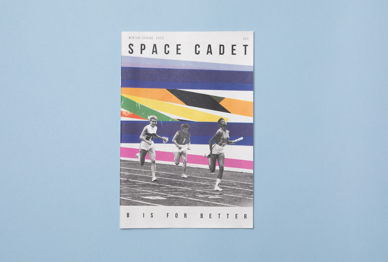
As an easily distracted child, Robin Scheines remembers being called a "space cadet." "The term always felt negative to me," she says. "We liked the idea of turning a wandering mind into a positive thing."
That's the inspiration behind the digital mini zine she launched with her friend, designer Natalia Olbinski. Published quarterly, Space Cadet is a celebration of random thoughts — each issue responds to a different theme word, starting with A ("Arrival") and progressing through the alphabet.
Below, NYC-based Natalia and Robin tell us about the design process for the latest issue — it's inspired by the word "Better" — and how making the zine has helped them both develop their artistic practice.
How did you come to create Space Cadet together?
Robin: Natalia and I are both pretty collaborative when it comes to creative things. I am a fan girl of Natalia’s incredible illustration and design work. She’s got such a great, thoughtful style.
I think we were on a Metro North train going to a friend's baby shower when Natalia started bringing up the idea of creating a kind of art collective with the first output being a print piece, maybe a newsletter or foldable tabloid. We wanted an excuse to do our own mini research projects and illustrations about topics we find interesting and want to explore. When a friend showed us one of Newspaper Club's mini samples, it helped that general idea take form.
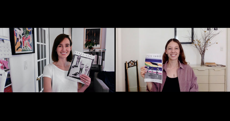
Natalia: For me it also came out of wanting to be able to direct my own work, and especially to draw more. I was feeling really burnt out as a designer, and had the worst creative block and low self esteem at the time we started this. Frankly even the thought of someone asking me to be creative would induce a panic attack. Space Cadet became a lifeline.
And it's amazing to have a friend and collaborator who is a great art director — Robin has really helped me in my work and I've certainly grown as an illustrator since we launched Space Cadet. It’s given us both an opportunity to develop our artistic practice.
What’s the concept behind the zine?
Robin: After we’d decided on the name and the mini newspaper format, we were able to get a clearer idea about the voice and mission of the zine. We decided we would lean into randomness as a strength and swing between topics. The challenge was finding some through-line to hold it together. We settled on basing each issue around the theme of one word, which we’d select by progressing through the alphabet.
We wanted the content to feel playful and surprising, each new piece providing a different interpretation of the theme. It also became a study in how to really tell a story on a few levels, which is something so specific to magazines.
We both write and illustrate most of the content, as well as edit it all to make sure it works together. It was a way for us to learn how to get short, concise points across in the writing and then have the fun of illustrating however we wanted. Every piece is a new experiment and we think juxtaposing the different interpretations together hopefully reveals unexpected insights.
Where does the name Space Cadet come from?
Robin: We threw out a ton of name options, but somewhere along the way I remembered my dad used to tease me as a kid about my lack of concentration. He used to do a whole bit where he’d pretend to be NASA ground control trying to reach me: “Earth to Robin! Earth to Robin!” So the term Space Cadet had always felt like a negative to me. We liked the idea of taking back the term in some way and turning a wandering mind into a positive thing that we could learn from.
Why did you choose the newspaper format?
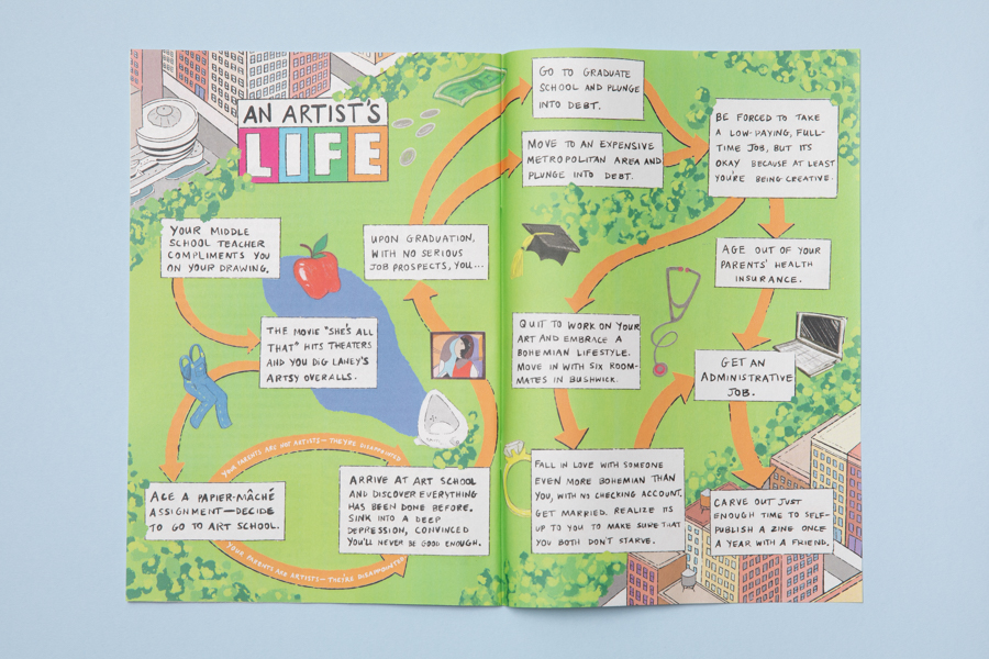
The size gives enough space for detailed drawings but is also a constraint in a good way, forcing us to use the limited space wisely. They're easy to send and share and the newsprint quality is incredible for color, but isn't too fussy. It hits this great spot between a temporary object and something you could save on your coffee table or bookshelf for years. It allows us to be experimental and free.
Did you have any specific reference points for the design?
When we were starting to think about the design, we looked at 90s Xeroxed zines to reference that kind of loose, off-the-cuff style. We also looked at old magazines like Holiday from the 60s and the Art Nouveau Cocorico first published in 1898. We admire what people are doing in the independently published magazine world these days, like the UK art collective Le Gunn’s publications with large-format, full-spread illustrations. And we really liked format, length and style of Seymour Chwast’s magazine, “The Nose” (pictured below).
Milton Glaser’s first issue of “Audience” magazine from the 70s had a big beautiful A on the cover. That inspired us to base our themes for Space Cadet on the letters of the alphabet.
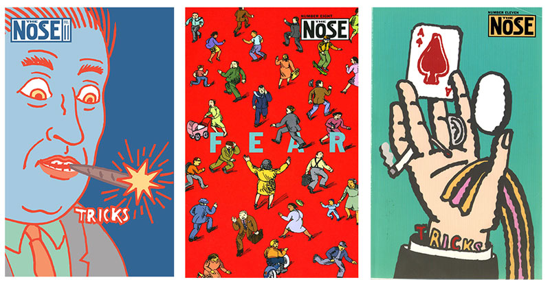
Can you describe your design process?
Robin: It’s very collaborative. We brainstorm the theme together and start coming up with ideas for pieces separately, always running them by each other for notes or additions. We're gathering all kinds of references all the time — we save images like album covers, paintings, illustrations we love and Natalia has a wonderful collection of design and art books we look through regularly.
Natalia: We start with a long list of things that we’d like to include and slowly narrow it down. We were doing flat plans physically, but now make them digitally. Since we can’t meet in person, I have no excuse not to learn how to navigate the Google Drive folders that Robin expertly sets up. Somehow I am completely inept when it comes to that — I wasn’t meant for the digital era. For issue 3 we have the page plan complete and now we’re in the process of writing and gathering material.
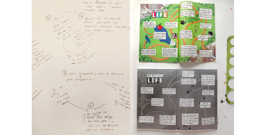
Robin: We're a little different here because I can't use an iPad to draw to save my life and Natalia is pretty skilled with it. I typically find a way in by doing the writing first and then a few different versions of accompanying illustrations.
Natalia: Haha. But at least this project was an excuse to try out the iPad, Robin! For the illustrations I've mostly been experimenting with ProCreate or some combination of traditional and digital media. Robin works in traditional media, mostly pen and gouache, and has a fancy shmancy scanner.
How do you find contributors?
We're so lucky that we went to art school and live in this crazy city filled with the most amazing and creative people. All of our collaborators have been friends and contacts of ours — many of the people who we'd always wanted to work with on something like this — and some more surprising finds.
For instance, in each issue we have a flashcard of the theme word in Spanish, created by a friend of ours who had been drawing flashcards to teach his girlfriend Spanish vocabulary. He was surprised when we became such fans of his educational side project, but it's been one of our favorite pieces.
And we're also open to strangers sending in ideas through our Instagram or website!
The theme of this issue is “Better" — how did you come up with that and how did contributors interpret it?
We purposefully choose words that are broad enough that we can get 10 or so different topics out of it. There’s a real pleasure in exploring a word’s many meanings. Better is such a great word — we could have gone on for 100 more pages about it.
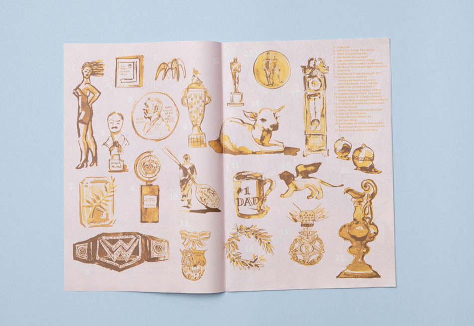
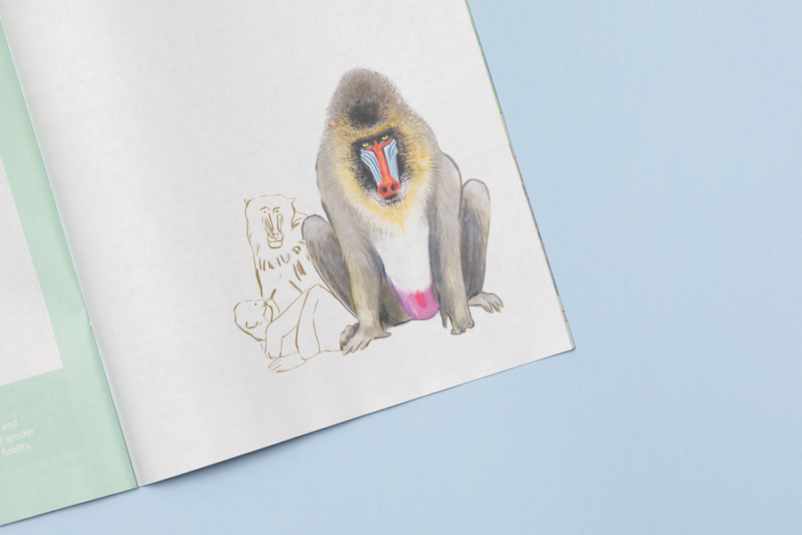
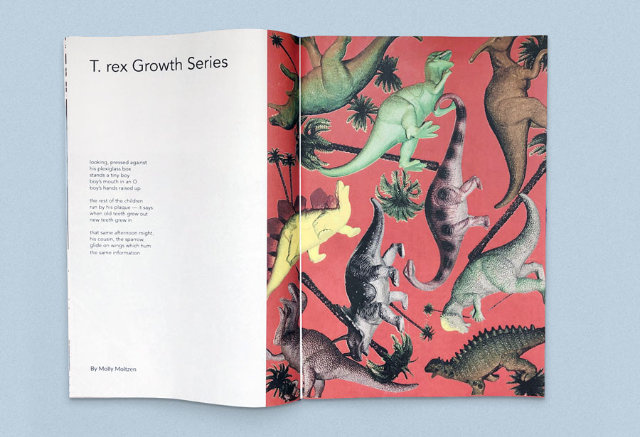
One of the first spreads in that issue is a piece Natalia did that explores trophies and awards through the years with expressive illustrations of each (pictured above). This is a more straightforward connection to “better.” That piece is followed closely with a poem by the wonderful Austin, TX based poet Molly Moltzen titled “T.Rex Growth Series” about a young boy in a museum looking at dinosaur remains. We loved how this might relate to the theme through the concept of evolution, biology’s way of getting “better.”
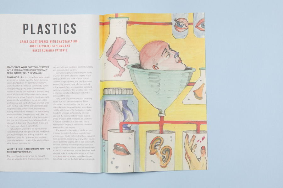
Then we also have an interview with a Physicians Assistant on a plastic surgery team at a hospital in West Virginia (pictured above). Medicine and health seemed like fun links to explore. So we try to relate in more literal ways, while also stretching.
Our next theme is C for Consume and we have some great stuff planned. It already feels a little moodier than “Better.”
How has coronavirus impacted your plans for the zine?
Robin: We had just printed our second issue two weeks before lockdown, and were in the middle of planning a launch party for it. We had JUST finalized the date of March 20th when all of this went down.
Natalia: It is definitely a change to not be able to meet in person for work sessions. We’ve accomplished a lot digitally though. We got our website up and launched our Instagram. We’ve locked down the content for the next issue, “C is for Consume”, and hope to have that printed as the city re-opens and maybe can hold that launch party after all.
Robin: We considered doing the “C” issue about COVID 19 but decided by the time this one comes out in a few months we might all be looking forward to thinking about anything else. “Consume” feels like it gives us the opportunity to talk about COVID while also discussing a wider range of topics.
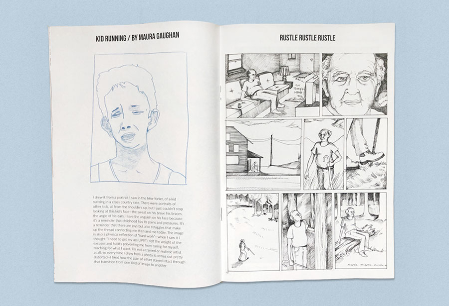
How have people responded to Space Cadet?
People have been really positive and supportive about it. It seems like an object people get excited to take home. It’s been fun (prior to COVID) stopping by someone’s house and finding it on their coffee table. We’ve had some people reach out with great ideas for contributions. And Robin’s dad was pretty proud of his call out in Issue 1 as inspiration for the name.
We hope if anyone reading this is in a stagnant place creatively (like we were), they’ll take this as some inspiration to find a topic you’re naturally curious about and just explore it any way you want. Forget the stuffy art school training and just have some fun.
Make your own newspaper with Newspaper Club. Print runs start at 1 copy!
Email newsletters weren't cutting it for photographer and creative director Max Hemphill. "Most of my outreach got lost in inboxes," says...
Nilly von Baibus gets three or four handwritten love letters every week. But she doesn’t read any of them. They’re responses to ads...
The first issue of Deluxe was, in Rupert Morrison’s words, “lumpy.” He’s the owner of Drift, an award-winning record shop in Totnes – not...