9 newspapers hot off the press in April
It’s April, and we’ve got a fresh batch of newspapers to share. This month, Brooks spotlights Barcelona’s running scene, The Covent...
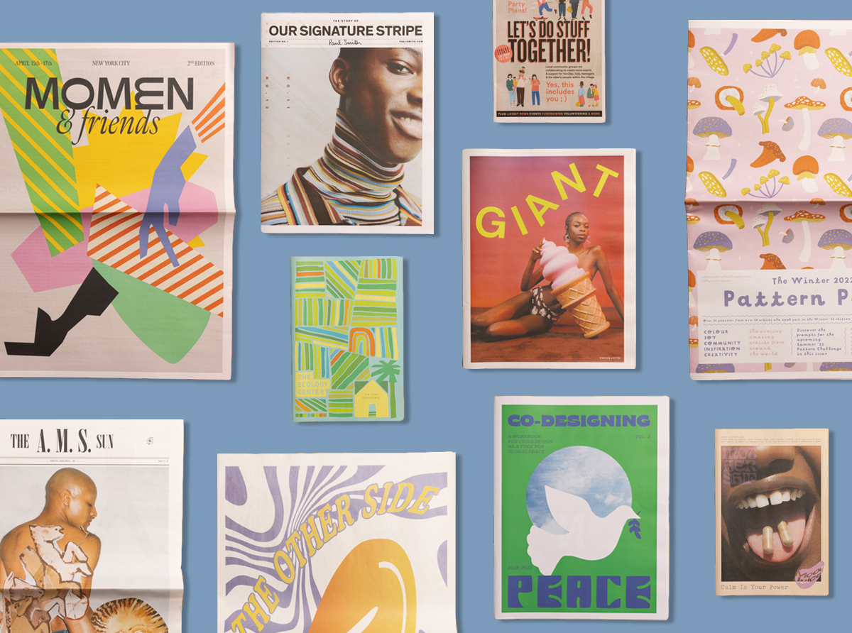
Every month, we put together a roundup to show all the exciting ways our creative customers use newspapers. In the June edition: a celebration of stripes from Paul Smith, playful patterns for a good cause and diapers with an eye for design.
Stripe story
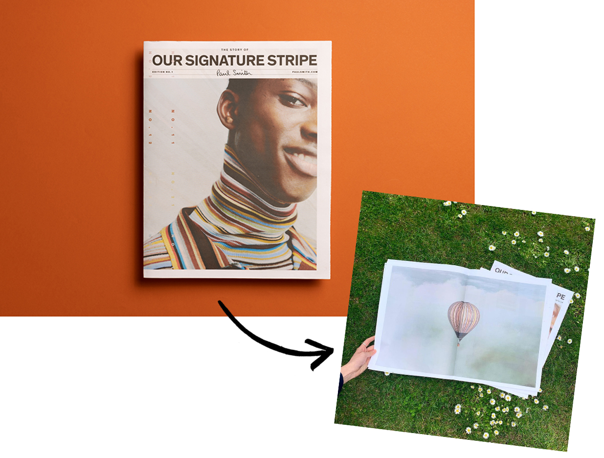
This traditional tabloid tells the story of Paul Smith’s 40-colour Signature Stripe, which has been part of the designer’s collections since he opened his first shop in Nottingham in the 1970s.
"A newspaper is scalable, low cost, dynamic and environmentally friendly."
Printed to celebrate the reveal of a new Signature Stripe mural on Melrose Avenue in Los Angeles, the 20-page newspaper features a double-spread poster of the hot air balloon the brand “wrapped” in its Signature Stripe last year.
“A newspaper is scalable, low cost, dynamic and environmentally friendly,” says Jean-Loup Leblanc Roy, a designer on the project along with Matthew Mumford and Cha Chaan Teng Studio.
Cosmic calm
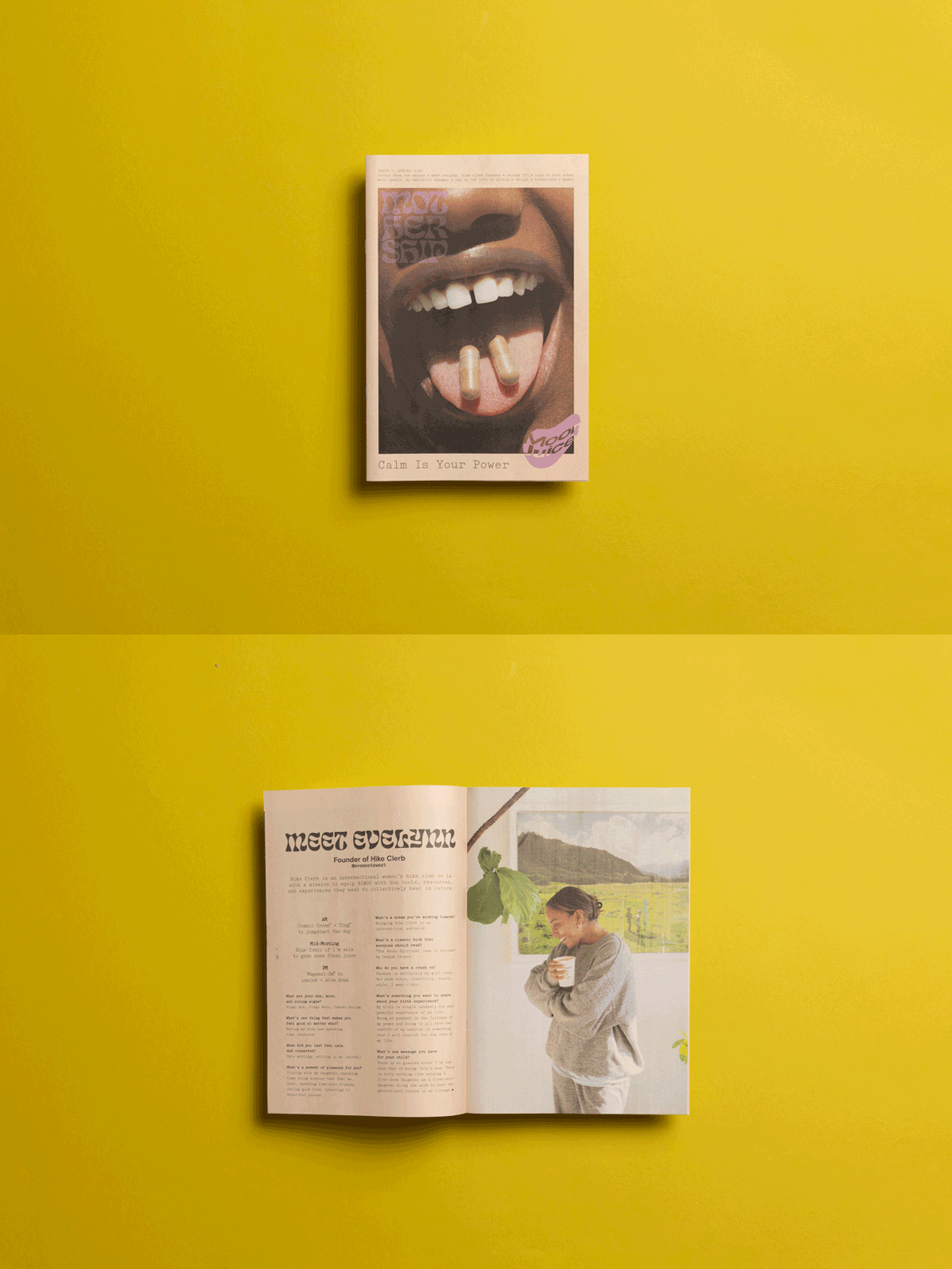
Wellness brand Moon Juice’s new zine, The Mothership, has landed. Designed to “inspire and inform” their customers, the first issue focuses on calmness and features recipes, horoscopes and interviews with friends of the brand and the Moon Juice team.
“We wanted something unique that would set us apart from traditional brand magazines or catalogs,” they say about choosing our digital mini. “Our community loved the look and feel of a classic newspaper. It brought back nostalgic memories of playing word search games on Sundays.” Designed by Jan Haeck with creative direction by Erin Hover.
Punchy patterns
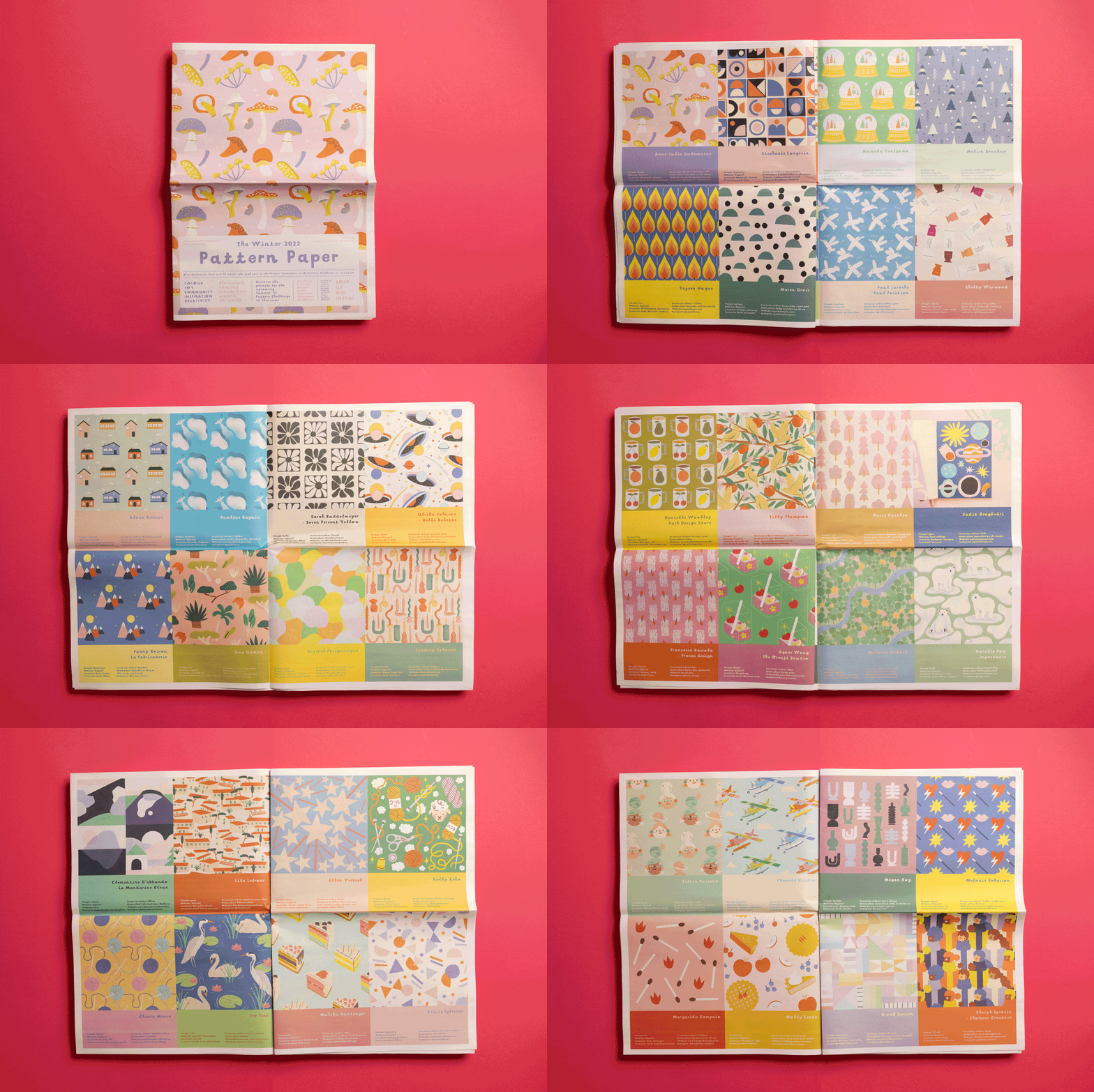
Pattern Paper showcases over 50 patterns from artists around the world who took part in Melanie Johnsson’s #thepatternchallengebymel on Instagram. This is the second edition (the first one came out last winter) and money from sales goes to causes the artists care about — this time, the British Red Cross. It’s already sold out, but you’ll be able to pre-order the next edition later this summer.
“Everybody absolutely loves it,” says Melanie about the digital broadsheet. “The format is super fun, the colours are bright and beautiful and it's easy to re-use for crafts.”
Delightful diapers
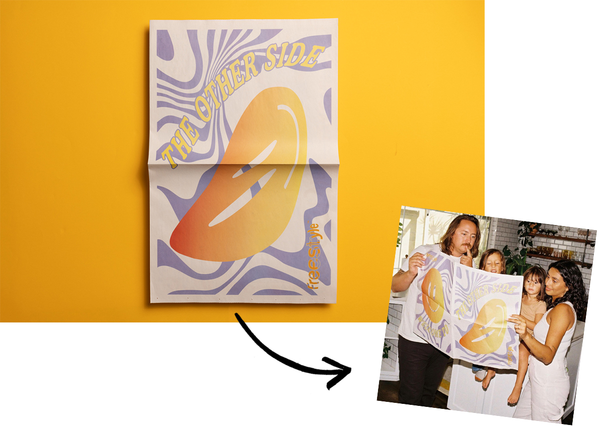
Freestyle makes super absorbent bamboo diapers featuring playful, limited-edition designs. “Easier on the eyes, easier on the planet,” they write in this digital broadsheet that’s sent to customers with their first order. It opens into a poster that reads “Welcome to the other side” and features info about Freestyle’s products and the artist they’ve collaborated with for the current design (in this case, Finnish illustrator Janine Rewell).
“We loved the idea of having a big canvas to introduce the brand and surprise customers when they open the package,” say designers Marina Veziko and Mike Constantiner. “People have loved the newspaper, the design, and reading the fun bits of copy on it!”
Farm fundraiser
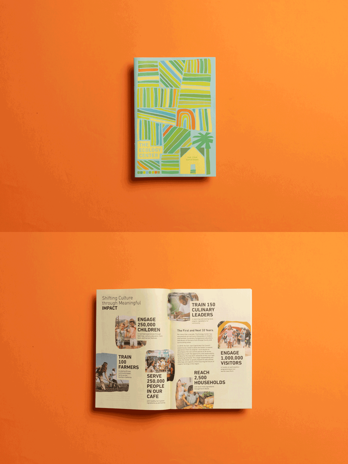
Located on a historic agricultural property, The Ecology Center is a 28-acre regenerative, organic-certified farm and education centre that serves as a hub for southern California’s ecological movement. This 24-page digital mini outlines their vision for the next 10 years — from training farmers to distributing organic produce to underserved communities. They’re sharing it with donors and constituents as a fundraising tool. Designed by Nereo Zago.
Stand-out handout
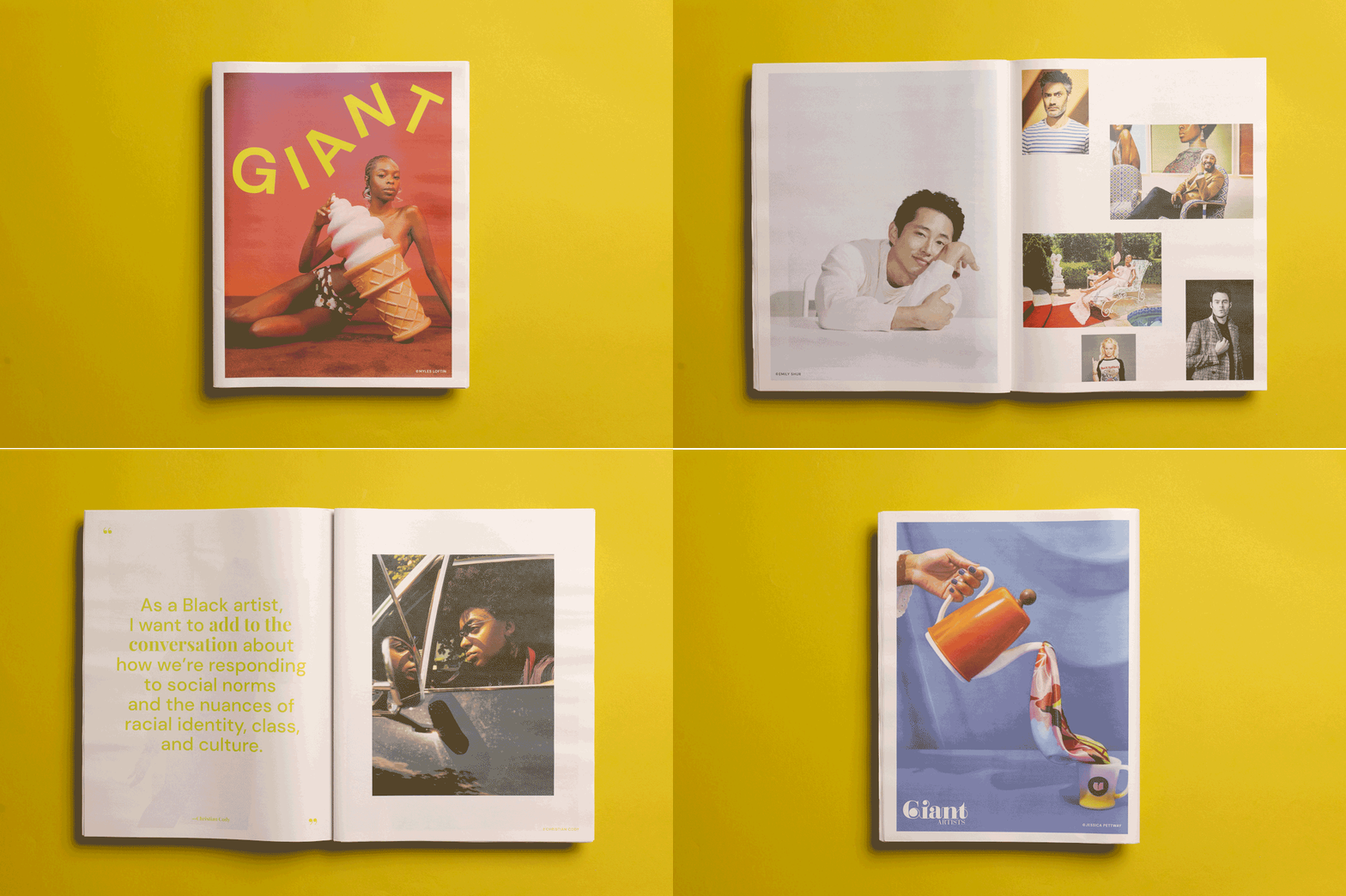
Production and management company Giant Artists handed out this newspaper at the Le Book Connections trade shows in Los Angeles and San Francisco this spring. Printed on our digital tabloid, it features work from their roster of photographers and creative directors, including Dustin Aksland, Emily Shur and Myles Loftin.
“This was our first in-person event in a couple of years, so we wanted to have a stand-out, printed piece for visitors to take with them after visiting our booth,” says visual brand manager Brett Fairless. “We worked with a lovely and talented designer, Rachel Mendelsohn, to create a piece we were all really excited about. And we received really positive feedback about it from people at both Le Book shows!”
Making moves
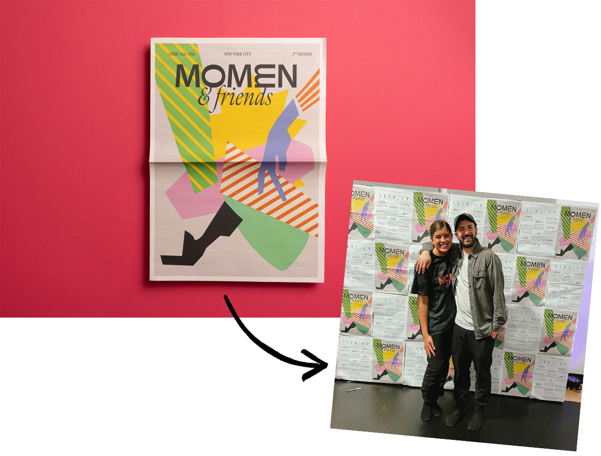
Momen & Friends is a weekend dance experience aiming to reconnect adults to their love and curiosity for movement. For each event, goodie bags include a digital broadsheet with the schedule plus stories written by members of the community.
"It isn't just a newspaper, we use it as wallpaper, wrapping paper, tablecloth — the options are endless!"
“We’re romantic about turning ideas into something tangible and the newspaper delivers this concept like no other,” says designer Abraham Lule. “It isn't just a newspaper, we use it inside the workshop for many purposes: as wallpaper, wrapping paper, tablecloth — the options are endless! Everyone loves it.”
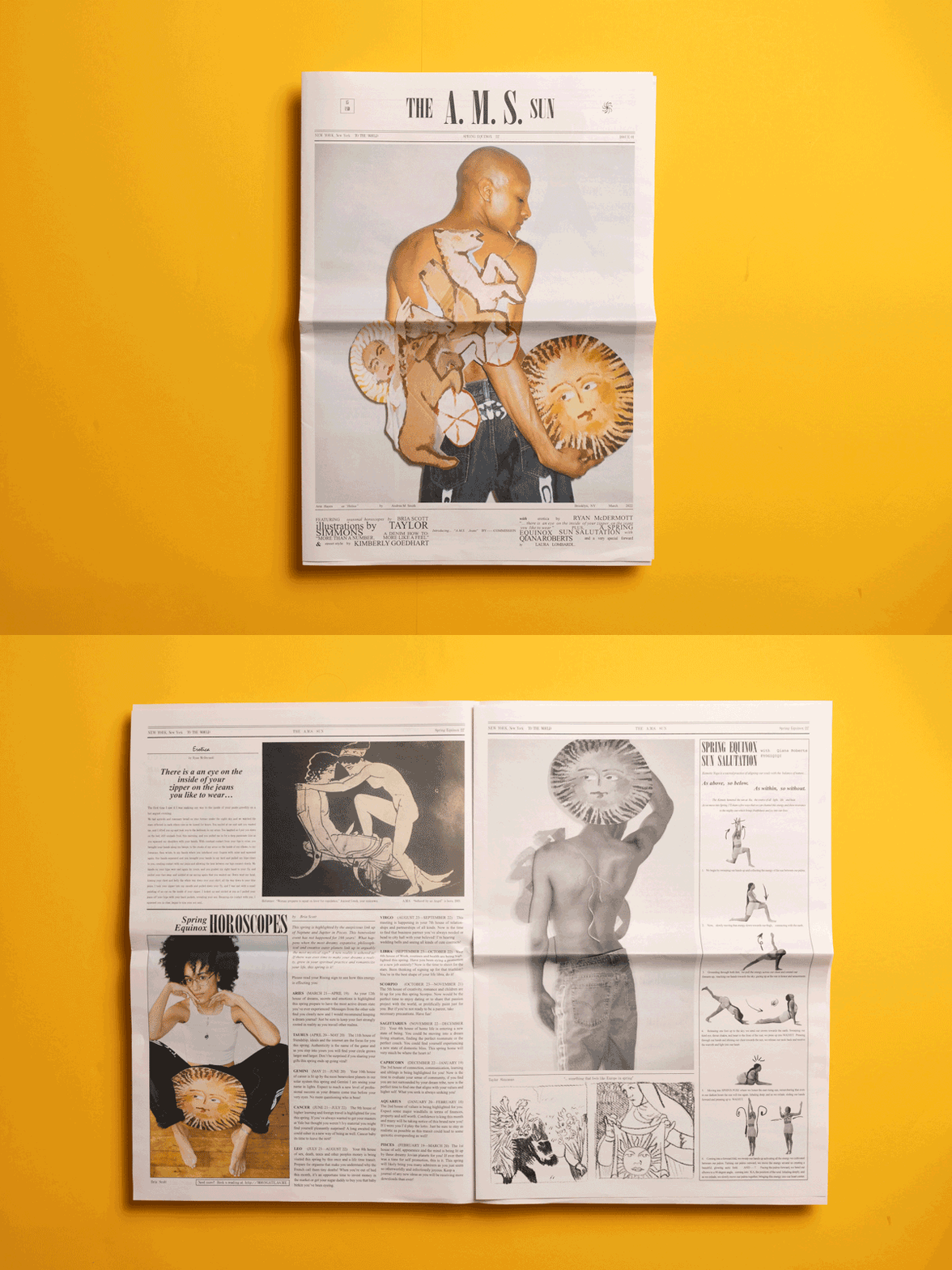
Creative community
Created by NYC-based artist Andrea Smith, The A. M. S. Sun celebrates one year of community-based collaboration through the medium of wearable art. The 12-page digital broadsheet is “an invitation to explore creation as a means of dialogue within our communities,” featuring photography, horoscopes and musings on style.
“I love the smell and feel and the way it ages, which I felt aligned with the way I work on clothing,” says Andrea. “I love that some of my copies have already yellowed in the sun.”
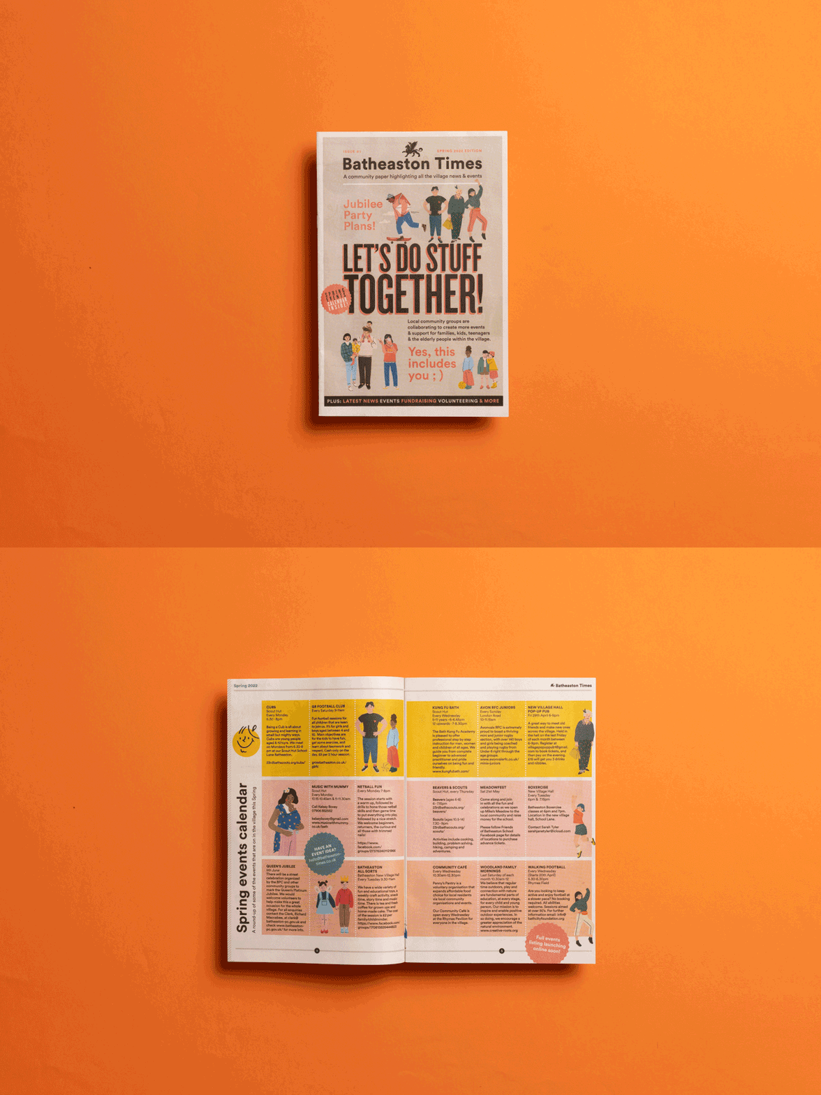
Batheaston springs into print
The village of Batheaston just got a new community newspaper! The first issue of Batheaston Times came out last month, introducing a spring events calendar plus news from local churches, schools, youth groups and non-profit groups. “It's an affordable format that's let people know what great things are happening in the village,” says designer Craig Brooks. Printed on our digital minis.
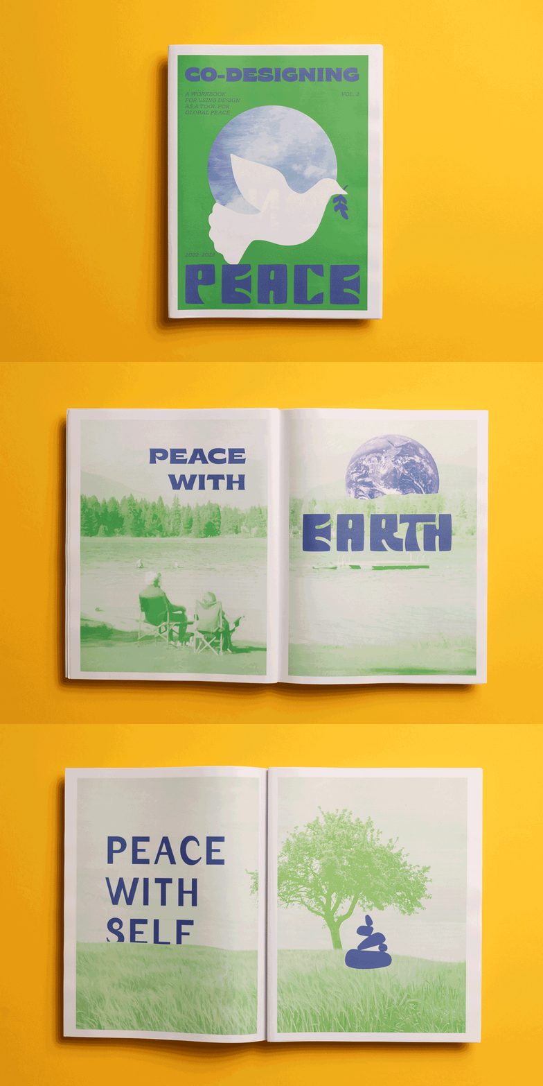
Peace pages
Founded by designer Gray Garmon, Co-Designing Peace explores using design methods "to achieve a more expansive and effective movement toward peace.” This newspaper, structured around different expressions of peace, was co-created with 16 students at The University of Texas at Austin’s Center for Integrated Design and graphic designer Kelly Thompson.
"We love the tabloid for [its] large, expressive pages. It can be read as a publication or hung as posters on the wall."
"After years of designing and teaching online, we were excited to create something that we could touch and pass along to our community,” says Gray. “We love the tabloid format because it allows for large, expressive pages that share the bold ideas of our co-creators. It can be read as a publication or cut up to hang as posters on the wall.” Printed on our digital tabloids.
Make your own newspaper with Newspaper Club. Print runs start at 1 copy!
It’s April, and we’ve got a fresh batch of newspapers to share. This month, Brooks spotlights Barcelona’s running scene, The Covent...
March is here, bringing more daylight and more newspapers! In this roundup: a design newsletter makes the leap from inbox to print,...
Our first roundup of the year features 7 brilliant projects, including a newspaper with artwork that quite literally leaps off the page...