How making a newspaper helped a small record shop find its voice
The first issue of Deluxe was, in Rupert Morrison’s words, “lumpy.” He’s the owner of Drift, an award-winning record shop in Totnes – not...
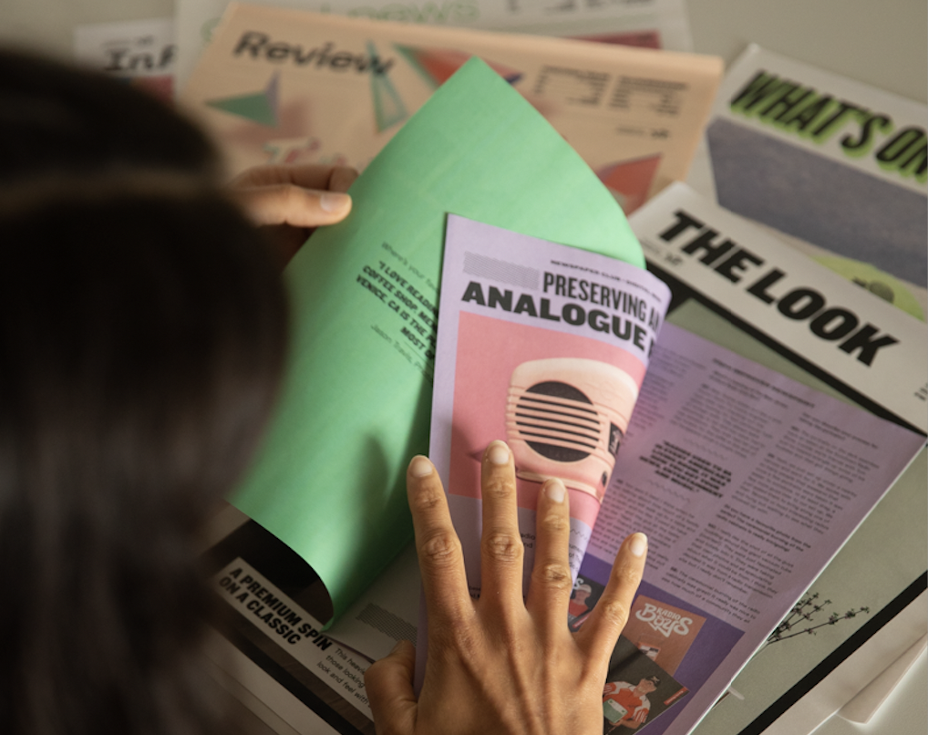
Portfolio reviews may be intimidating, but they can also change the course of your career. Our partners at Shutter Hub — who've worked with us to make photography exhibitions more accessible and help photographers build connections during the pandemic — recently released a guide to help you nail your first portfolio review and we're excerpting some of the key advice here.
Below, Shutter Hub shares 6 tips for preparing for a photography portfolio review (get the full guide for free on their website). We’re also taking a look at how a newspaper can help seal the deal — with examples of creative portfolios that photographers have printed with us.
Shutter Hub's 6 tips to nail your portfolio review
• Get the edit down. Don't turn up with a hundred prints and just tip them onto the table, or send a bulging dropbox folder. Think carefully about the work that represents you, and where you want to be as a photographer, and share that.
• Make a sandwich! Start with something strong, layer the images in a good flow, and spread the weaker (but obviously relevant!) images throughout, and then end on a banger! First impressions count, but the last thing people see will stick with them too.
• Be hands-on. Handling prints is a great way for the reviewer to connect with your work in that limited amount of time you have together.
• Think small. If you're taking prints to a review, you might only have a small table available and you'll want to be able to spread things out a bit. The biggest size to go for would be A3, or 12x16 at the most, because generally you'll be limited on space.
• Cut loose. Having loose prints enables you and them to move things around and sequence things together, or change your sequencing as you please.
• Keep the conversation going. Exchange contact details at the end of the session and ask the reviewer if you can contact them in the future. If you’ve got postcards, prints, spare books or (ahem) newspapers and you can afford to give them away — do it. Your work can go home with that reviewer and act as a useful reminder of you and your work.
And on that note...
A look inside 6 inspiring newspaper portfolios
After making a great first impression at your portfolio review, it's a smart move to leave your reviewer with something they can reference later — or pass on to contacts who may want to work with you. Get inspired by the portfolio newspapers below, then order a free sample pack and create your own.
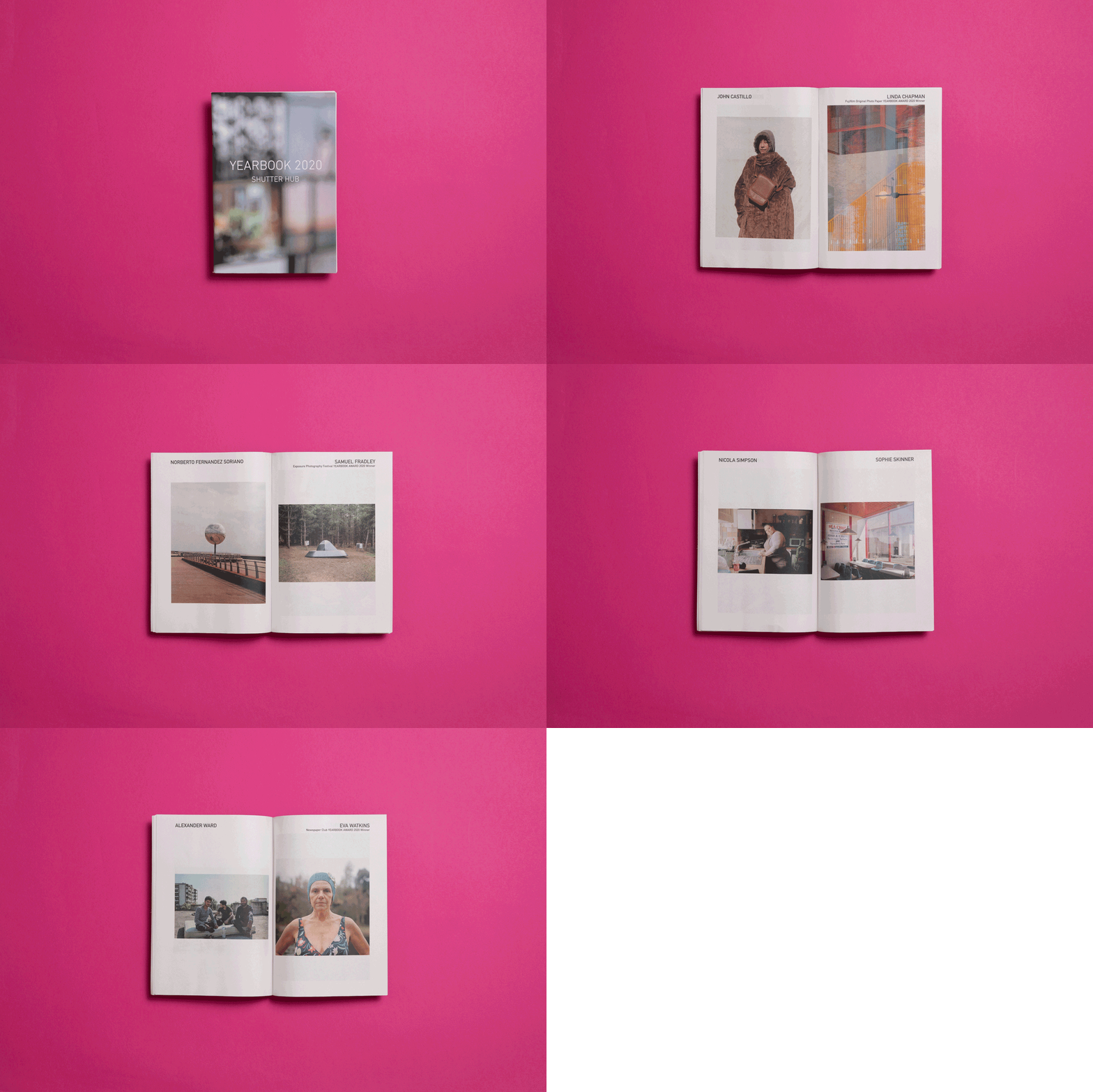
Shutter Hub
Kicking things off with Shutter Hub's own newspaper, YEARBOOK. Featuring work from over 100 photographers, they sent the digital mini to editors and agencies to help their community make new connections during the pandemic.
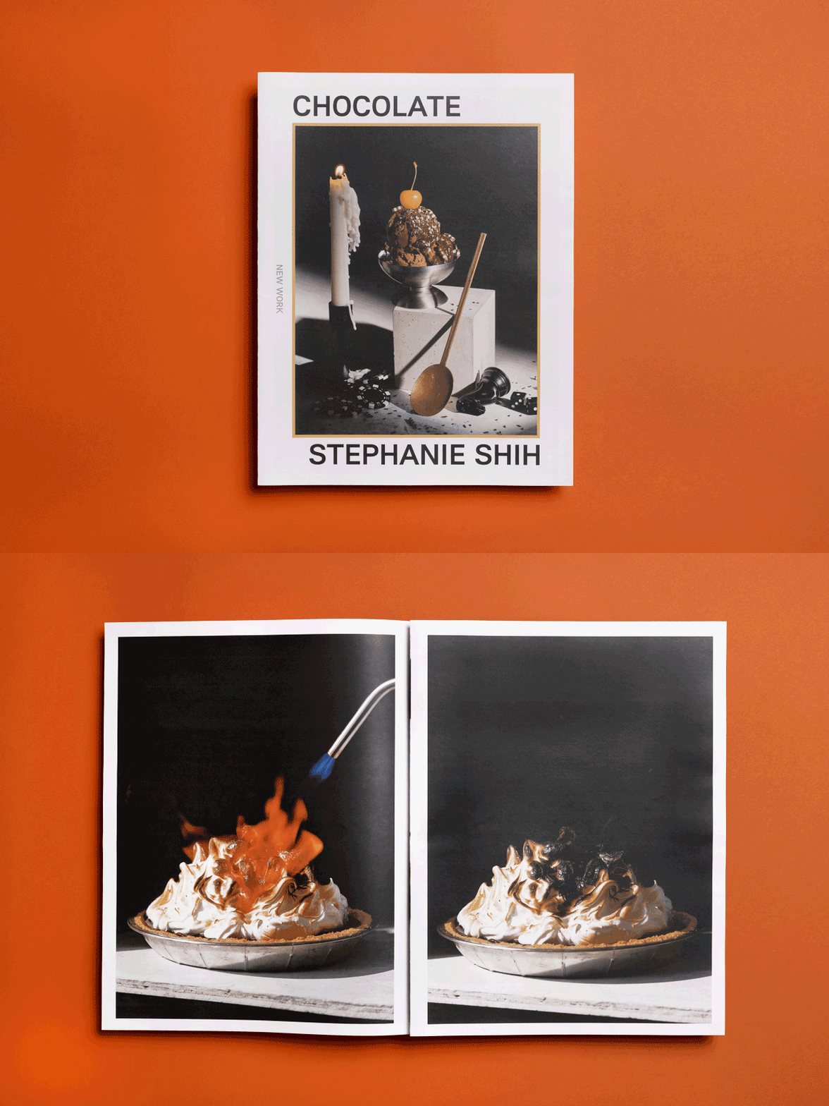
Stephanie Shih
Los Angeles-based photographer Stephanie Shih printed this digital tabloid to showcase a chocolate-themed shoot. She sent the portfolio to photo editors and art buyers: “The people who've seen it are really excited about seeing photography in print — something that's a bit too rare these days!” she says.
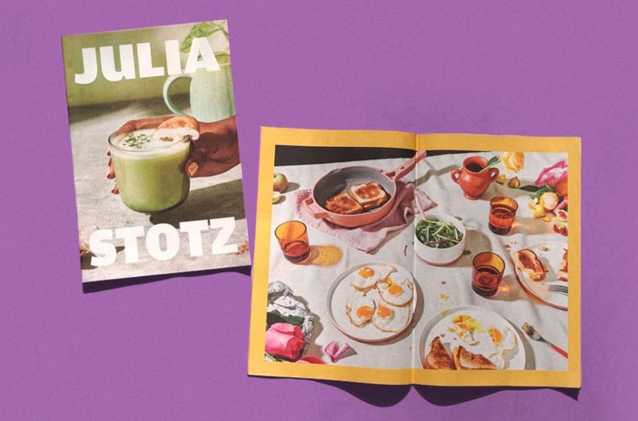
Julia Stotz
Specialising in food photography, Julia Stotz's clients include The New York Times, Bon Appetit and Eater. She printed this digital mini to leave behind after client meetings: "I love how light and easy they are to keep in my bag and hand out," she says, adding that it also offers enough space for clients to be "immersed in the imagery."
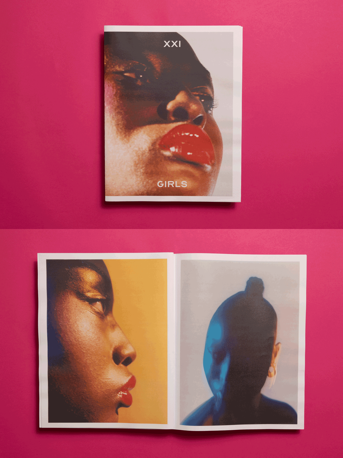
Chloé Le Drezen
In this dreamy digital tabloid, London-based photographerChloé Le Drezen presents a series of 21 portraits experimenting with colour and movement. “What was fun was to print [the zine] big, making all the portraits larger than life, drawing you to look at the little details,” Chloé told Another magazine about the project.
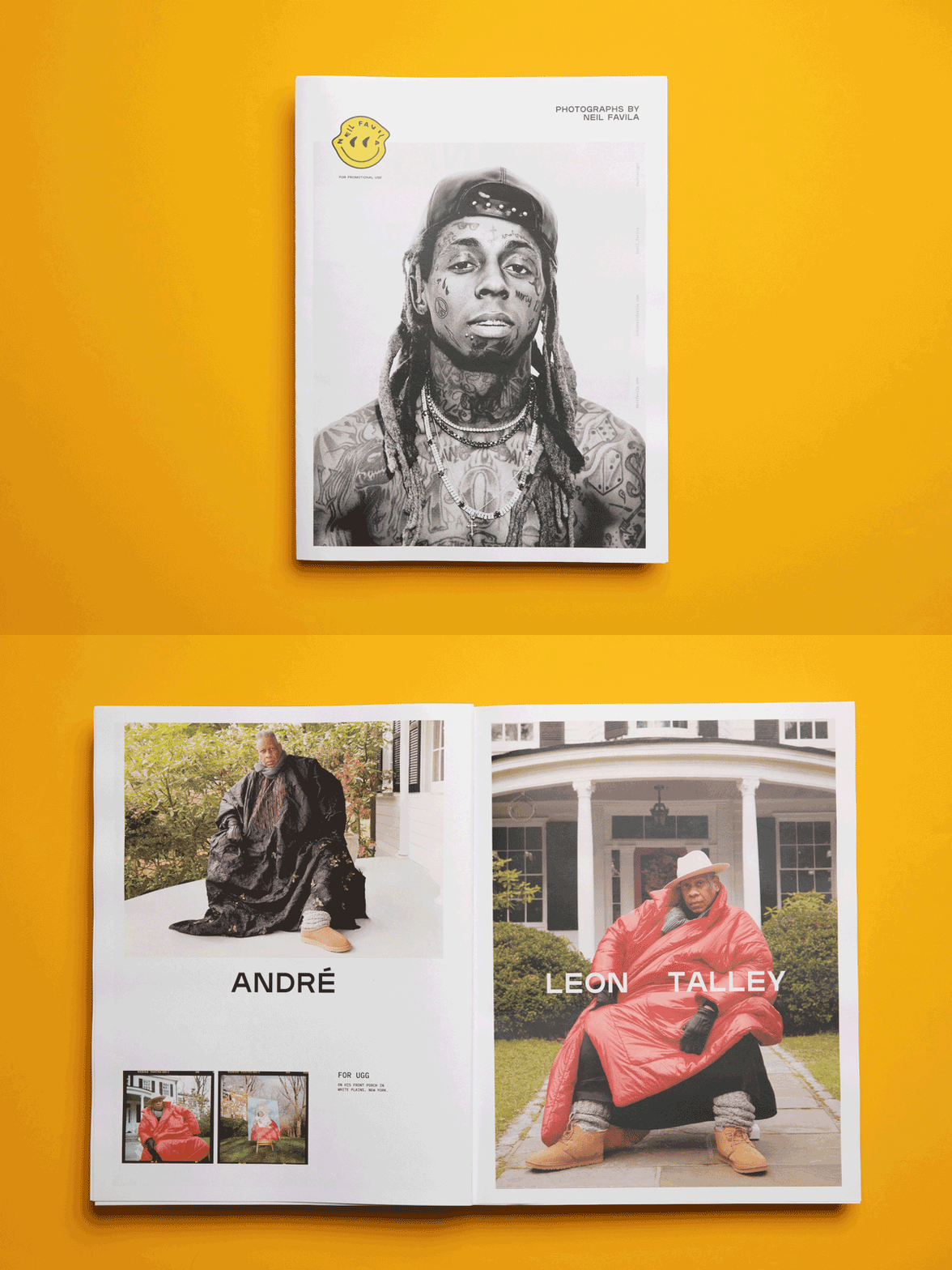
Neil Favila
Neil Favila’s digital tabloid is a mix of personal projects and portraits shot for big clients like Playboy, Don Julio and Ugg (“One for the books,” he says of photographing the legendary André Leon Talley in Uggs, shown above).
“I've always been a fan of the oversized tabloid dimensions, and wanted to experiment with a promo that was a bit more hands-on,” says Neil, who sent his newspaper to creative directors, art buyers and photo editors.
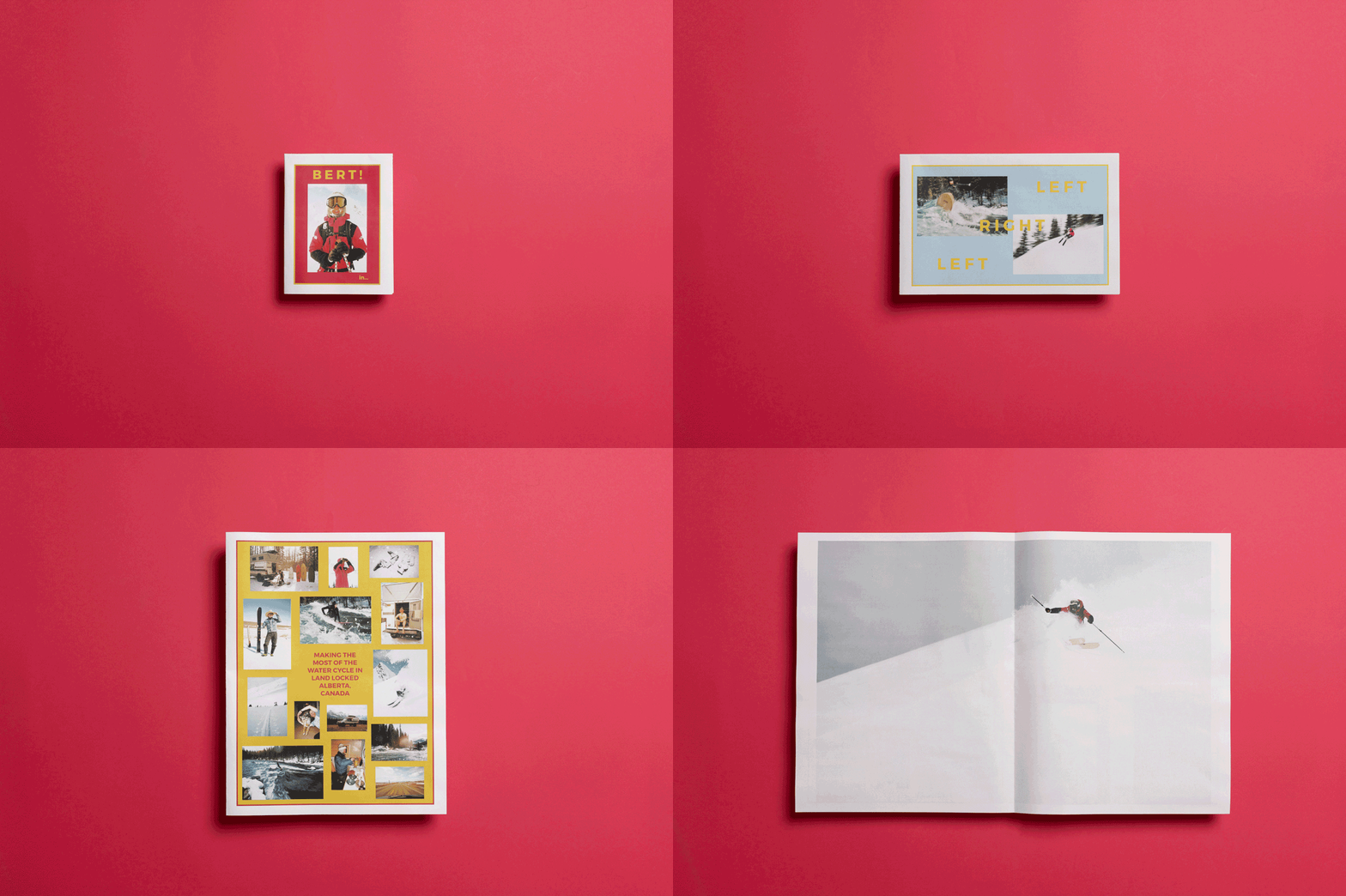
Kyle Gibson
Vancouver-based photographer Kyle Gibson added extra folds to his digital tabloid after printing, to create a compact booklet that opens up into a poster (see how it works above!)
“I’ve had lots of people comment on the unique fold-out format and the print quality,” says Kyle, who used our heavier 80gsm recycled paper for his zine. “The finished product has a great look and feel!”
Make your own newspaper with Newspaper Club. Print runs start at 1 copy!
The first issue of Deluxe was, in Rupert Morrison’s words, “lumpy.” He’s the owner of Drift, an award-winning record shop in Totnes – not...
Spring is in the air and a new season of print is upon us! In this roundup, we've got a creative pick-me-up from Papier, a peek behind...
As Newspaper Club’s digital product manager, Billy Whitehouse spends his days helping others bring their print ideas to life. But...