This print newspaper is reviving the lost art of personal ads
Nilly von Baibus gets three or four handwritten love letters every week. But she doesn’t read any of them. They’re responses to ads...

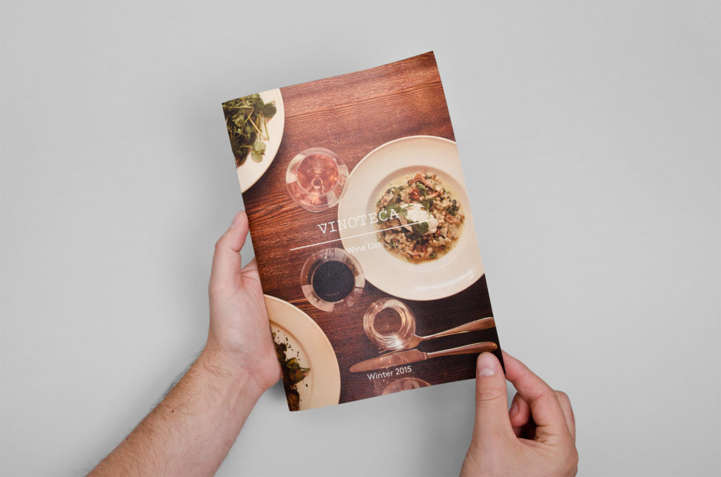
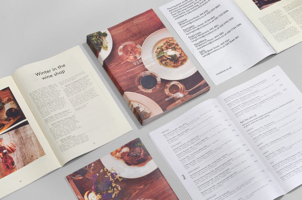
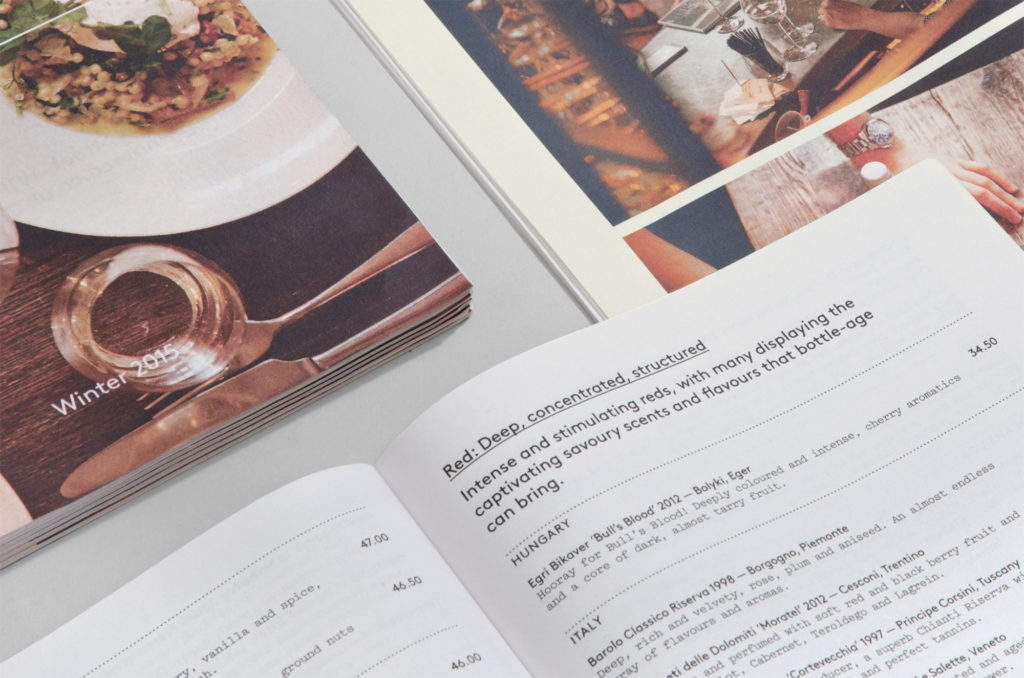
London-based wine bar Vinoteca wants customers to be informed about what they're drinking. With over 285 bottles on offer, they use a traditional mini newspaper to make their extensive wine list more accessible to wine newbies and experts alike. It's designed by dn&co, who chose newsprint because it "embodies Vinoteca's welcoming and easily digestible take on the complicated world of wine."

"There's something about wine lists that often feels quite intimidating," says dn&co Creative Director Patrick Eley. "A sort of dusty leather-bound reprimand from a cheerless aunt."
Not at Vinoteca. They've printed two issues of their down-to-earth wine list, which reads more like annotations from a witty, wine-savvy friend. Vinoteca's personality comes through in a welcome note from the owners ("We are so excited about the new wines on our list that we are, literally, about to cry") and honest staff picks ("The wines that our staff just can’t stop drinking. Even though they probably should").

"We made a mini newspaper because it's simple and immediate – something that you could put in your bag and take home at the end of the night," says Eley. "Like Vinoteca, it's unpretentious and engaging. The format allows us to combine editorial with insightful, helpful listings, change things seasonally and crucially, doubles as a price list for the in-store shops. And there's no leather in sight."
Print your own newspaper with Newspaper Club.
Nilly von Baibus gets three or four handwritten love letters every week. But she doesn’t read any of them. They’re responses to ads...
The first issue of Deluxe was, in Rupert Morrison’s words, “lumpy.” He’s the owner of Drift, an award-winning record shop in Totnes – not...
Spring is in the air and a new season of print is upon us! In this roundup, we've got a creative pick-me-up from Papier, a peek behind...